Look closely and you’ll see all sorts of clever hidey-holes in this apartment, which also fools onlookers into thinking it’s just another beach house.
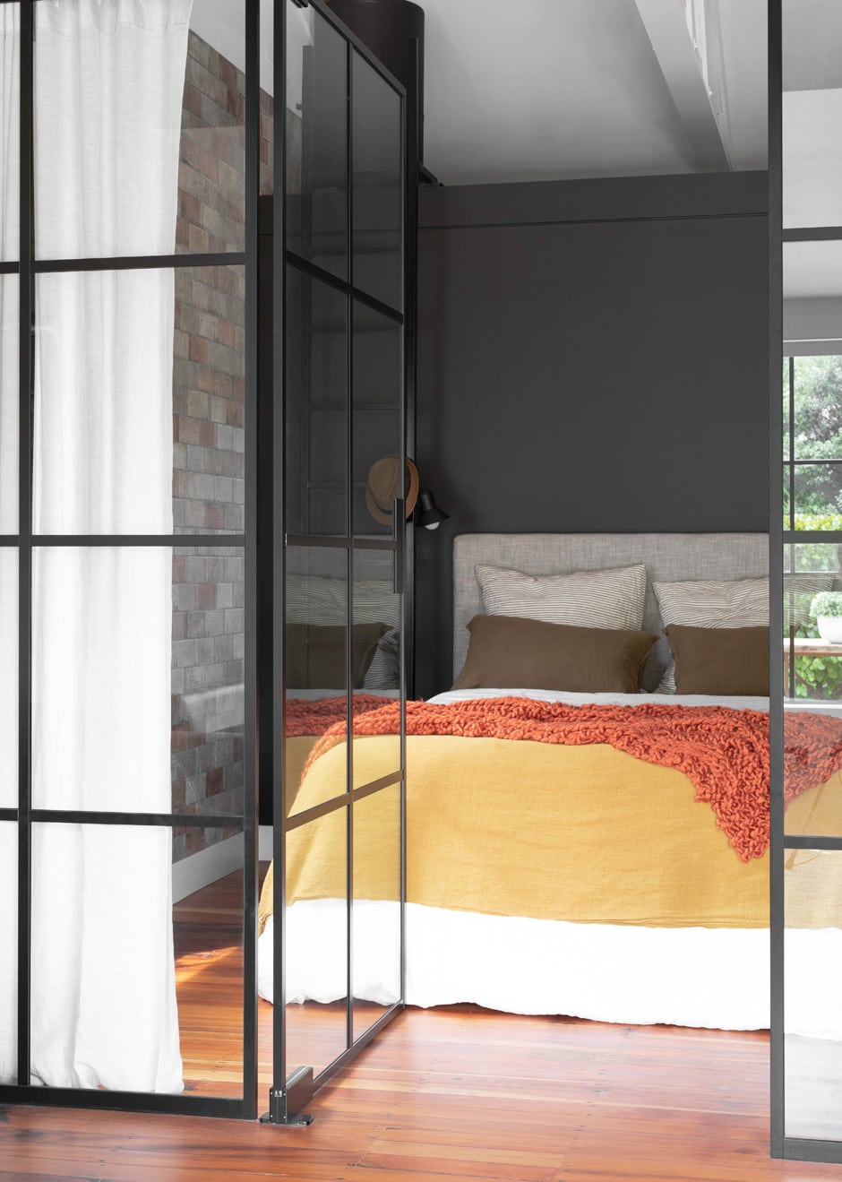
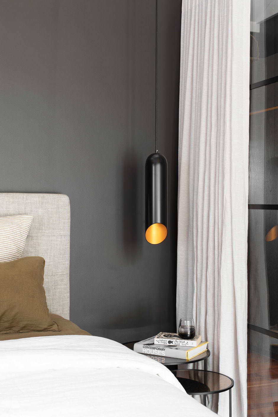
Tidying tutor Marie Kondo might know how to precision-pack a suitcase, but she says nothing about where to keep the darned thing. She’d doubtless find joy in the secret-squirrel storage space above the bed in this 50m2 studio. Accessed by a metal ladder with a detachable shelf that’s used as a bedside table, the loft also accommodates the hot-water cylinder out of sight. Genius.

Interior designer Peta Davy of Yellowfox felt justified in pushing her clients — her mum Shelley Brockliss and Shelley’s partner Mike Coghlan — out of their comfort zones when they downsized to this apartment on the north-facing edge of a converted hall on Waiheke Island. For one thing, Shelley had always loved white-on-white schemes, “but when she presented me with swatches of a rusted-looking benchtop material, copper mosaics and brick as part of her brief, I knew I had
to talk her into dark walls,” says Peta.
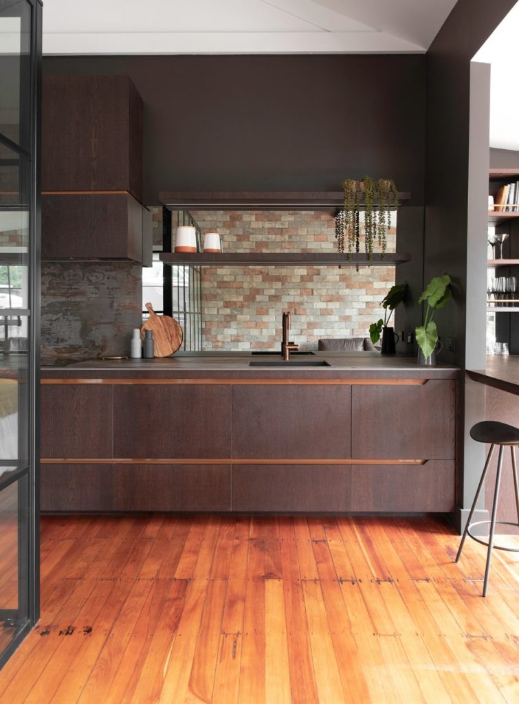
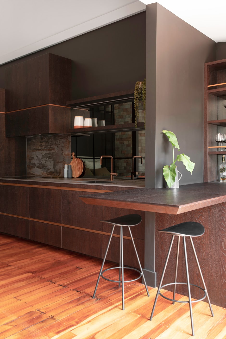
With a vaulted ceiling, exposed rafters and matai floors, the above-and-below design strategy was obvious. All that was left was to put the filling in the sandwich. The floorplan is rectangular, so Peta made the decision to stretch the cabinetry the length of one wall, with the kitchen, a bar, a TV zone, a wardrobe and storage all incorporated. “I had a bit of a battle with Mike, who’s the cook, as he was adamant he wanted an island,” she says, but she was equally insistent that there wasn’t enough space. A cantilevered breakfast bar kept them both content.
Kitchen designer Leonie Metge of Cube Dentro took the industrial-style palette and fleshed out the accents using a thin-profile benchtop with a rusticated finish; the ‘handles’ are a negative detail backed by a powder-coated copper strip that glows the same colour as the timber floor. Mike’s beloved coffee machine is integrated above the oven and warmer drawer, while the TV in the bar area all but disappears against the charcoal backdrop.
On the opposite wall — decorated with trompe l’oeil tiles that look like bricks — a small bathroom backs a bedroom that’s sectioned off not by solid partitioning, which would have closed in the space, but by metal joinery. When black steel proved too expensive, the mother-daughter duo agreed on aluminium instead. The bed lifts up on hydraulics, so out-of-season outfits can be stored underneath.
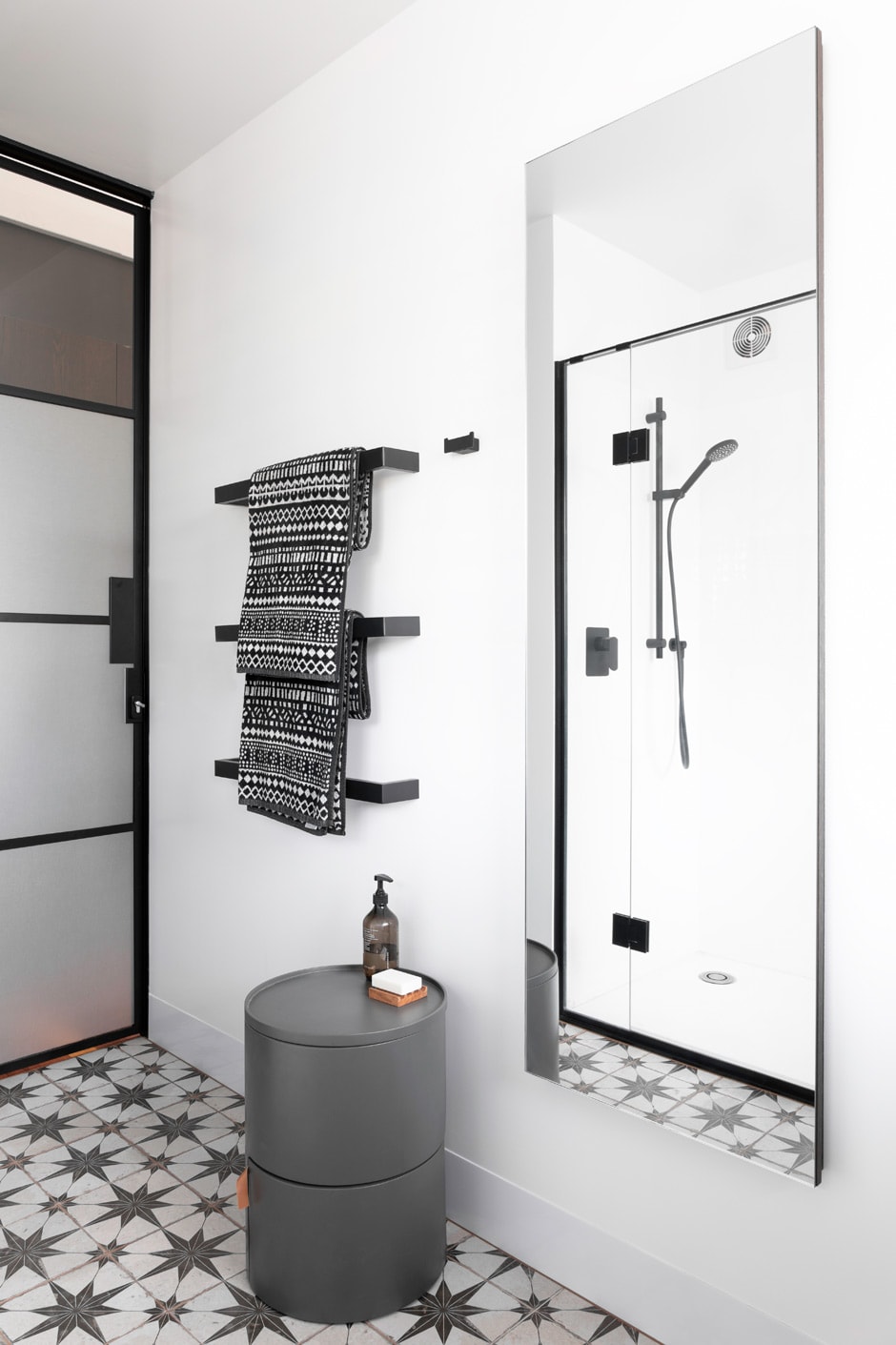
Vintage-style tiles line the floor in the bathroom, where storage is disguised behind the mirror and the washer/drier is hidden behind a honeycomb blind. “We didn’t have space for a sliding door, so that was our solution,” says Peta.
Living in this small apartment was initially a challenge, but Shelley and Mike have quickly grown to love their island home. That said, the petite wardrobe has taken some getting used to. “I really want half of Mike’s side,” confesses Shelley, who has trimmed her options down to some key staples.
The couple are revelling in the dichotomy of the urbane sophistication of this New York-style pad (which doubles as a showroom for Yellowfox, allowing clients and associates to view beautiful new products) against the casual beach vibe of its Oneroa location. They have plans to construct an outdoor room so they can entertain in the sun, but for the immediate future, their dial is set firmly to ‘travel’.
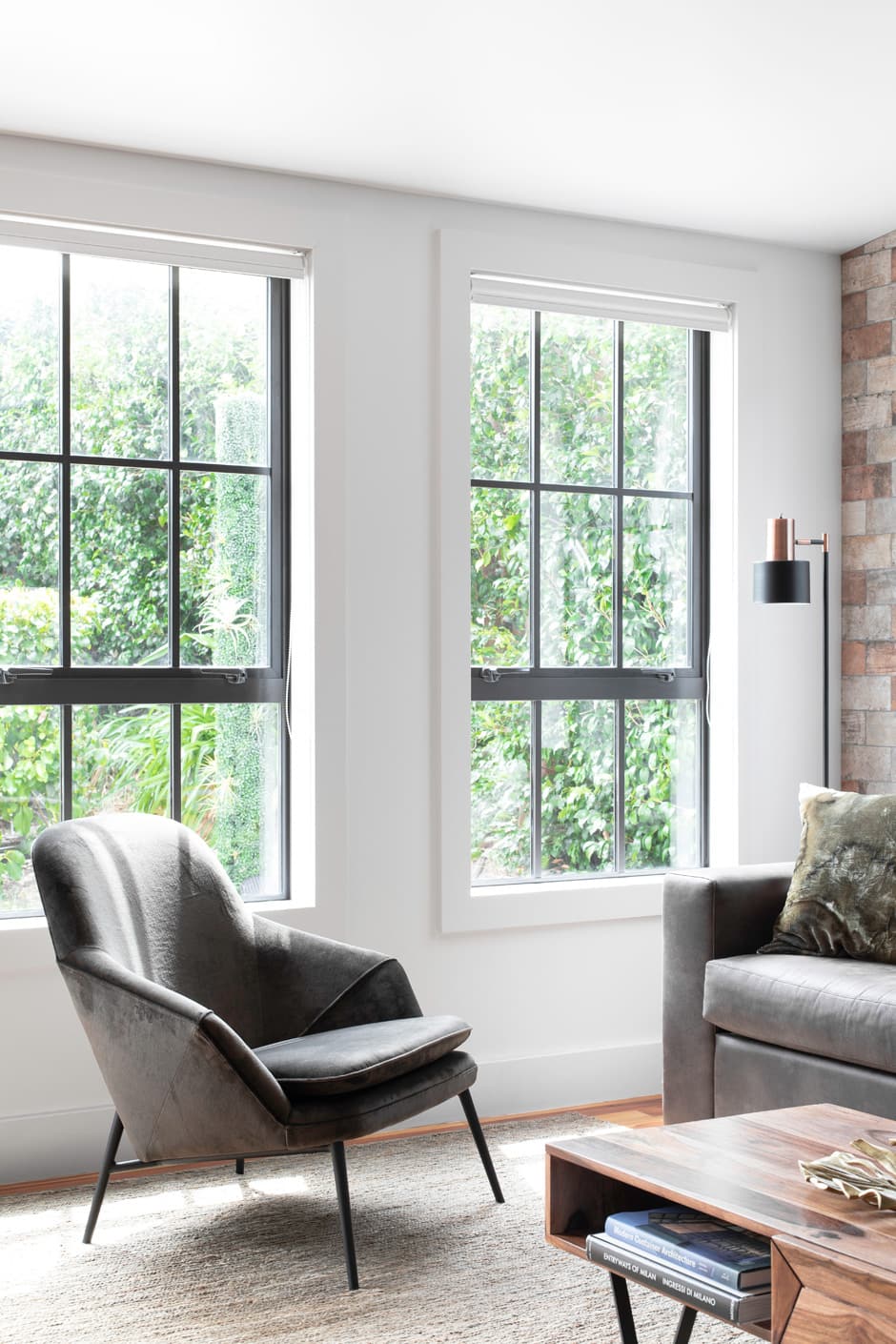
Peta’s pleased with how the studio functions, but what she enjoys most is the way the aesthetic is such a surprise inside the home’s typical white weatherboard shell. The way the light bounces up into the ceiling to achieve a sense of spaciousness, then off the chocolatey walls and bronzed mirrors in a sophisticated turn, is artistry in action. Now, if the occupants would only free their suitcases from their hidden perch and head off on their adventures, she might be able to move in for a spell.
Words Claire McCall
Photography Kirsty Dawn

