A mandarin and kiwifruit orchard in Te Puna, a rural enclave northwest of Tauranga, may have delivered the good life a couple whose children have recently left the nest hoped for, but inside, their country home was feeling a bit blah. Built in 2003, the three-bedroom house had attractive, tumbled-brick cladding and the scale was generous, so its owners, Nat and Andy, saw the flight of their fledglings as an opportunity to breathe fresh style into their surrounds. What started as an idea to update the kitchen and bathrooms grew and grew, until interior designer Kathrine McDonald was charged with giving almost every space a contemporary makeover — right down to the furnishings and the art.

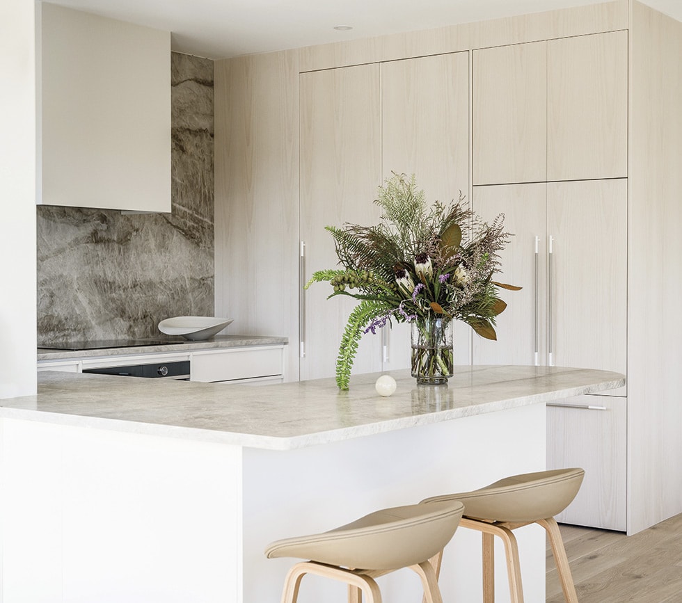

“I first met Nat on Melbourne Cup day in 2020,” recalls Kathrine. The glamour of that event paled into insignificance at the excitement of taking on this project. Working closely with Nat, she began the quest to fast-forward the interiors by spatially planning the kitchen.
“The layout needed to be reworked,” she explains. “We blocked off a door that led to the garden, which gave us the flexibility to create a U-shaped design, then we installed a tall bank of cabinetry along that wall.”
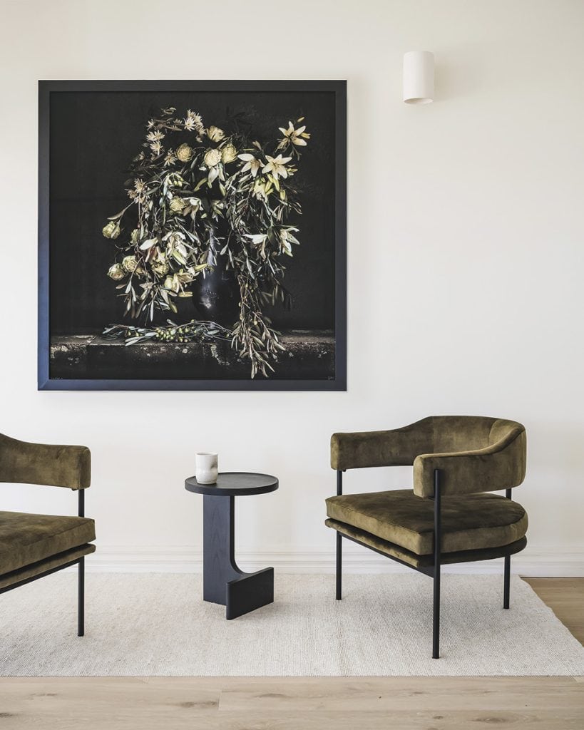
Tones of caramel and soft grey bring lightness to the scheme: it’s modern but with a sensitive side. “Nat is all about warm shades — she doesn’t like cold whites,” says Kathrine. “She also loves beautiful things.”
The pair chose materials that would segue with the somewhat traditional architecture of the home. Knotted oak floors and copper tapware are a nod to that. Pattern plays a worthy supporting role. The Taj Mahal granite splashback and benchtop is pretty and painterly. “Instead of a linear overhang, we rounded off the edge of the bench to bring in more softness,” says Kathrine. A washed finish on the pale timber cabinetry allows the natural grain to shine, and long handles wrapped in grey leather are a tactile surprise.
Now when Nat stands at the kitchen bench, there’s a much better connection to the patio and rural backdrop. “We hinged the windows right back and out, so it gives the appearance that the benchtop is running all the way to the exterior,” explains Kathrine.


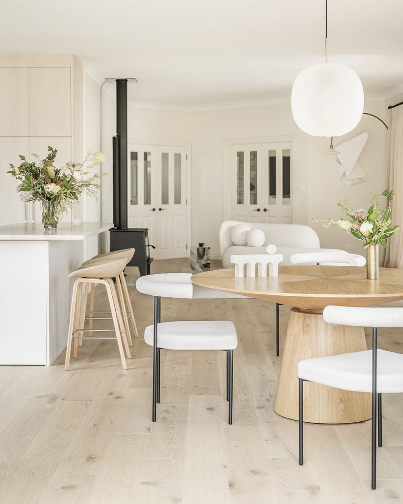
In the open-plan dining and living room alongside the kitchen, a curvaceous theme is evident, with circles rather than straight lines grabbing the spotlight. “The existing dining space had a long, rectangular table, but I wanted to reference a shape that spoke to the curve of the benchtop,” says Kathrine. Not only does the circular American oak table do this, but it also sets up a gaggle of conversation, picked up by dining chairs with a gentle hug of a backrest, a globular Japanese-style pendant, a sensuous bouclé sofa and ball-shaped scatter cushions. The wood-burner fireplace could look incongruous amid these furnishings, but it manages to tie into the black steel legs of the dining chairs, and no self-respecting country house would be complete without one.
Achieving a sense of cohesion is central to Kathrine’s design philosophy. Initially, she keyed into the Spanish-white tones of the existing louvred shutters and plush curtains. Once the living room was complete, carrying this through into the bedrooms and bathrooms was a given.


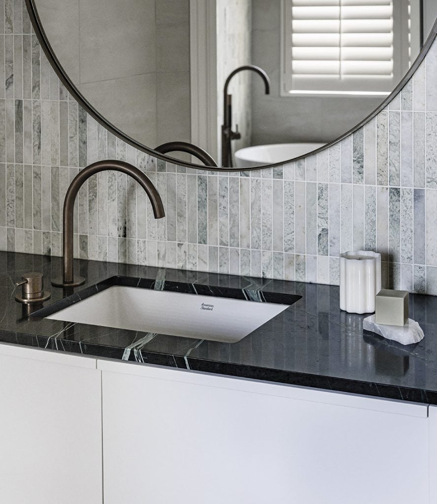
The layout of the main ensuite again needed a spatial tweak to make it more functional; as Kathrine says, “A square footprint is not as easy to work with as a rectangular one.” Now that there’s a walk-in shower with niches on both sides to increase storage, mornings are a breeze and side-by-side basins mean the couple can be individual… together. The timber vanity unit reflects the material used for the kitchen cabinetry and a rippled feature wall of fluted tiles elevates the tranquil ambience. Kathrine says she likes to tile every surface — “Tile the whole lot if possible!” — and here the same tiles on the walls and floor evoke a luxe mood.
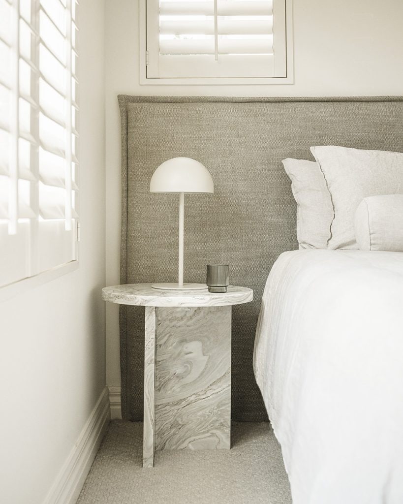
The green-grey tones of these large-format tiles in turn transfer to the main bedroom, where a headboard that stretches the width of the wall and allows the space to feel bigger and less cluttered. Going for a horizontal form rather than a vertical one in this case has made for a more relaxing room. “And I quite like the way the headboard frames the bedside table as well,” says Kathrine.

Having special pieces custom-made in New Zealand is integral to Kathrine’s process. Supporting Kiwi design is a priority. Fortunately, in Nat and Andy, she had complete buy in. The loving-it-local flavour begins in the entrance hall, where a chandelier designed by Snelling Studio is a sculptural starting shot. It continues beyond a set of French doors in a reading zone, where a striking Paula Petherick photograph is tonally in tune with the interior palette.
“I love the way this is quite a deconstructed piece — not too perfect,” says Kathrine. “Sometimes Paula uses 32 shots to create the layers in her artworks.”
Similar to the artist, Kathrine builds up her interiors layer by layer — and deems Nat and Andy the ideal clients for their willingness to evolve ideas and jump on board for the ride. Now that everything has come together in this renovation, it was evidently well worth it. For these homeowners, the good life on the orchard just got even better.
Words Claire McCall
Photography Jay Drew

