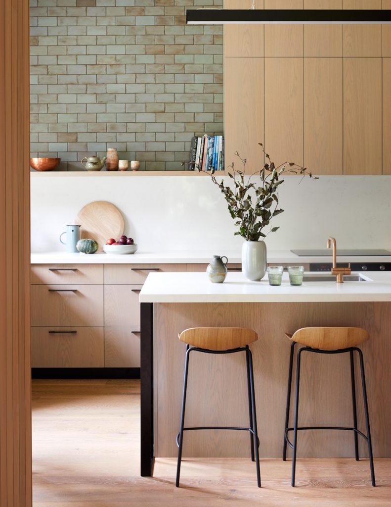
There’s so much more to this home than meets the eye — come inside as we discover its secrets.
Estelle Martin loves how different her Point Wells home is to the others around here. “Neighbours call it the Mystery House because it doesn’t reveal itself from the street,” she says. “There’s always a ‘Wow’ when I show people around.”
This exceptional home was one of the first to be built in a new subdivision in the area an hour north of Auckland that Estelle and her family have lived and vacationed in for more than 25 years. Its design was a collaboration between mother and son — Estelle and her architect offspring Antony, director of Melbourne’s MRTN Architects. Some say you should never work with family, but the process was a treat for them both.

“Antony came over from Melbourne every four to six weeks during the build, so I really enjoyed spending that time with him and watching him doing what he’s good at,” says Estelle.
Ditto, says Antony. “Working on the house together was a wonderful learning experience. Obviously I was very aware of my mother as a person, but to see her as a client and grow into that, and see the pleasure she received from the construction process, was lovely. I’m thrilled that she loves living here.”
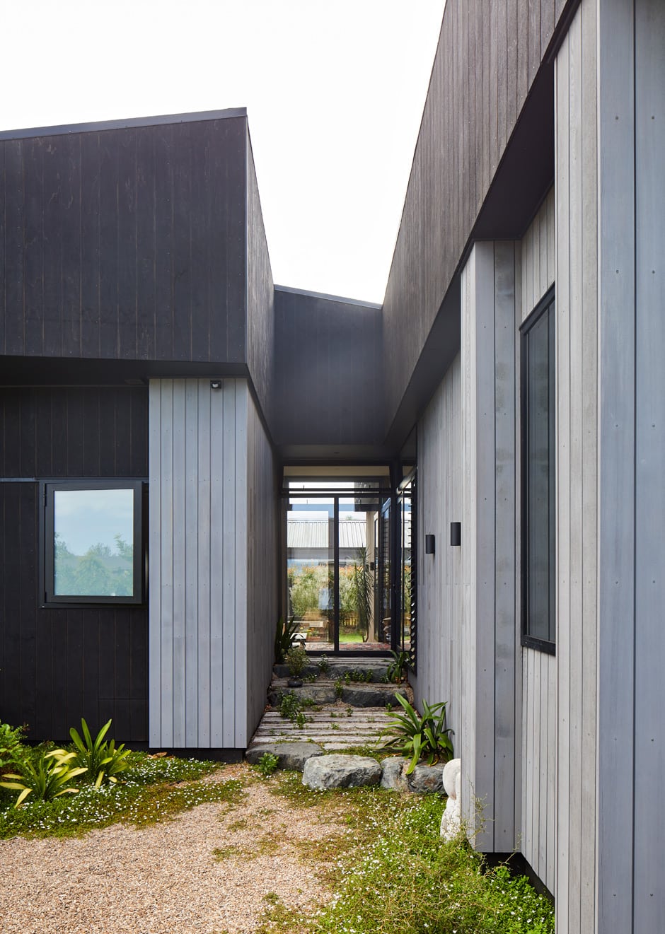
Antony’s work is known for its material-driven approach, and here he’s expertly used shadow as a design material. “A significant element is the heavy overhanging roof,” he says. “There’s an obvious reason for this — to keep water away from the house — but I also love its calming and protective nature, which is very important when designing for your mother. The dark extended eaves embrace the house under shadow and accentuate the surrounding greenery.”
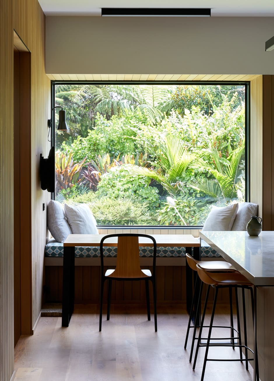
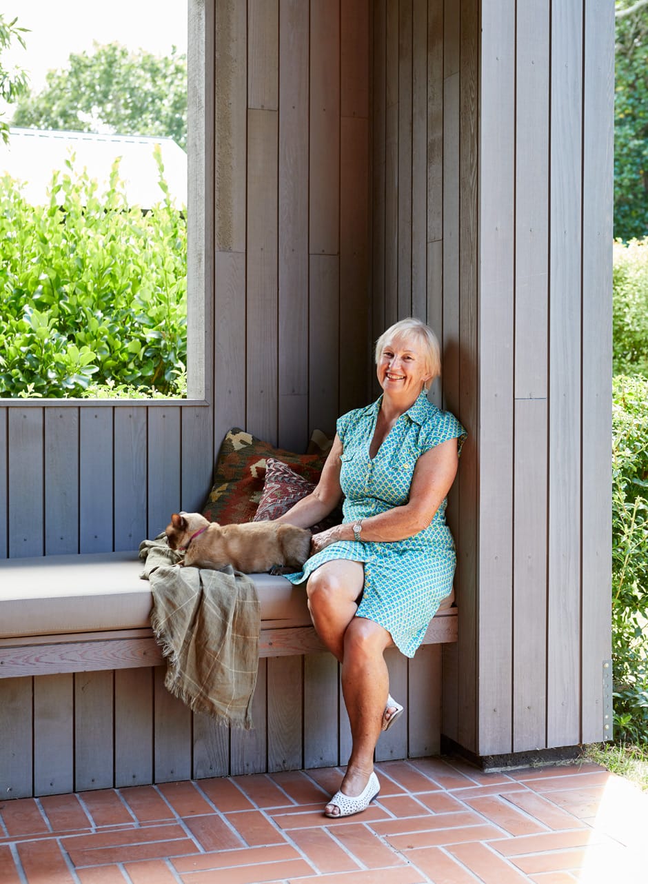
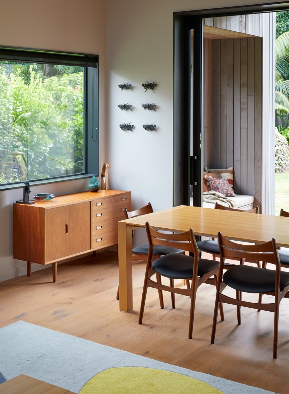
Antony’s lifelong experience of the climate here was another prime driver of the architecture. “I was well aware of the importance of cross ventilation, and the need to shelter from the region’s heavy downpours while still being open to the outside,” he says. “We were also conscious about providing various locations around the house where you could be outdoors yet out of the wind, which often changes direction over the course of the day. We addressed this through a complexity in the perimeter of the plan. By creating a lot of movement at the edge, we were able to provide places of refuge and screened views from inside. These nooks and crannies also allowed us to bring the landscape into the house. We wanted Estelle to lose sight of the fact she’s in a subdivision and rather feel like she’s located on an island of green.”
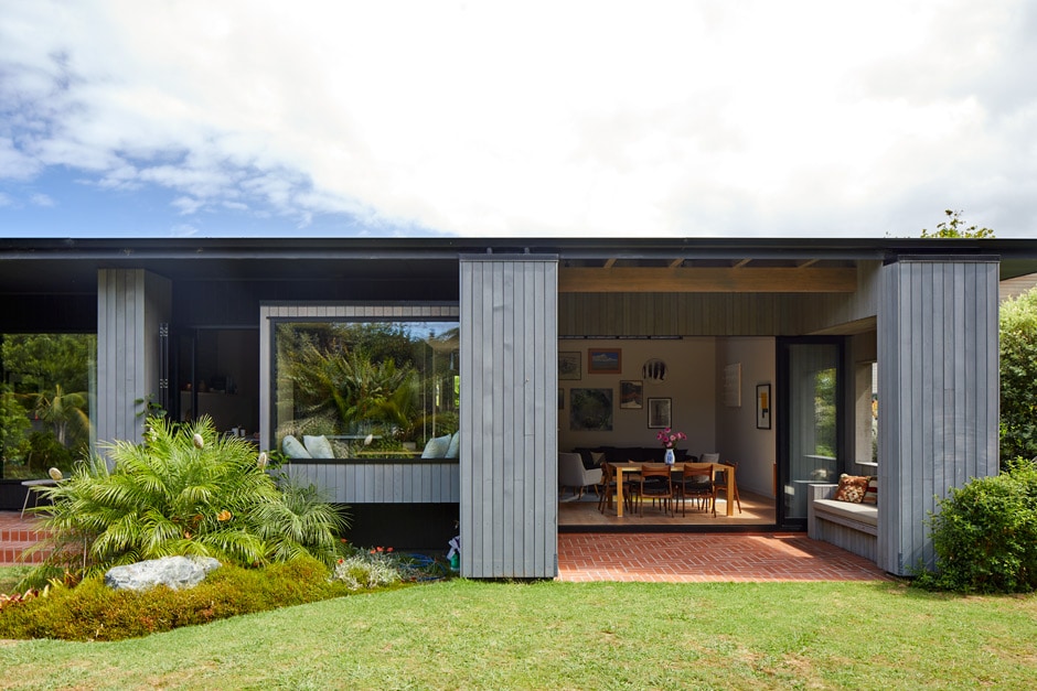
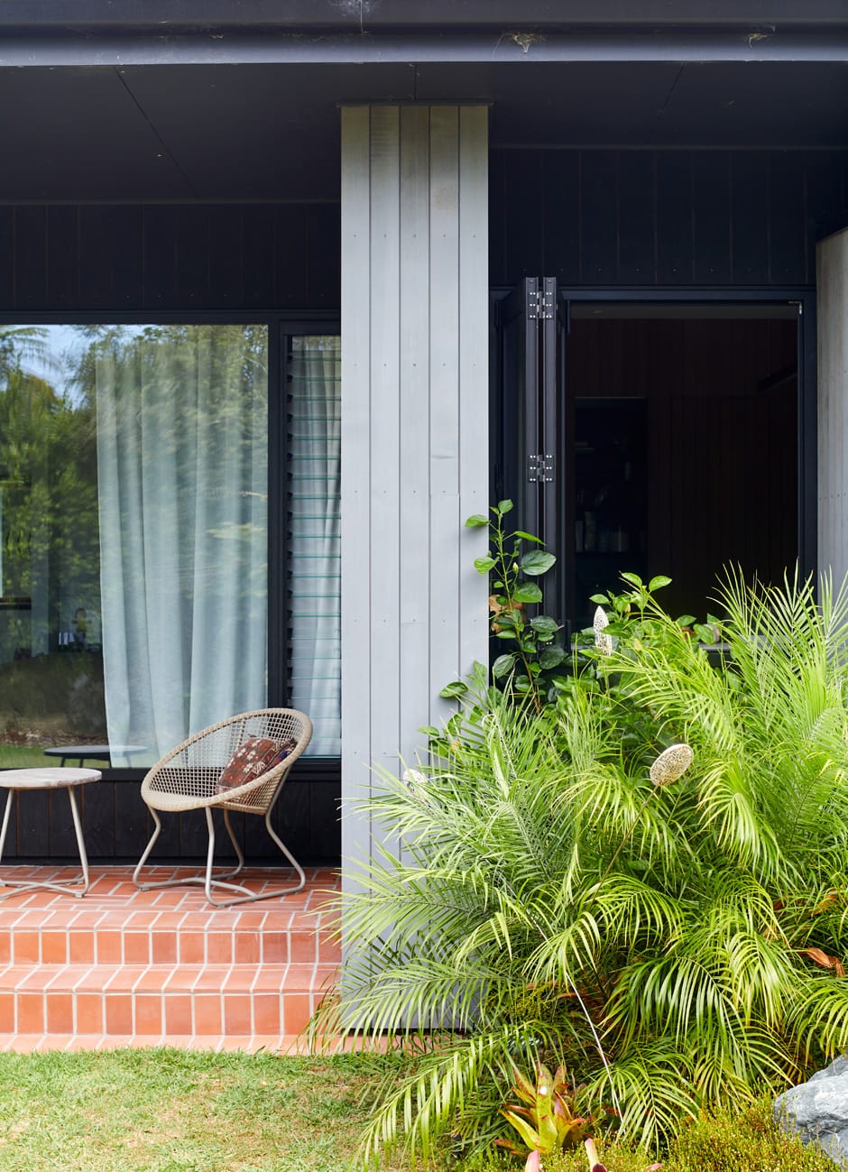
A cast-in-place concrete wall screens the home’s entry, with cedar framing the composition on each side. This exterior cladding continues to become the interior wall lining, complemented by locally made glazed tiles — part of a pared-back colour palette (with differing textures for interest) that doesn’t compete with Estelle’s art collection and ensures the garden views remain an emphasis. The interior’s split-gable form divides the floor plan into two wings connected by a glazed link, with Estelle’s living quarters and office at one end and a guest wing at the other; when it’s not in use, Estelle can shut off this part of the house completely. A glass hallway runs the length of the dwelling, stepping down towards the back wall, which opens to the north-facing garden.
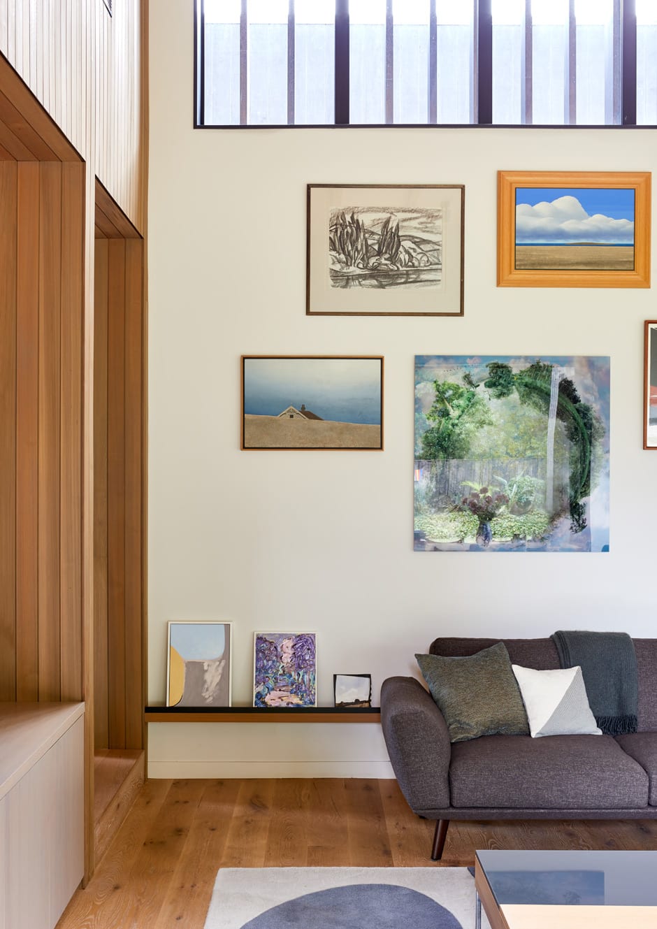

“The scale of the house is fascinating,” says Antony. “It appears relatively small, but keeps opening up as you move through it. By the time you’re in the garden looking back, it’s hard to believe it’s the same home you saw from the street.”
“There’s a lot of added interest that doesn’t reveal itself immediately,” says Estelle. “For example, the house has three different ceiling heights and the hallway has several different widths. The bottom of the hall cupboard extends to become a seat, and the bottom of the bathroom vanity extends to become a seat or shelf.
“The element of surprise and originality of the design make it my special place,” she says. “This project has taught me that it is possible to build a quality home within budget, that it can be fun and rewarding, and that your children know a whole lot more than you think they do!”
Words Philippa Prentice
Photography Simon Wilson

