
Optimistic colours dominated at the 2024 Milan Furniture Fair — an idea that readily translates to our interiors here in Aotearoa.
In association with Dulux.

Davina Harper
COLOUR & DESIGN SPECIALIST FOR DULUX
How would you summarise the mood at the Milan Furniture Fair this year? I’d describe it as cautiously optimistic with key themes of sustainability and technology (AI) running throughout. Brands such as Missoni and Moooi, who were bold and colourful last year, were more subdued, featuring a range of neutrals with subtle patterning. This is likely a reflection of the economic and political uncertainty happening in the world right now. But, as always, it was a visual feast featuring the best in innovative and dynamic design from around the world.
Which shows did you find the most inspiring? This year, I found the apartments to be one of the most inspirational aspects of Milan Design Week. There were a number of brands that chose to show in residential-style apartments — Elle Décor, Artemest, Muuto, Cor and Dimorestudio to name a few. Seeing brands show their designs in spaces such as these allows you to experience how the designs come to life in a residential context alongside paint colours and styling.
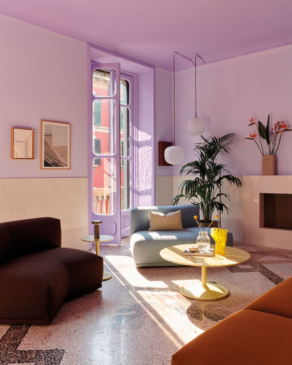
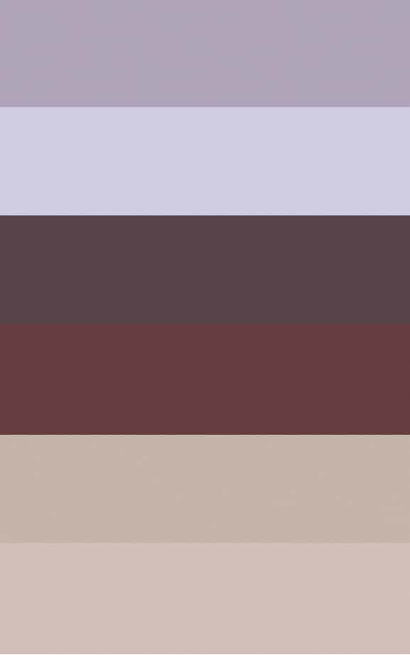
The Muuto Milan apartment was a highlight for me, featured inspiring colour combinations including fresh greens, soft lilac, dusty blues and enveloping browns. Lilac has been around for a few years now and hasn’t shown signs of disappearing — Dulux Hickeys Mistake and Rabbit Island are two shades that I particularly like.
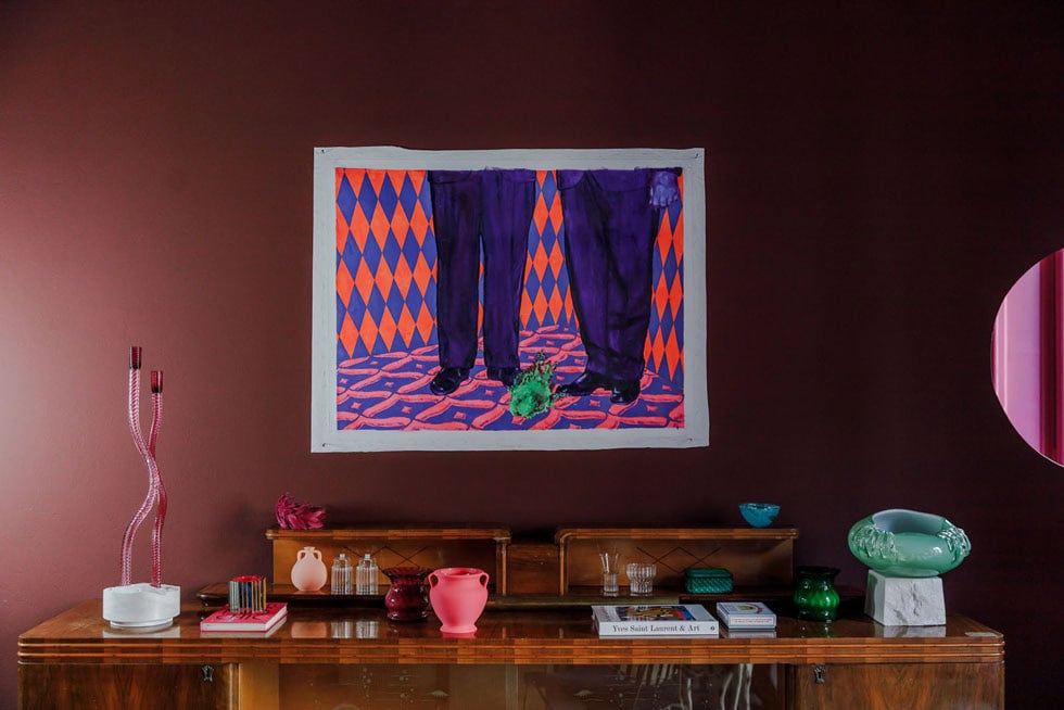
Which colours caught your eye as being ‘on the rise’? Maroon, berry, deep red and burgundy (and all the shades in between) — these were everywhere this year, lifting the mood and adding a decadent deliciousness to almost every exhibit. Dulux Martinborough and Gibbston Valley are two colours that encapsulate some of the beautiful burgundy hues on show.
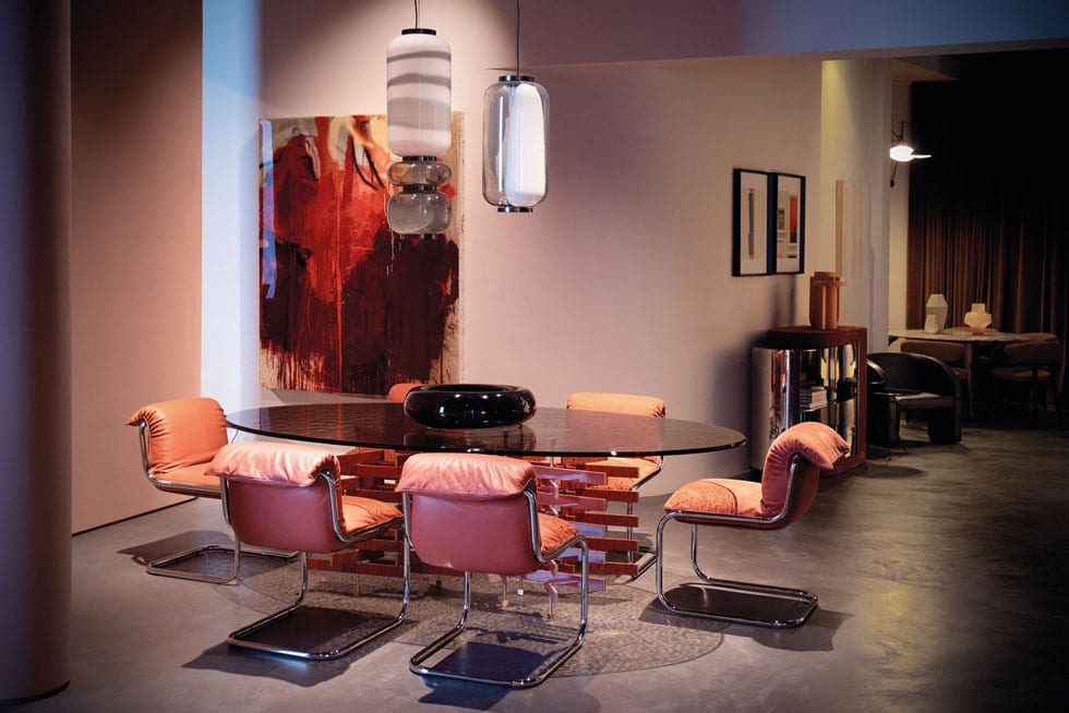
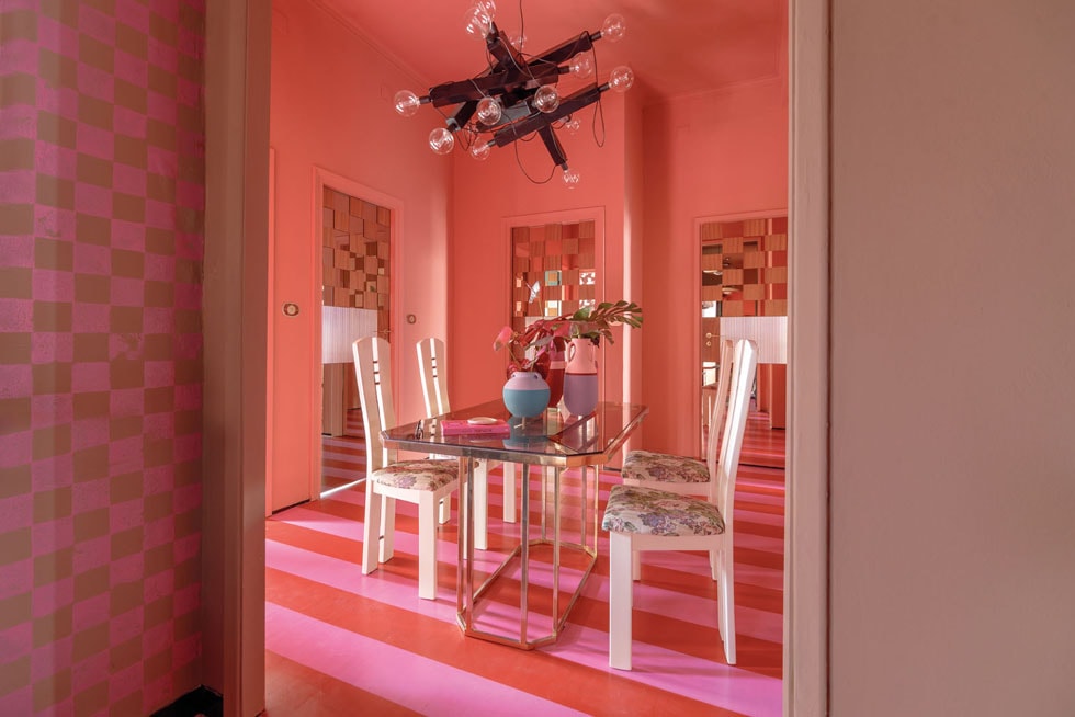
Less dramatic were the pinky-brown neutrals used as an all-over wall colour such as Dulux Punaromia and Trentham — similar to what we saw in a dining room created by Baxter Cinema. These lovely shades create a warm, cosy backdrop for a variety of spaces.
Which brands do you think did a particularly good job of capturing the mood of the moment? Muuto and their Milan apartment in the Brera District for its stunning combination of colours, artwork, furniture, and architecture. The Baxter, Zanotta, Kartell and Cassina showrooms were remarkable for their inspirational room sets and on-point colours, patterns and innovative colour combinations.
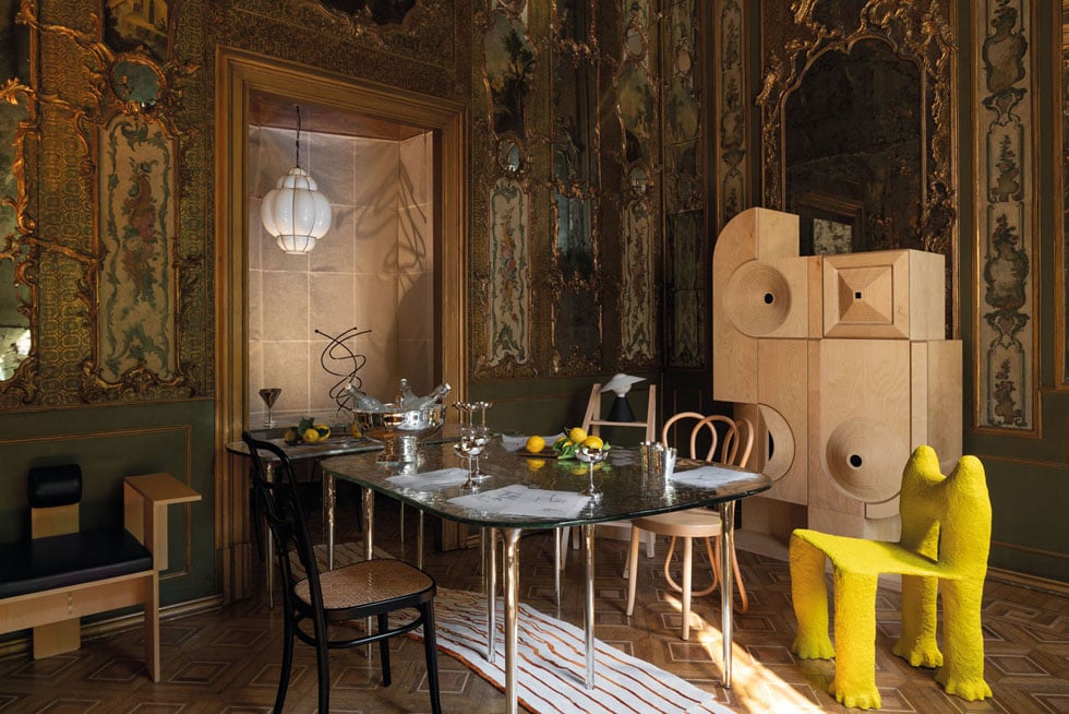
The Artemest L’Appartamento was an elegant ’30s Milanese apartment curated by six interior-design firms. Each studio designed a different room using Artemest products to celebrate the beauty and uniqueness of Italian design. I loved the dining room from VSHD Design for its seamless blend of modern and historic design.
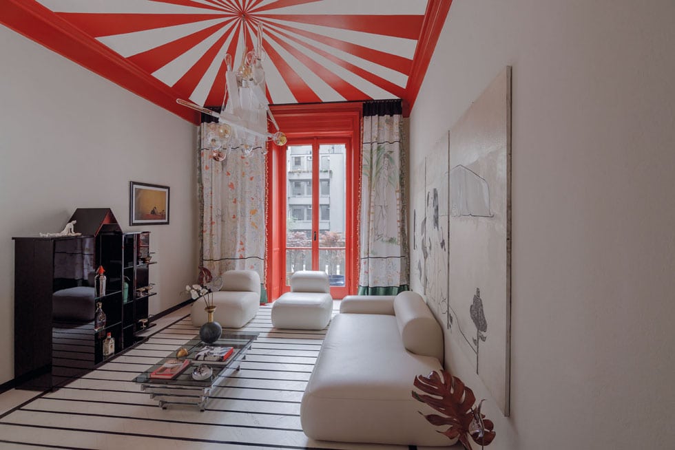
I also appreciated designer Maria Vittoria Paggini’s apartment for the sheer fun and joyful maximalism. Reflecting her vibrant and eclectic taste, small rooms featured clashing colours, spots, stripes and patterns applied across the floors and ceilings. This framework was then layered with unique art and objects.
What are your thoughts on following trends? How can people adopt them in their own homes without feeling like something might be out as quickly as it’s in? I always say that trends are extremely helpful to look to for design and colour inspiration, but only use them if you are drawn to, and genuinely like, the colours.
If you love something and enjoy living with it, then it doesn’t matter whether it’s on trend or not. Create a space that works for you and the way you will use it for years to come.
When exploring the latest colour trends, it’s a great idea to order large colour samples to place on your wall. Live with them for a few days and view them in different lights. That way, you’ll start to get a feel for how this colour might work in your space, and most importantly how it makes you feel. You can order up to four free large colour swatches from the Dulux website to help you decide on a colour.
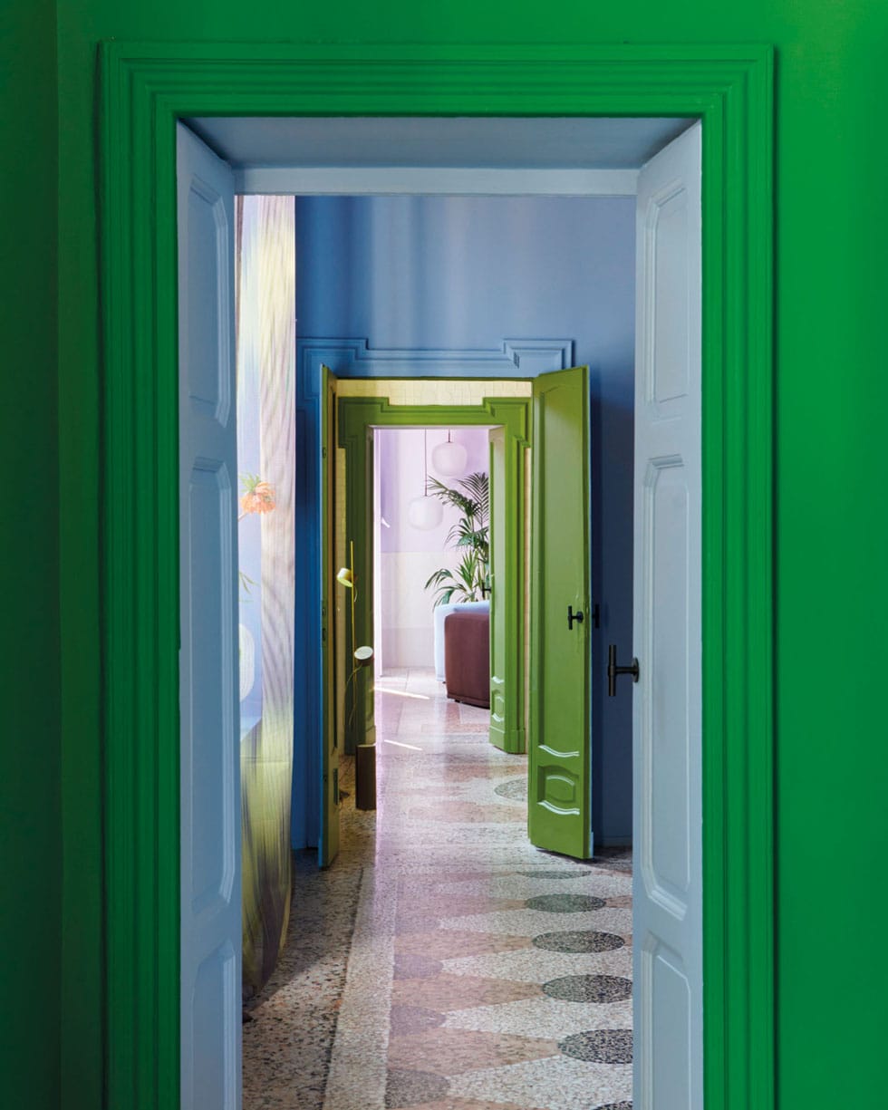
Any key takeaways that you would consider trying at your place? I’d certainly explore colour drenching, which involves painting everything the same colour including the walls, window frames, doors and even, in some cases, the ceiling. It can help create a beautifully cohesive look and even make smaller spaces seem larger. It’s a fantastic way to make an impact without being overly expensive. It also works in just about any style of home and, even though it’s something that we’re seeing a lot of now, is actually very timeless.
dulux.co.nz
Up the intensity
Inspired by the saturated scenes shared in Milan? Whether you’re colour drenching, or applying just a splash of colour, here’s how to make a start with burgundy.
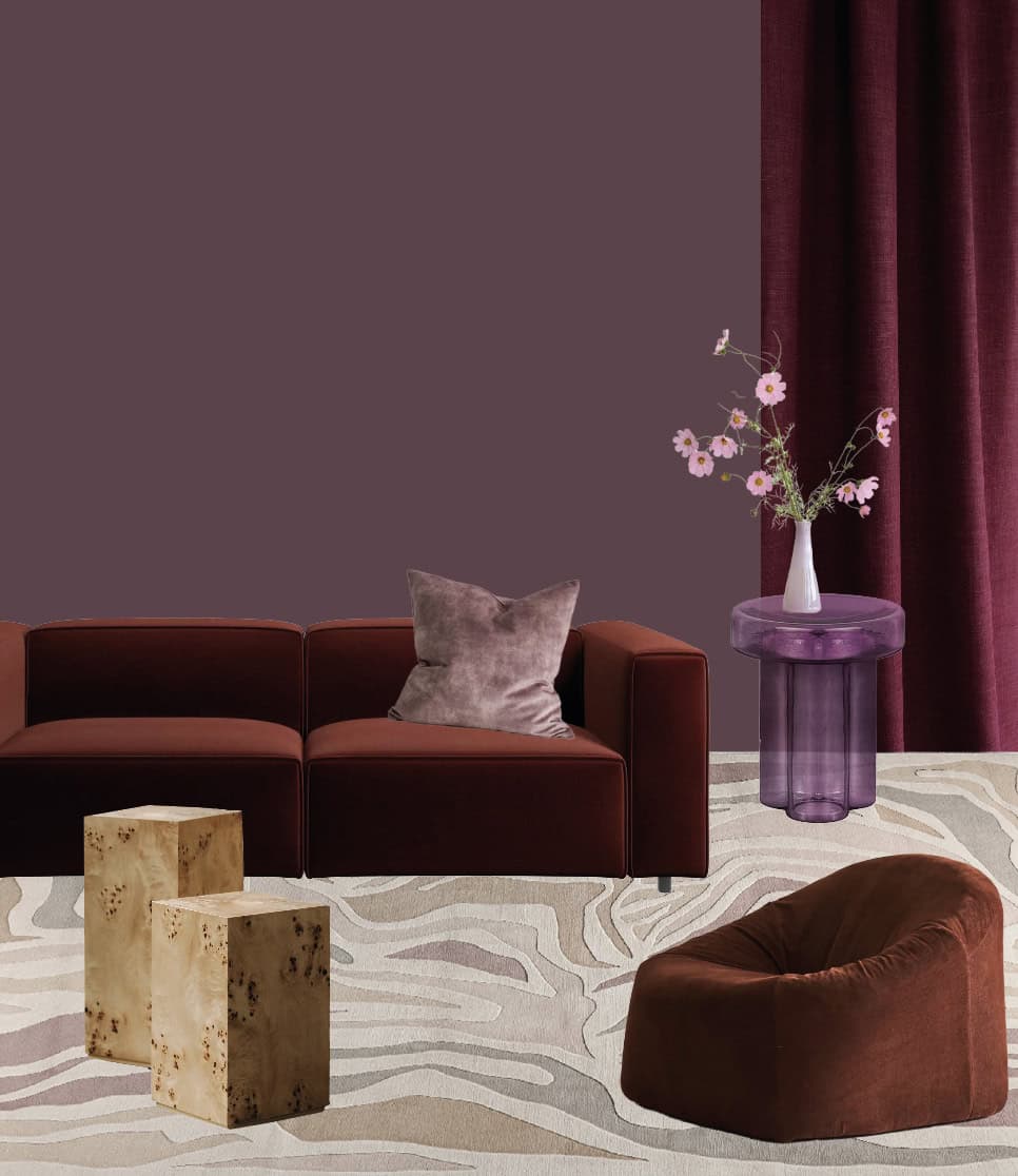
ABOVE, CLOCKWISE FROM LEFT Carmo sofa in dusty red velvet, $6319, boconcept.co.nz. Ava cushion in dusk, $99, weavehome.co.nz. Dulux Martinborough wall colour, dulux.co.nz. Soda side table, $2795, matisse.co.nz. Isadia x Monmouth Glass Studio vase, $180, isadia.co.nz. Tarantino linen fabric in merlot (used as curtain), $98/m, marthas.co.nz. Arbor armchair by Cameron Foggo for Natadora, $1909, dawsonandco.nz. Collage Rêverie blonde rug, from $12,650, designcentralnz.co.nz. Louvre plinths, from $590 each, nuageinteriors.co.nz.
Dulux is a registered trademark of DuluxGroup (Australia) Pty Ltd. Due to the limitations of the printing process, printed images and swatches may not represent the true colour. Always confirm your final colour choice with a Dulux Sample Pot.