
Tax isn’t typically particularly alluring, but the Best Design Award-winning fit-out of Tax Traders’ Tāmaki Makaurau/Auckland office sure is. We went behind the smoked mirrors to find out how Liv Patience and Lorraine O’Rourke of interior design studio Material Creative put such a fresh spin on things for a consultancy that’s doing things differently.
What kind of brief were you working to on this project, and how did you respond? Lorraine: Tax Traders’ brief aligned with our passion for creating humancentric interiors with elements of the unexpected. Because training and collaboration are key components of their DNA, an interactive space for this was top of their list, and other specific needs included varied meeting areas within the greater open-plan environment and a colourful entertainers’ kitchen. Founders Nicola and Josh Taylor wanted the interior to capture the essence of a boutique hotel — for it to be inspiring yet inviting. We began our process by looking at what a boutique hotel does. It celebrates the individual over the generic, and it was this ethos we wanted to foster to design spaces that would spark creativity and collaboration.
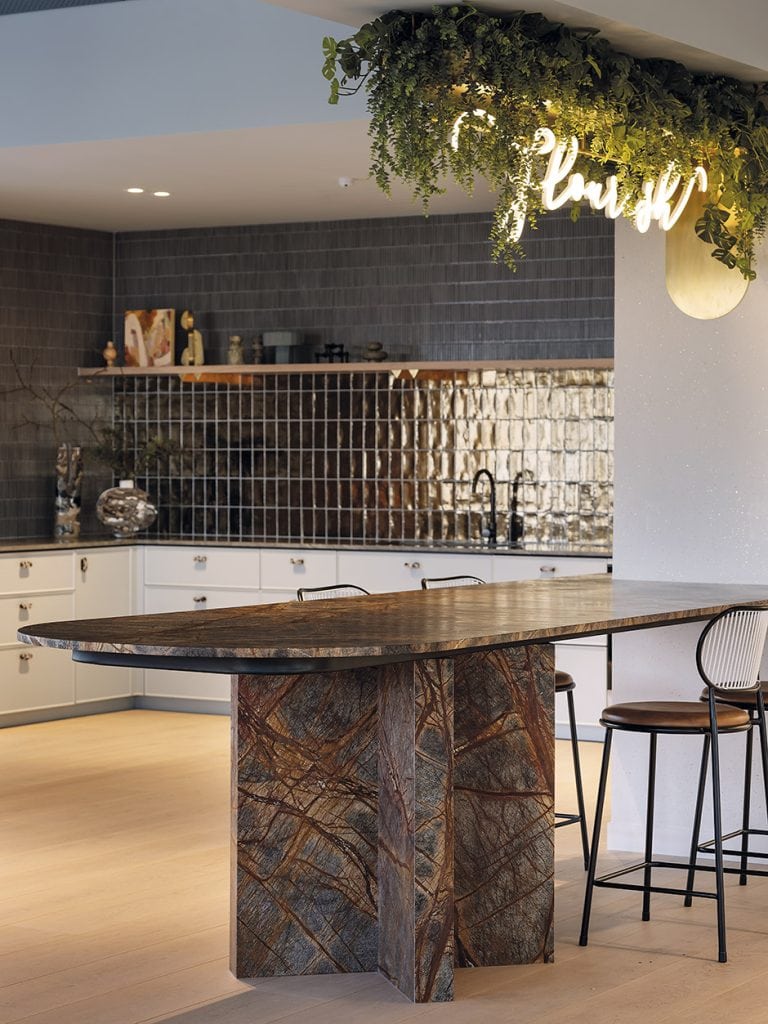
Liv: Our clients have a passion for hospitality in all senses of the word — community, food, shared spaces — so it’s essential that their office authentically embraces that. Given how important training and presentations are for Tax Traders, we looked at how their teams work and created the idea of a central market forum, a gathering place in which to exchange and test ideas. Traditionally, a marketplace is a large, open space that provides multi-use zones, and this concept informed our design.

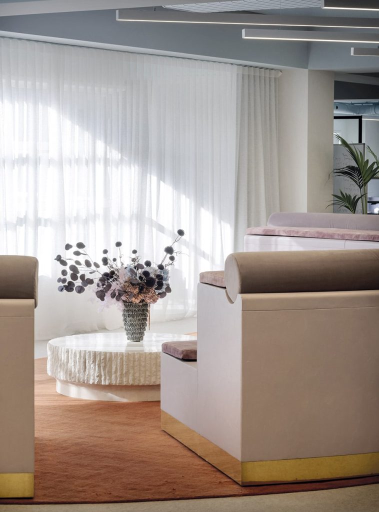
So walk us through the floorplan… Liv: We created a deeply evocative sense of arrival from the moment you step out of the lifts into the rich, textural palette of plaster, mirrors and plush carpet. You realise you’ve arrived somewhere pretty special, then from there, you move into the main open-plan office space.
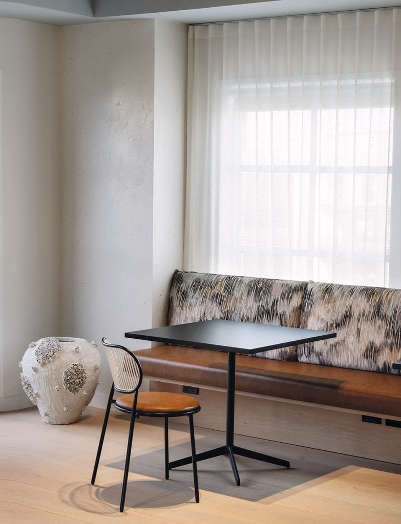
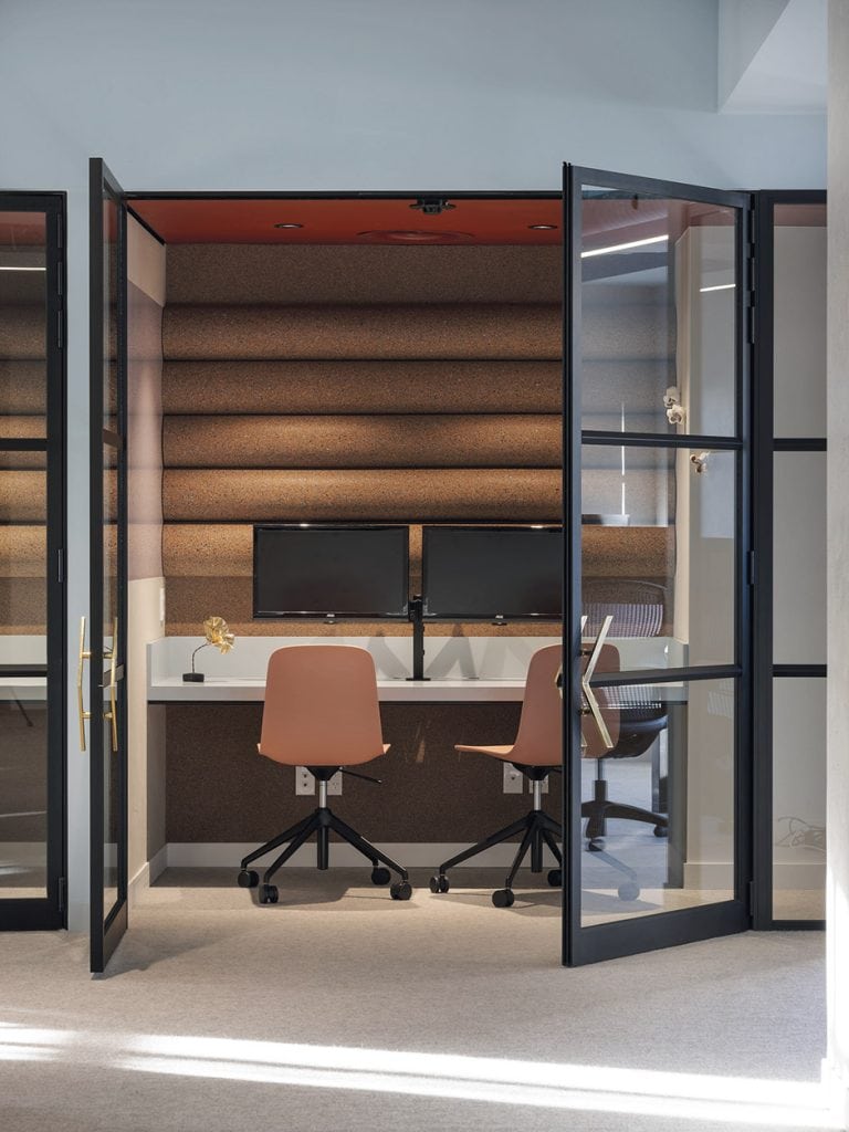
Lorraine: The open-plan layout pivots around the central forum, the ‘Circle’ — a tiered, plastered amphitheatre that sets the stage for regular training and casual meetings. Open-plan desking flanks either side of this. Three meeting rooms can expand and contract as needed with a series of acoustic, operable walls, and capsule ‘quiet rooms’ provide individual meeting spaces. The kitchen and dining areas are strategically placed to minimise noise within the open-plan zone.
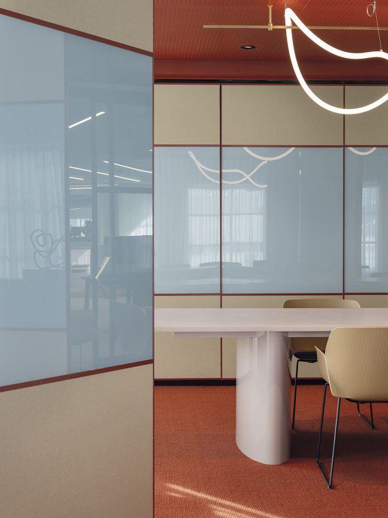
How did you land on this colour palette? Lorraine: Nicola and Josh’s brief was to use colour, so we leaned into it! A play of light and dark starts in the lift foyer, where the walls are lined with smoked mirror glass, plus a free-form LED installation. Moving through the office, we layered soft tones with deep, inky ones, and metallic brass and steel. We treated the meeting rooms to colour blocking in rust tones using Dulux paints and Nodi wool carpets.
Liv: We used colour very strategically. The beautiful, warm rusts and nudes in the meeting rooms — which can be converted into one large entertaining space — are at once calming, invigorating and exciting. Teamed with the ever-inspiring cornflower blue — a go-to hue in the Material Creative office — we felt this would draw people in and encourage them to stay.
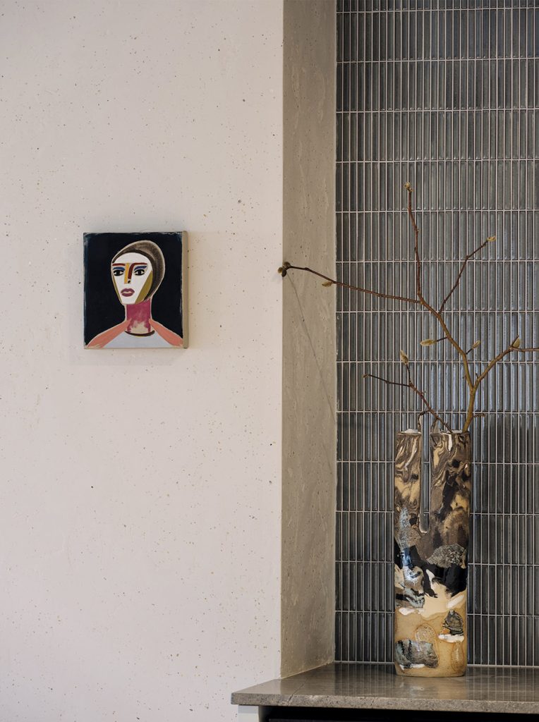
From there, we took those tones and pared them back, in the form of soft blues on the ceiling and cabinetry, the warm lilac plastered forum and the rust underfoot. We specified brass handles, a gold fleck through the off-white plastered columns, and then the culmination of these meeting in the central heart of the space — the communal kitchen and eatery.
There’s a really interesting play on light, both natural and artificial… Liv: Lighting is so essential to an office, but too much artificial light can leave you feeling wide-eyed and like a bit of a space cadet. Natural light is always so much nicer to be in, so we were very lucky with the expansive widows on three sides of this building. By adding in sheer curtains, bright rays are toned down and transformed into an soft, even, diffused glow. The diagonal ceiling lights provide sufficient task lighting, but were purposely positioned on the diagonal to reflect Tax Traders’ logo. The final layer was interesting, sculptural feature lighting, which really enhances that sense of joy and wonder.
Material Creative has a knack for moments of surprise and delight — what are some of your favourites here? Liv: The training forum is a favourite area for us — it’s just so unexpected within the open-plan space, and it’s proved to be a successful concept. The mix of colour and materiality within the boardrooms is also a highlight. Many people think offices need to be plain or stark in order to be productive, but we believe that through considered layering of colour and materials, the opposite can be true.
materialcreative.co.nz
Interview Alice Lines
Photography Sam Hartnett