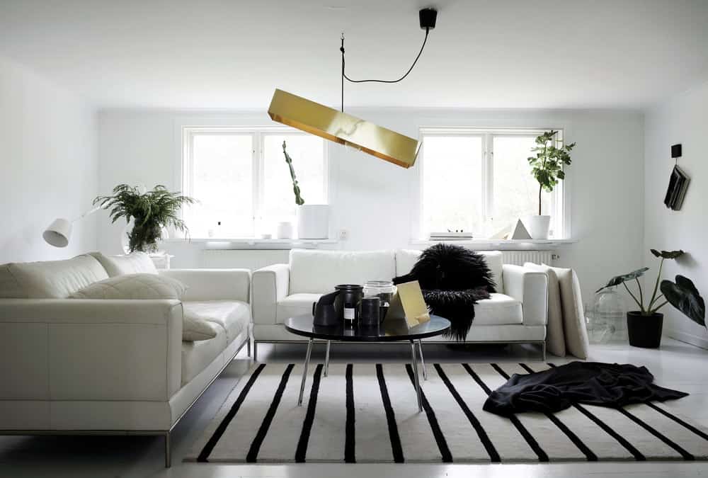
Choosing a monochrome interior is a minimalist stance, a refusal to get caught up in the drama of colour and all the associated complications of what goes with what. Here interior stylist Hilary Robertson shares her five basic rules for combining black, white and all the shades of grey in between…
In black and white
White loves black. Black loves white. Exploiting their symbiotic relationship builds an interior that is timeless, flexible, practical and liberating. An interior combining black and white is greatly affected by the balance of each. The white envelope approach (pale walls and floors) that wraps a space in light demands some defining characteristics if it is to be anything but a blurry snow scene. Mixing black furniture, black-and-white photography and a lamp or two adds punctuation, and a rug combining both colours will ground it all – because there’s an awkwardness to a room where objects float, leaving the eye with nowhere to rest.
Given that paint companies offer so many versions of white and black and a variety of finishes from matt to shiny, the monochromist has many choices to make: chalkboard paint is a softer black that works well with vintage and antique pieces, while gloss and lacquer suit crisper modern spaces. Brilliant whites have a more contemporary feel than softer shades, which sit well next to objects with some patina and age. Texture is all important in the monochrome interior, which relies on the tension created between hard, soft, rough and smooth to add character.

Grey matters
Welcome to the middle ground. The uninitiated might accuse the grey interior of being neither one thing nor the other, a cop-out for the undecided or those who prefer to play it safe. But as every Farrow & Ball paint chart aficionado can testify, there’s much more to grey than a politician’s flannel suit. Fashionably complex greys with names like Pigeon, Down Pipe or Plummett are far from a basic mix of black with white. The most successful execution of a grey-on-grey scheme combines several paint shades (with green, blue, brown or violet undertones) and naturally grey materials such as slate, zinc, steel or wood weathered to a shade of silver. Grey may be warm or cool, it plays nicely with other colours, tones down brighter shades and illuminates softer ones; it is calming and restful and, when used judiciously, it is far from boring. Dutch master colourist Axel Vervoordt uses the most sophisticated range of greys in the soothing interiors he designs: shades that veer towards green or brown, letting light, texture and scale operate as the decorative elements. In Sweden, 18th-century Gustavian interiors employed a pale blue-grey as both the backdrop and the shade used for painted furniture of the time – a device which made for some atmospheric interiors that made the most of the available light.

Dark looks
Black earned a bad reputation in the 1990s, when Gordon Gekko and his tribe were spending their bonuses on Le Corbusier chaises and Artemide lamps for their newly converted loft apartments. Black took its time to slink back, but here it is, reinvented for our times in a softer, more sensual incarnation. The dark materials emerging today are far more subtle, far more esoteric: ebony, Maarten Baas’s scorched wood, chalkboard paint, floors made from rubber or poured resin and paint colours with names like Railings and Old Mystic. A room painted in a subdued shade is imbued with a certain romance, inviting the eye to enjoy the dynamic contrast between the backdrop and the brighter things chosen as a foil.

In the mix
A monochrome background, be it white, grey or black, demands contrast, texture and some playful elements to temper its serious side. Choosing bleached wood, a nubbly jute rug, handwoven baskets or a lampshade knitted in wool takes an interior in a modern rustic direction, whereas adding geometric copper candlesticks, a severe side chair fashioned from sleek folded metal, industrial lighting and sculptural marble objects takes a lead from contemporary Scandinavian trends. Even in the most minimal interior, accessories are the pieces of the puzzle that conjure the narrative of the person living in the space. Consider stone, a coil of rope, cast concrete, gold, zinc, black-and-white postcards stuck onto the wall with paper tape, a collection of curvaceous olive wood cutting boards or a group of ceramic vessels.

Shades of pale
There are countless good reasons to choose white. So many, in fact, that I’m baffled by people who insist on asking if I don’t worry about it being cold, sterile, empty? No, no and no, I reply, quite the opposite. White is reflective, peaceful and restorative. It is the optimum choice for Scandinavians, who live in a harsh, chilly climate under leaden grey skies for much of the year. Their interiors are made for comfort not ostentation, but they have developed an extraordinary ability to create relaxed yet simultaneously sophisticated homes that put human life and its quotidian needs at the centre of design. They choose white because it maximises the daylight that they do have and because it serves as the perfect neutral, unobtrusive canvas for their furniture and decorative objects. White and its related shades of pale seem to enlarge a space. Not only do Scandinavians like to paint their walls white, they also are keen on cloaking floors in coats of heavier duty white floor paint or rubbing a liming paste into wooden boards so light bounces around from surface to surface. White isn’t tricky or self-conscious; it doesn’t dominate or demand attention, but simply allows you to focus on living your life, to lend your character to it.
Edited extract from Monochrome Home, by Hilary Robertson, photography by Pia Ulin, $49.99. Published by Ryland Peters & Small.
Words Hilary Robertson
Photography Pia Ulin


