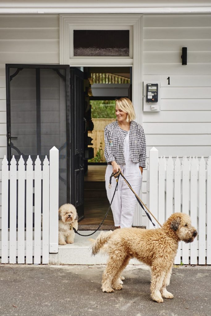
The bright spark behind this colourful interior played by her own rules.
There’s absolutely nothing ordinary about Alex McCabe’s Melbourne home. But what would you expect from the co-founder of vibrant bedding and homeware business Kip&Co? Two years ago, when the time came to renovate the place she and her partner Bobby Babb had called home for six years, she enlisted the expertise of architect Mike McManus of McManus Lew and builder Dav Ardlie of Ardlie Projects – but the interior was her domain…

Alex, did you purchase this house planning to renovate? Definitely. It had great flow and light, plus a decent backyard, which is unheard of in inner-city Melbourne; however, the interior was a patchwork of the original house, which was built somewhere around 1910, an ’80s extension and a ’90s renovation. It was liveable but freezing cold in winter, boiling hot in summer and not the beautiful sanctuary you want to come home to.
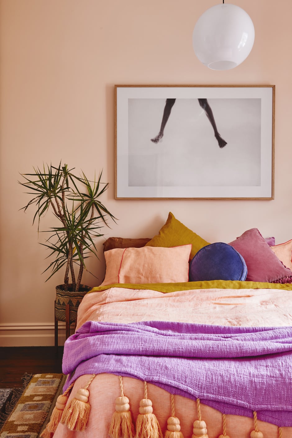
Did you have a clear idea of what you wanted to achieve? My design brief was relatively simple. I couldn’t bear another winter of going to bed fully dressed, so I wanted the house to be well insulated, and have lots of natural light and storage, two bedrooms and a bath.
In terms of the interior, it was all about creating unique moments. With the exception of some of the white goods, I chose every element, and suspect I drove everyone mad trying to accommodate my ideas, but it was worth it to have the house represent who I am and my sense of style. There were times when I thought some of my choices were a bit out there, but I love how it’s all come together.

So how did you go about it? The nice way to describe my approach is ‘organic’, but a more accurate description might be ‘haphazard’!
I bought the paint two years before we even had draft drawings, when Kip&Co did some work with Haymes Paint and I fell in love with a couple of their colours. And I stumbled on some other key pieces and then worked around them – like the quartz splashback in the kitchen, which we found at Melbourne’s Peraway Marble; we walked down aisles and aisles of pre-cut slabs in every colour imaginable, then right near the back, there it was, dusty and forgotten.
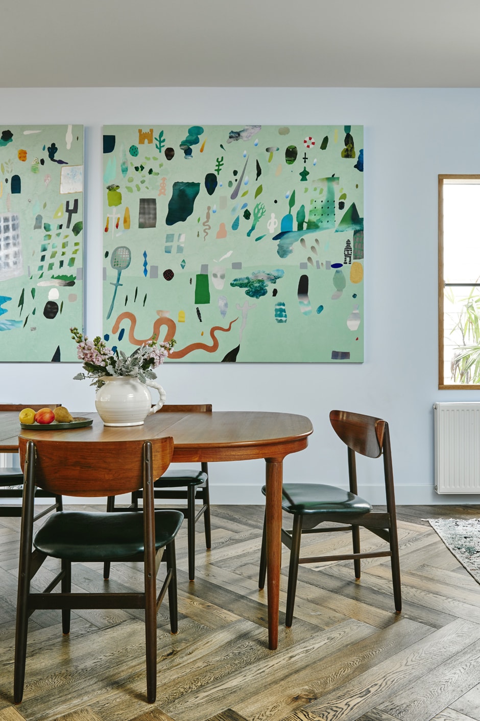
Bobby and I commissioned Australian artist Fred Fowler to paint the 5m artwork that takes up most of our living room, and he worked on it while the house was being built, so that was a bit of a gamble, and so was our pink concrete kitchen island. Our concreter Bill Rusto told me he doesn’t often do coloured concrete because there’s no guarantee that it’ll end up the colour you have in mind, as each batch is unique. Ours is quite different to what I pictured, but that was half the fun.
I’d seen the brass kitchen cabinets in another beautiful home and had been coveting them ever since, so I spent hours trying to find the same supplier to make sure ours were just as special. Bobby and I aged the brass ourselves after googling YouTube videos on our way to the supermarket to buy the tools to do it, so it was all a bit fly-by-the-seat-of-your-pants. The whole house is like that, but I like that it’s eclectic. I love every element and I think it all works well together.
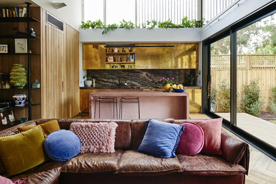

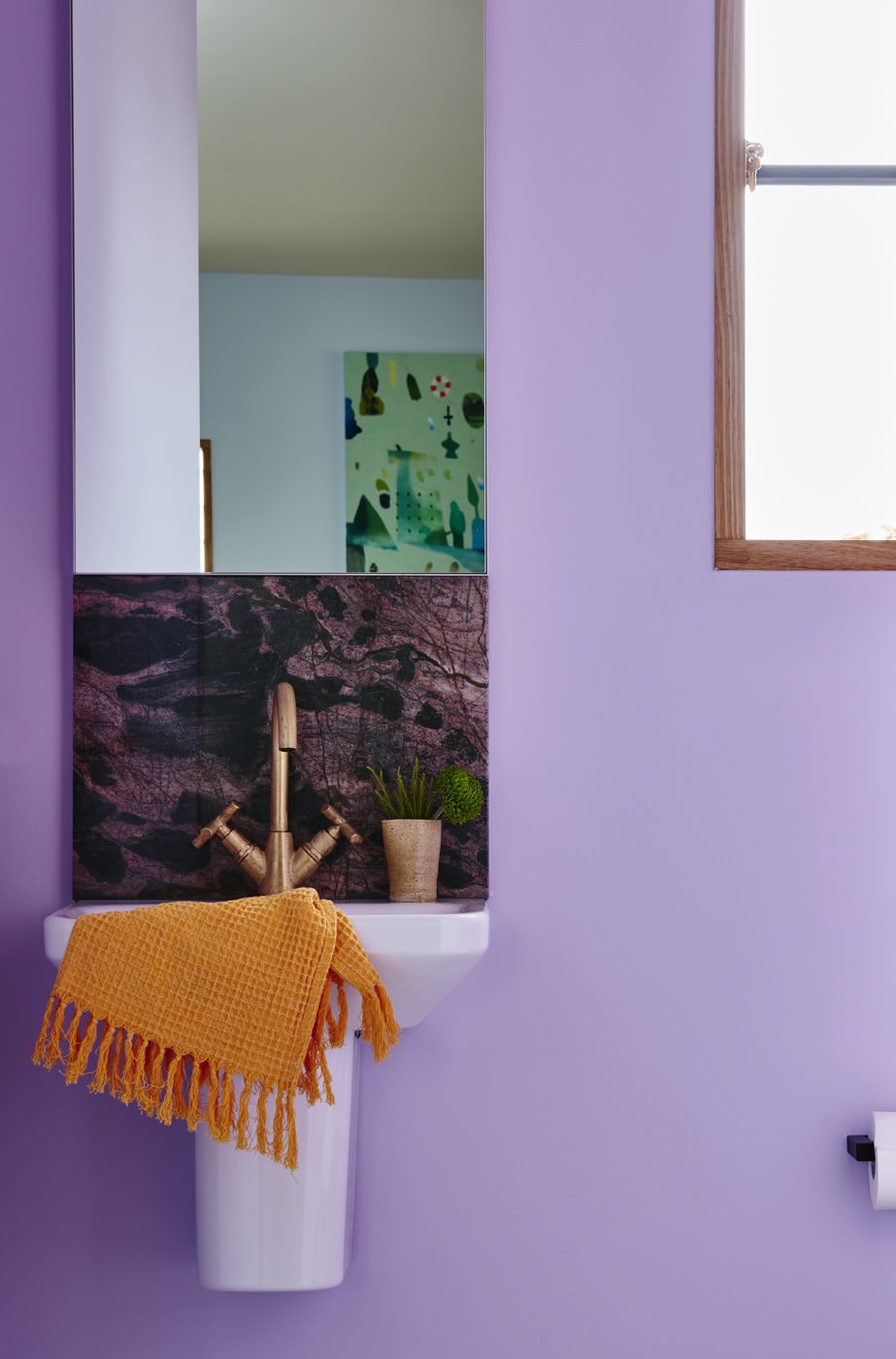
Kip&Co is known for its bold use of colour – how did you choose the palette for your own place? Colour is my life and I can’t bear to live without it. I’m into mixing and matching bold colours and patterns – just like we do at Kip&Co. There aren’t any white walls in this house. I originally left the walls in the powder room white because I didn’t think I’d notice the lack of colour given it’s the smallest room in the house, but it drove me bonkers, so I had the painters come back a couple of weeks later to paint them purple.
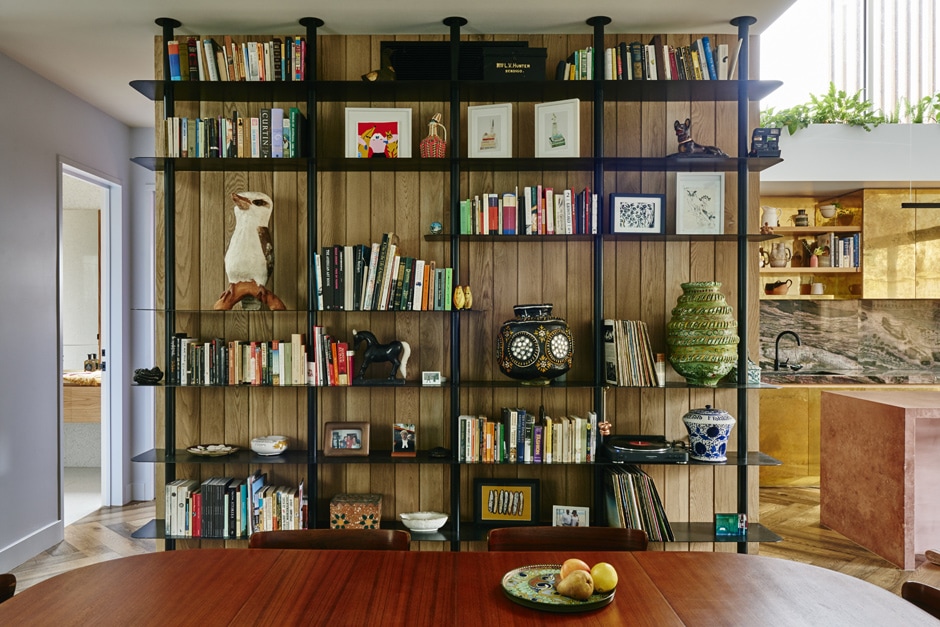
Is there a secret to creating a lasting interior look in our throwaway society? The older I get, the more selective I am about my purchases, and I’m also more conscious of the footprint my consumption creates.
It’s probably obvious, but choosing quality products that are built to endure is critical, and although that generally means paying a bit more, I think it makes you more grateful for the objects in your home.
When is this house at its best? At about 10am, the sun comes through the windows above the kitchen and creates a beautiful pool of light on the couch while throwing an amazing rainbow onto the wall. It’s always a magical little moment.
What are some of the everyday rituals you enjoy here? Most mornings, Bobby makes me the most amazing homemade chai, which I have in a huge MUD Australia mug. What a star.
What was the most satisfying thing about this renovation? I absolutely loved the whole thing. I really enjoyed learning about all the amazing trades out there and the art in each of them – it was a real education for me.
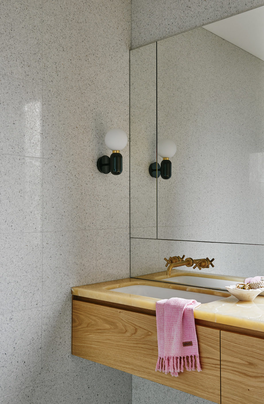
Which room are you the most pleased with? I particularly love the bathroom. The honey onyx benchtop is luminous and after decades of enduring grimy bathrooms, it’s so nice to have a space that feels so zen.
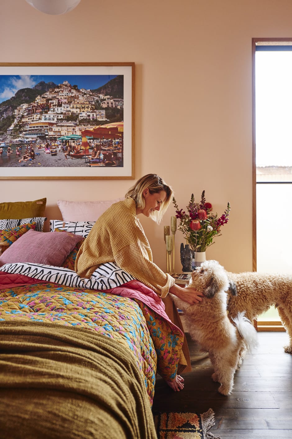
How have your family and friends responded to the design? I think everyone likes it! Quincy seems happy in her new home, and she’s the boss around here now.
Interview Alice Lines
Photography Nikole Ramsay

