After unexpectedly falling for their West Auckland property, the pair pooled their Strachan Group Architects and JR Hosking Carpenters & Co resources for enviable results.
One-year-old George Hosking may not be an architect like his mum or a builder like his dad, but he’s a hands-on judge of form-follows-function design. Now that he’s getting around a bit more, he can vouch for many elements in the Avondale, Auckland home he shares with his parents Maria and James: the built-in daybed in the dining area where he likes to snooze in the morning light; the low-silled window in the olds’ bedroom that means he can be busy in the garden and
still keep one eye on Mum; the way the winter sun warms up the concrete floor, keeping his toes toasty while he zooms his wooden crane up and down the corridor; and the custom-made mobile kitchen unit filled with pots and pans at just the right height to make a convenient play station.
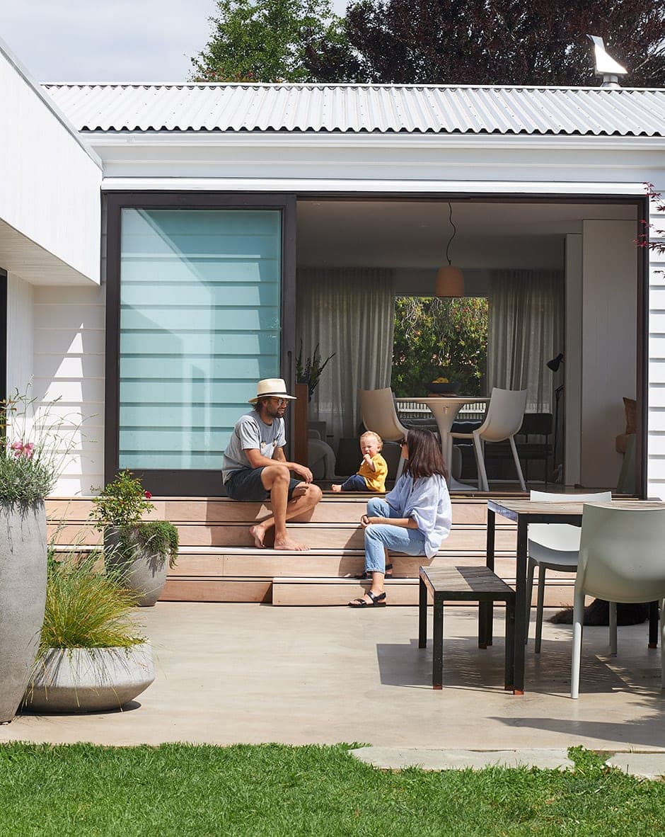
Yes, life is pretty good in the Hosking household, yet when the couple bought here five years ago, they considered it a temporary move. Maria, an associate at Strachan Group Architects, was working full-time and completing her Master’s thesis at night, so she put her complete trust in James to seek out a property they could afford, never even laying eyes on the 65m2 home before they settled by private sale. When she finally saw it, she was confronted with a cottage painted baby blue. It’d been moved onto the site in the 1970s and there was no flow between its spaces or connection to the generous backyard.

She was unfazed. “We thought we’d just do it up and sell,” she says. “We didn’t intend to stay.”
With Maria’s eye for spatial synchronicity and James’s resources (he owns building company JR Hosking Carpenters & Co), they had what could be called the best-laid plans. They didn’t count on falling for the charms of this area close to town, in a quiet street with a backdrop of mature trees. Within a year, six groups of friends had moved into the suburb. The renovations took on new meaning.
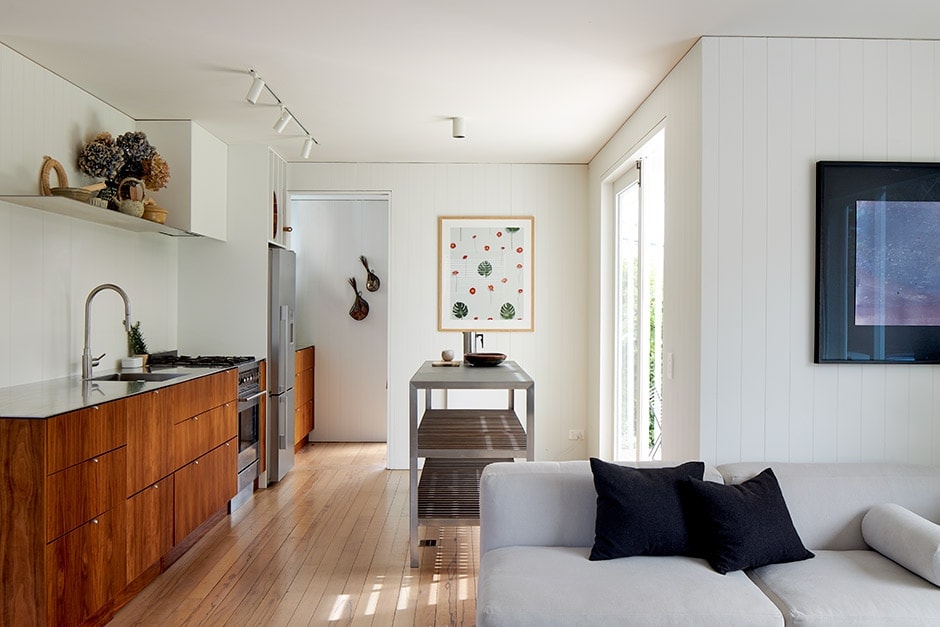
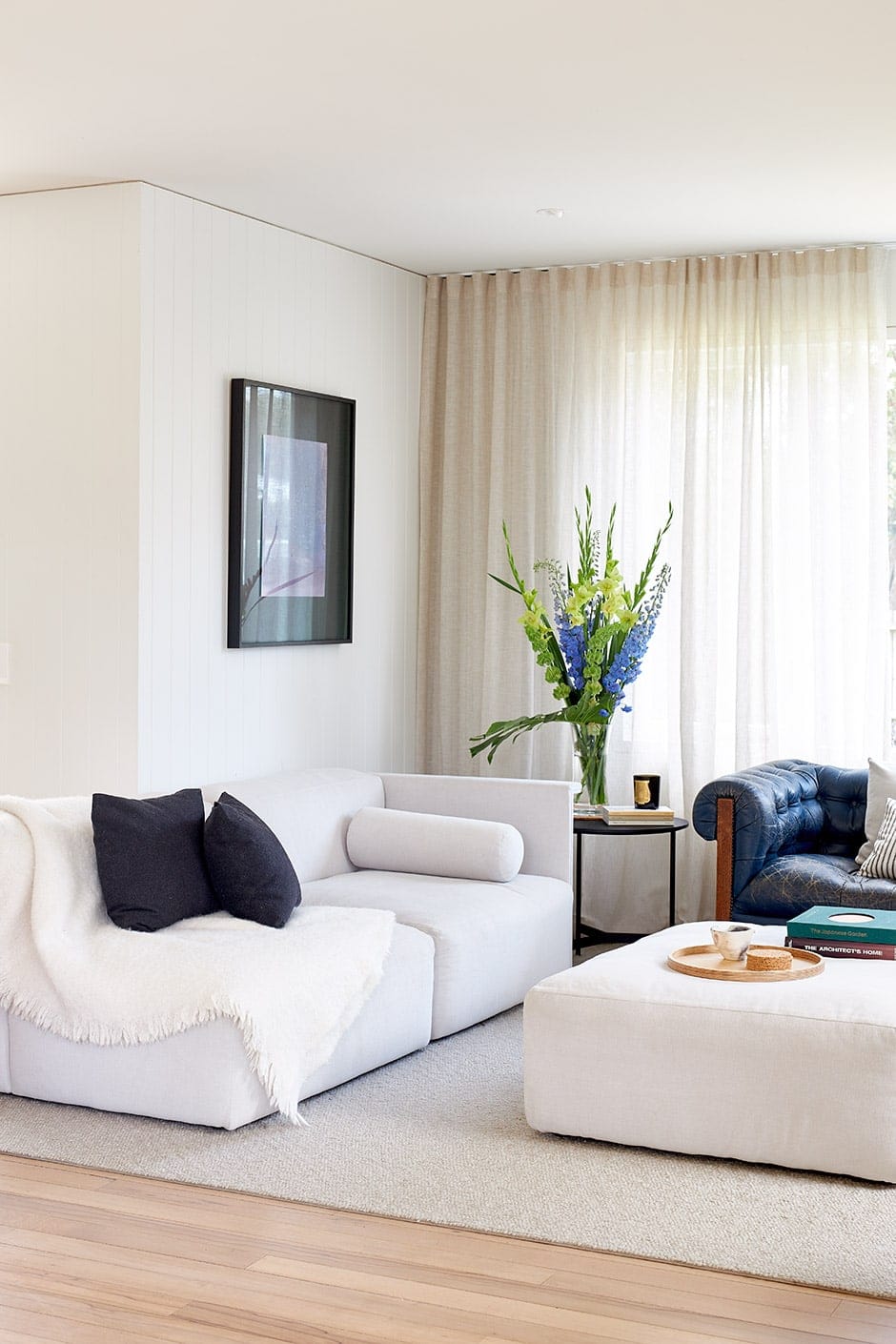
With James and some of his team on the job, they relocated for five months while the work took place. Walls were removed to achieve a visual link from the front deck, past the kitchen and centralised dining area to the rear courtyard, and the remaining walls were lined with grooved ply to give the unremarkable bones a characterful lift.

“We put negative detail top and bottom to make it more modern,” says Maria, whose design focus was also on creating that missing flow and crafting a bedroom wing. The bathroom and kitchen were kept in the same place to take advantage of the existing plumbing, and a toilet and hot water cupboard in a lean-to were transformed into a scullery off the new kitchen.
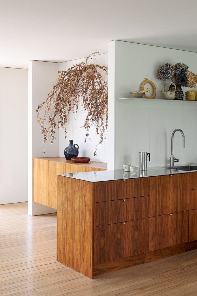
The couple invested for maximum impact while economising with their own labour and clever design choices. The kitchen is a case in point, with its richly coloured American walnut cabinet fronts and slender stainless steel top. “I drew up the design and had the timber CNC cut, then James and I put it together and glued and clamped the benchtop,” says Maria.

Because there was no space for an island, a custom-made mobile unit is a flexible stand-in. The large-format slate tiles that form its counter were another huge saving. “They were an eighth of the cost of a single slab of slate,” says Maria. The cedar slats used for the shelving were repurposed offcuts from a pergola the couple built over the front deck.
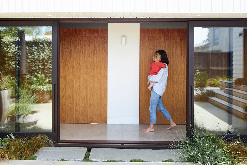
The bedroom-wing extension is a long, skinny rectangle that tucks in beneath the roofline at a right angle to the original home. It effectively doubles the footprint and wraps the courtyard garden into the architecture. A glazed corridor running its length allows a connection to the outdoors rain or shine. On summer days, American walnut sliders with a pelmet detail close over the doorways to the bedrooms so they become like a furniture cabinet within the form; in winter, glass doors maintain the outlook to the garden while passive solar gain warms up the sleep spaces.
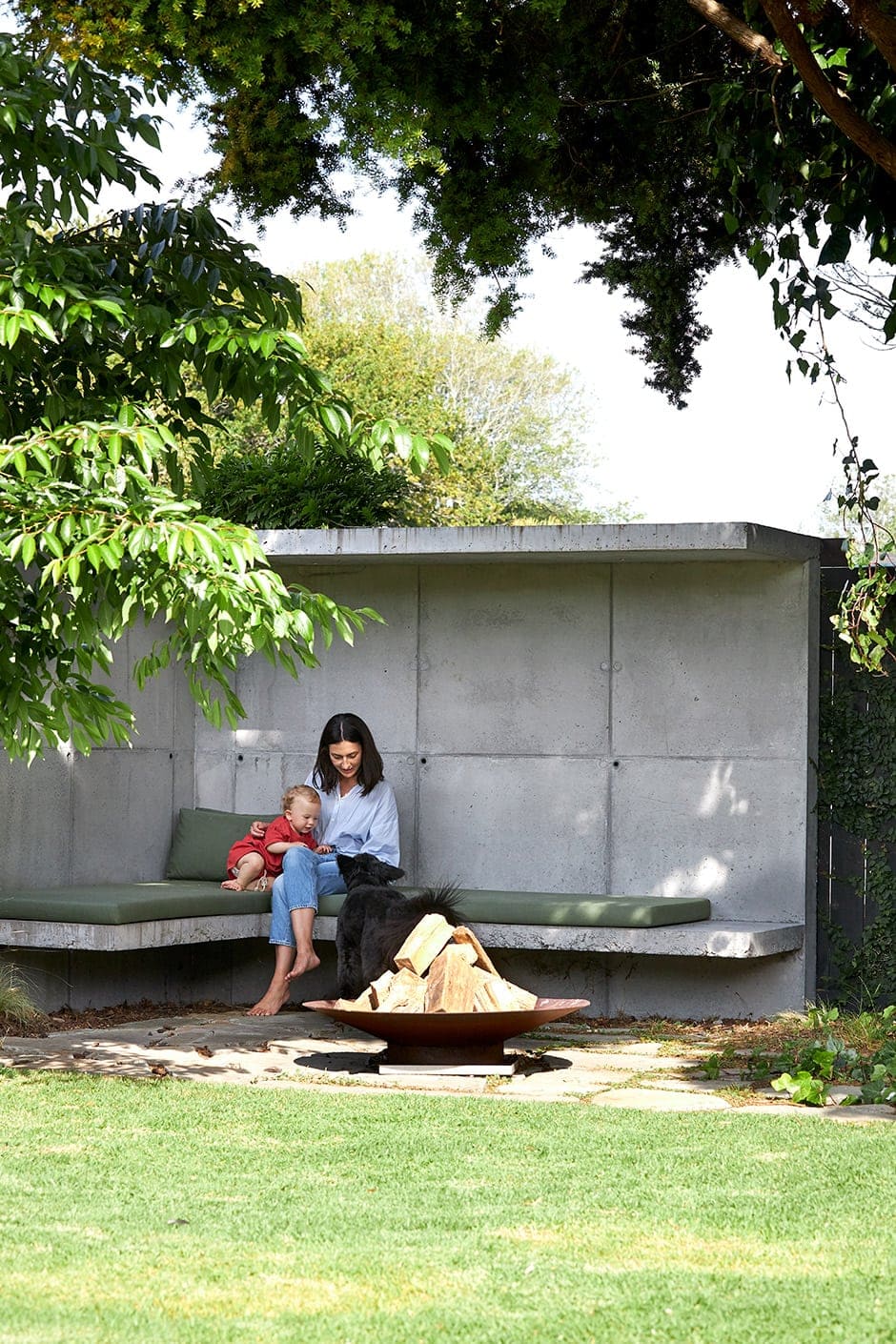
In the extreme north-east corner of the property, a concrete ‘bookend’ creates an entertainment zone that draws the eye. Poured in-situ, the seating is akin to a brutalist bus stop but softened with squabs that tone in with the trees. A fire bowl placed on crazy paving made of Northland stone is a catalyst for companionable times.
With Oscar the bordoodle waiting patiently nearby for love and leftovers, the scene could be straight out of a storybook. The Hoskings have fashioned the perfect family home. George, for one, approves.

Words Claire McCall
Photography Simon Wilson

