Inside the Melbourne home of interior architect Therese Carrodus
It’s full of bold colour expertly employed – find out how she strikes a balance.
Taking notes from her muse, LA-based designer Kelly Wearstler, while upholding her own principles, interior architect Therese Carrodus used bold colours, interesting textures and a mix of new and vintage when renovating her Melbourne home. The result is a beautifully resolved, family-friendly dwelling that can’t help but make you feel joyful.
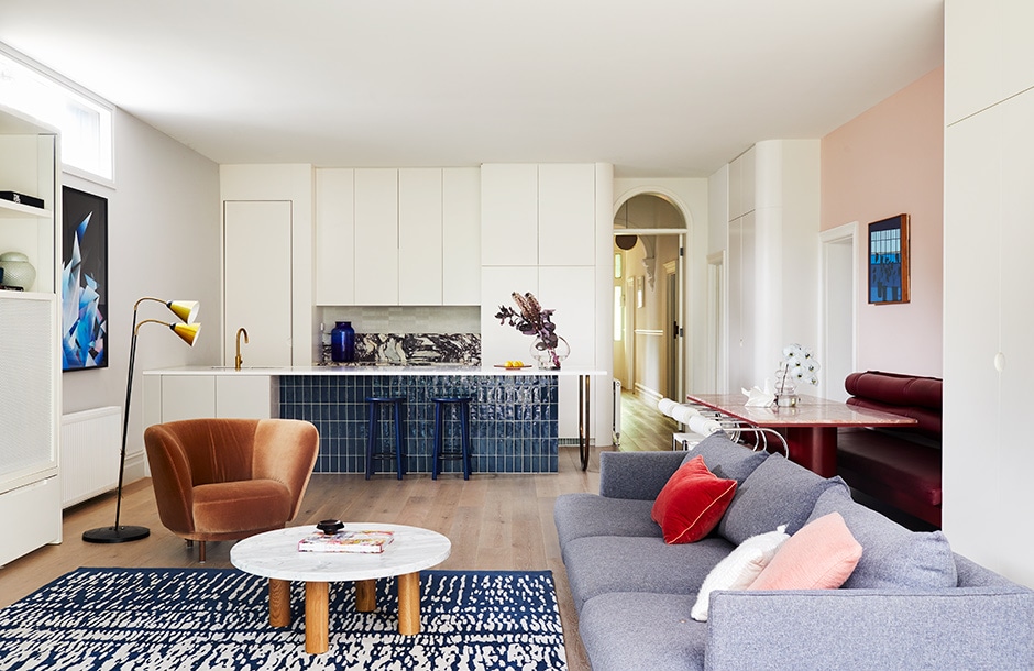
ABOVE The self-assured décor in this space includes a vintage floor lamp, Dandy armchair by Massproductions, rug by Cadrys, Chub coffee table by Sarah Ellison and Frankie Deep sofa by Fanuli. The artwork on the left wall is a commissioned piece by Zac Koukoravas.
Full of Grace founder and mother of three Therese is known for her signature style that mixes strong shades and tactility with brave design choices, an aesthetic developed through years spent working in London and on projects all over Europe. She and her husband Chris stumbled across their 1880s Victorian home in South Yarra by chance in 2017. “We were living in the area, so went along to the open home for a sticky-beak,” she says. “As soon as I stepped onto the front veranda, I imagined our daughter Rosie having her first-day-of-school photo at the front door and, later, her school formal photo. I could see this being a place our children could grow up in.”
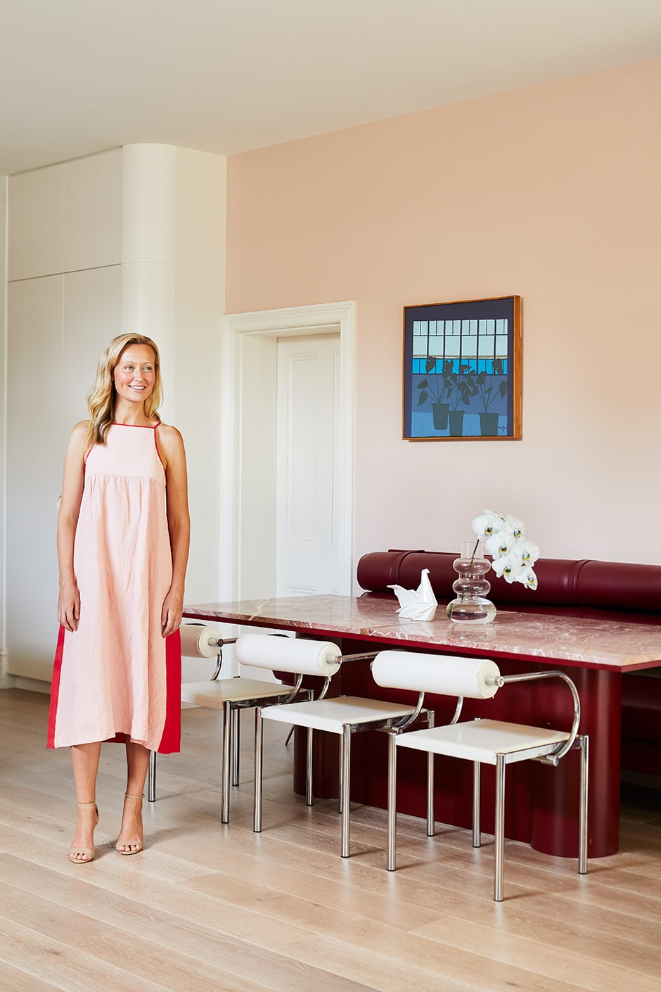
ABOVE Dulux Basic Coral provides a pretty backdrop to a painting by Greg Adams and the dining table and banquette seating Therese designed and teamed with vintage chairs. Her advice for combining colours is to select bold hues first, then layer in lighter ones. ”I used blues and plums to inject richness and personality into the house, then white, light grey and pale pink for balance. Layer shades on the same spectrum, as I have with the burgundy and pink.”
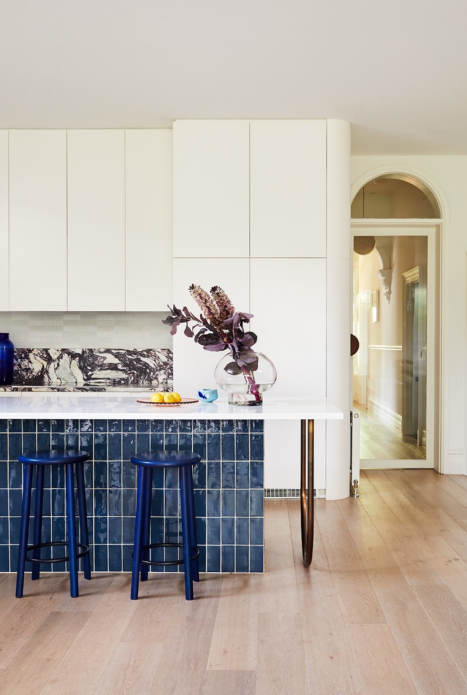
After they made it theirs, Therese got to work redesigning the home’s interior, letting the existing architectural features inform her modern approach to details such as the arched doors in the living room. “The inspiration for these came from the original period archway in the hallway,” she says. “I wanted to repeat this idea throughout the house in a contemporary way.” Today, the arch motif can be seen in those steel-framed doors, the dining room chairs, the kitchen island’s brass leg and more.
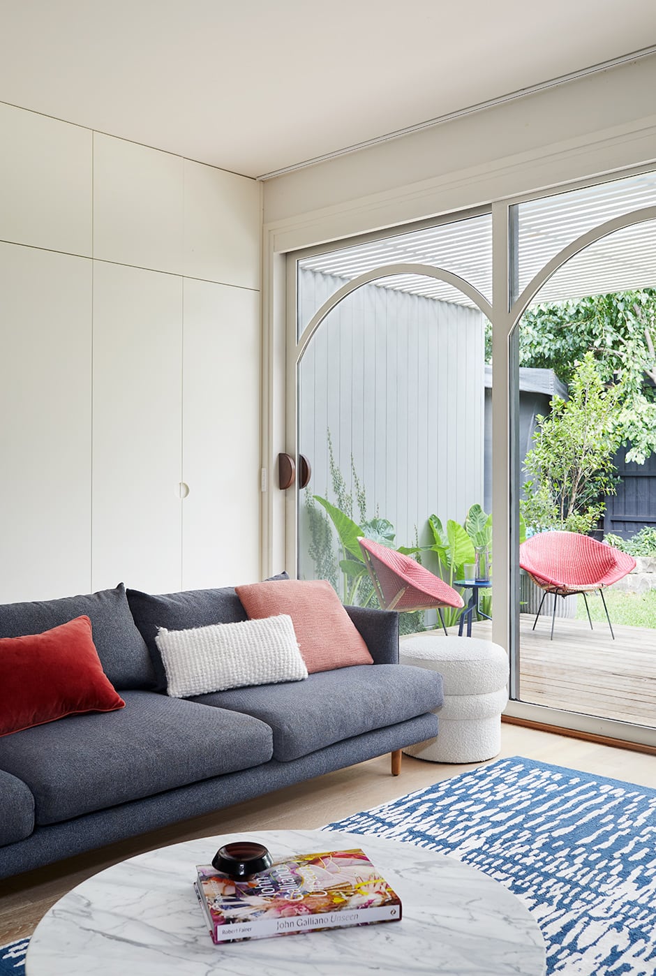
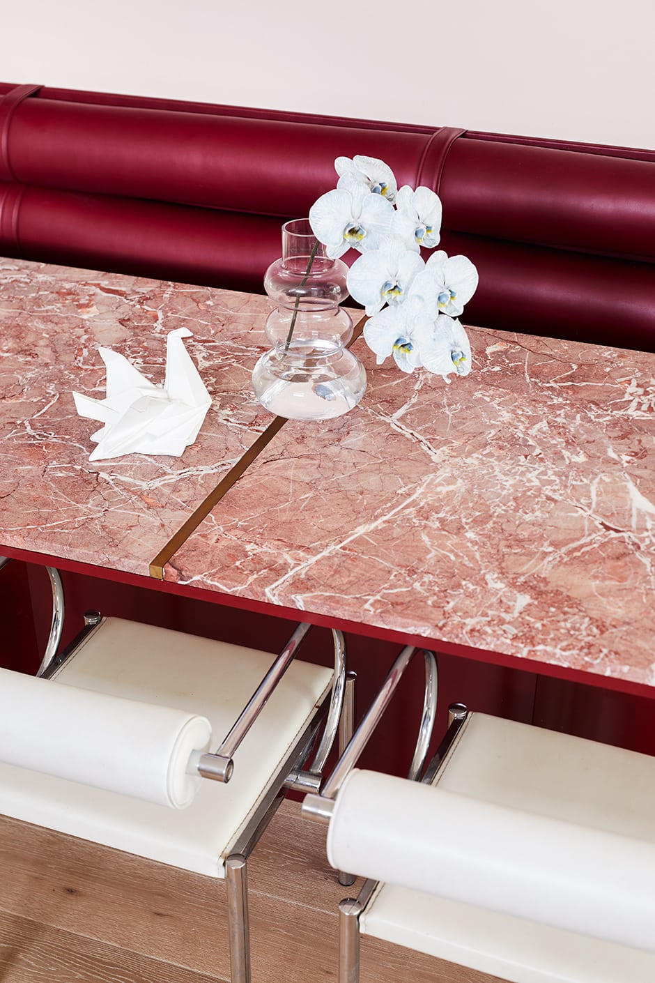
TOP Therese’s repeated arch pattern appears in the sliding doors that lead from the living area onto the deck, and she loves the shadows they create when the sun streams in. When designing the living zones, her intention was to maximise the natural light, so she expanded the opening in the back wall as much as she could. ABOVE The Persian Red marble dining table and complementary seating get more use than any other area in the house. “Food and drinks are frequently split on the table, but the beautiful veining in the marble hides all manner of sins,” says Therese. “As it turns out, it’s hardier than any timber table we’ve owned.”
The kitchen had two iterations; the first had it facing the dining area instead of the garden. “Initially, I intended for it to be oriented differently, but after a light-bulb moment one evening, I hastily edited the drawings — and I’m so glad I did,” says Therese. “As much as I enjoy looking at the dining area, I definitely prefer the view we have now, across the living area to the rear garden.”
ABOVE The calacatta viola marble splashback and benchtop at the rear of the kitchen are contrasted by cabinetry in Dulux Natural White, and a white Hi-Macs island benchtop by Laminex atop Devon Blue Jeans tiles by Earp Bros. The Solo bar stools are by Mattiazzi, the appliances are by Miele and the statement vase “is a vintage find I stumbled across covered in dust at the back of a $2 shop,” says Therese. Cooking is a priority in this kitchen, so the sink was positioned at the far end of the island to leave lots of bench space.
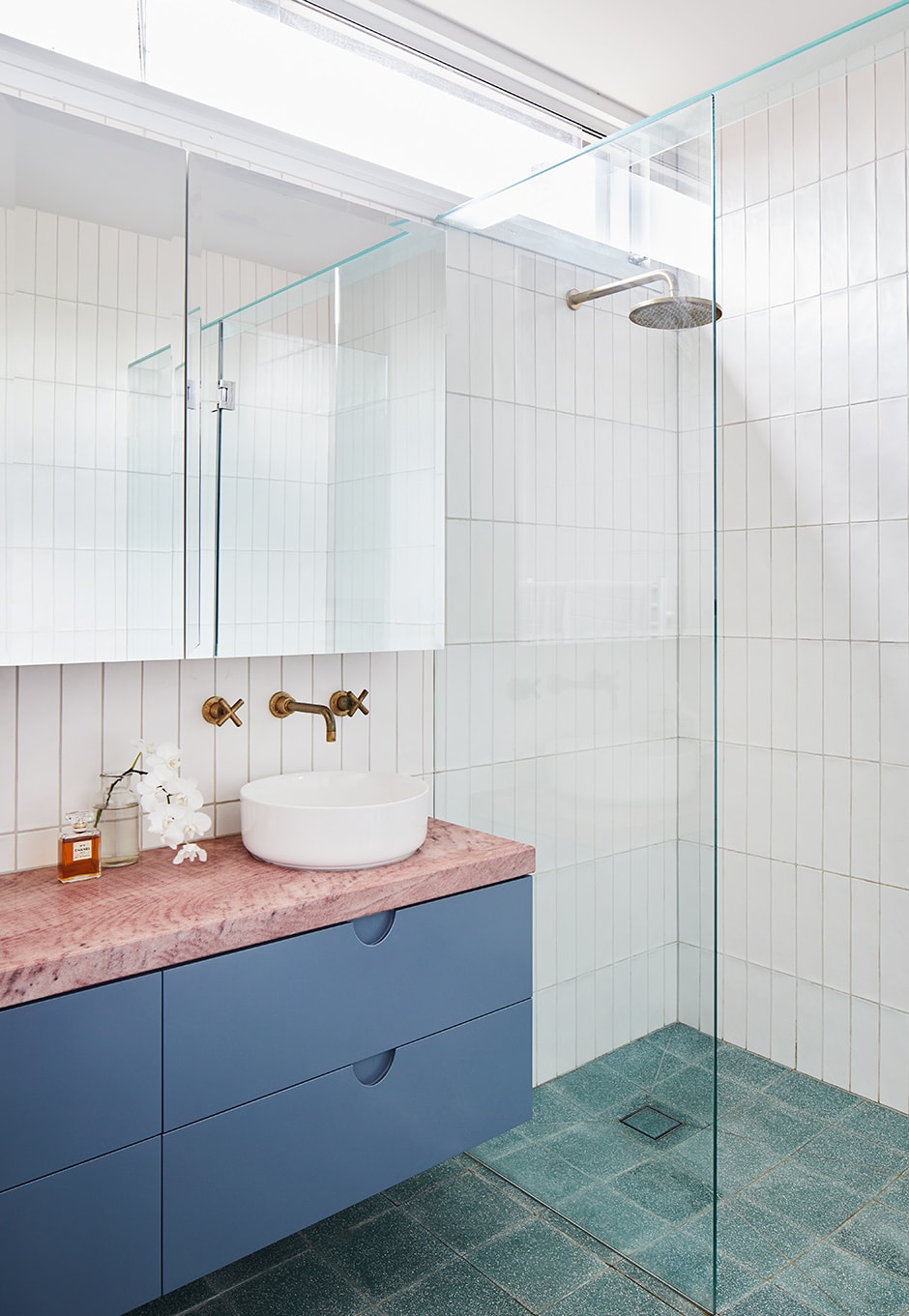
Colour-confident Therese devised the kitchen’s winning palette of calacatta viola marble and deep-blue glazed tiles as a throwback to the home’s original décor. She followed through in other parts of the home, too, including the ensuite, where a pink and blue vanity is paired with sea-green tiles. “Neutrals are important, because too much colour can be overwhelming, but colour is so much more exciting to me,” she says. “I think it’s about finding the right balance between the two.”
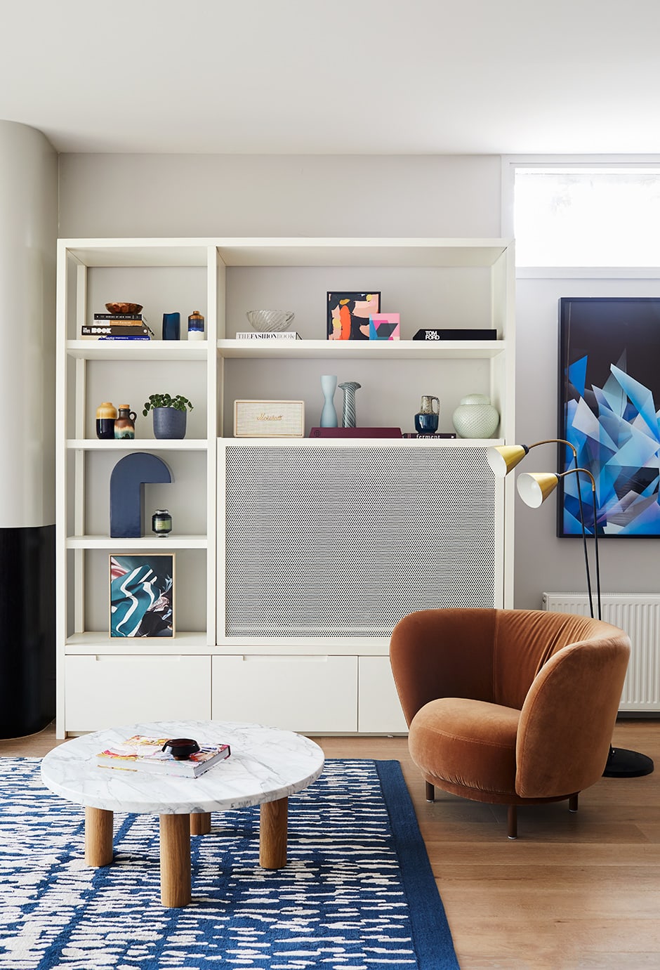
ABOVE The rear wall here is painted in warm grey Dulux Dieskau to create a soft backdrop for the white custom- designed shelving unit, which has a perforated aluminum screen to hide the TV. Therese has a tip for styling shelves: “I try to place objects in small groups to create little vignettes, and balance their colours and forms so each shelf has a combination of tall and short, wide and narrow pieces.”
During her years as a designer, Therese has discovered ways to be resourceful. One of her favourite things in this home — the family’s dining table — is made from marble offcuts. “I found two Persian Red offcuts at a stoneyard and snapped them up,” she says. “I then designed a table base to suit the size of the stone and incorporated an aged brass strip in the middle to join the two pieces together.”
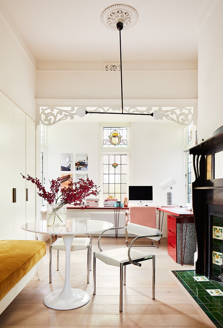
TOP Lit by a Two Spheres pendant light by Atelier Areti and warmed by the original fireplace, Therese’s home office is filled with strong shades that keep her inspired while she’s working. The Victorian stained glass windows add another layer of colour to the room when sunlight washes through them. The flooring here and throughout the house is engineered timber. ABOVE Therese stores the majority of her interior design samples concealed in her office’s built-in cupboards, but likes to keep exceptional ones on the shelves, where they double as artwork. “This is such a comfortable, relaxed environment — I really enjoy bringing clients into my workspace,” she says.
Five months after the renovation began, the family moved in, just a few weeks before Therese gave birth to her and Chris’s youngest child. The new home’s open-plan living spaces have proved brilliant for their young kids. “They often run and sometimes scoot up and down the hallway, and make cubby houses in the living area,” says Therese. She and her loved ones are enjoying every minute of creating memories in this fabulous-looking and functional home — just as she’d imagined they would.
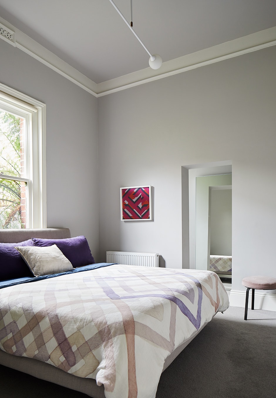
TOP The bedrooms are also painted in calming Dulux Dieskau. “I painted the ceilings the same grey, then painted the ceiling roses and cornices in Dulux Natural White to make those period features really stand out,” says Therese. The graphic print of the duvet from Nancybird ties in with the artwork — a piece of fabric Therese had framed. ABOVE Crayon tiles from National Tiles meet textured Ceppo floor tiles by Earp Bros in the couple’s ensuite, where the colour palette continues in the pink quartzite benchtop, cabinetry in Porter’s Paints Hampton’s Blue, Eden basin from Highgrove Bathrooms and raw brass Portsea tapware by Par Taps. The clerestory window is another new addition that makes a world of difference in this relatively tight space.