
Delve deeper into how she and her husband Warren Durling wrote the next chapter of their 1907 building’s colourful life.
In association with Dulux.
When did colour come into your planning process, Jess? Right at the beginning. The walls were originally clad with timber, which would have been lovely, but unfortunately it was rotten beyond repair in many places, so we looked at it as an opportunity to expose some of the gorgeous brickwork, which became the foundation of our colour and material palette. From there, it was about finding other colours and textures to complement the brick and help balance the light, which is a bit inconsistent throughout the building.
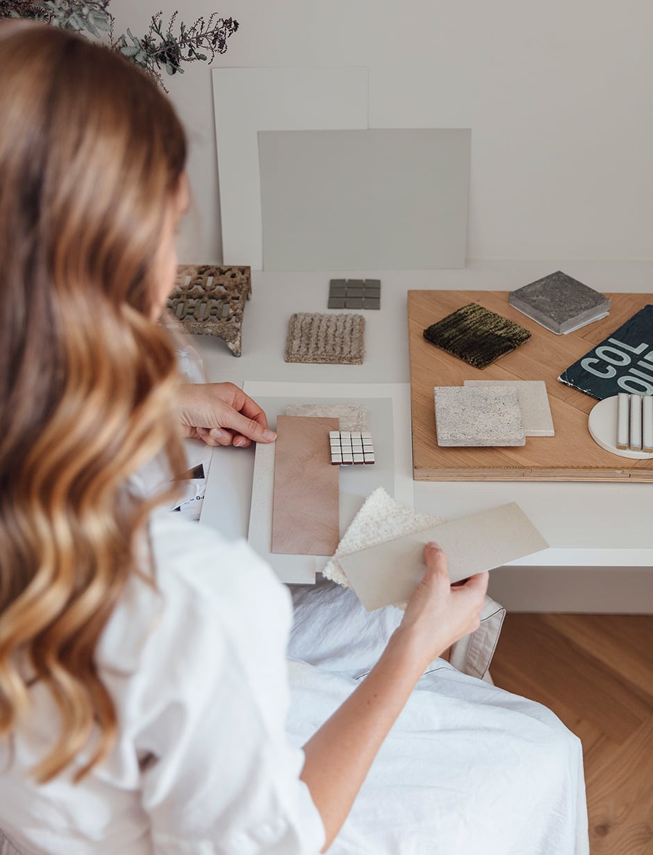
How did you harness paint’s textural qualities? I love colour, but I knew I wanted the focus to be on texture and how colour could enhance it; I liked the idea of using texture and paint to enrich the mood and express our personalities. I was also curious to explore how paint products, which are mostly thought of as 2D or flat, can introduce texture and depth, and was blown away by the number of unique products Dulux has on offer, such as the Dulux Design Effects and Dulux Renovation Ranges.
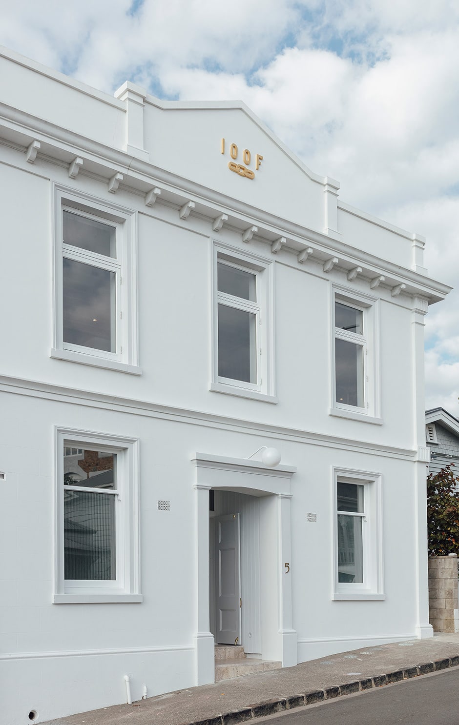
This being a heritage-listed building, were there any guidelines you had to work around? Before launching into any work, we did a lot of research on the history of the ‘category A’ building so we were able to approach our renovations with care, and our paint choices were very much a reflection of this. We chose colours that were close to what would have been used originally, and these decisions were supported by Auckland Council and Heritage New Zealand, who we’ve worked closely with throughout.
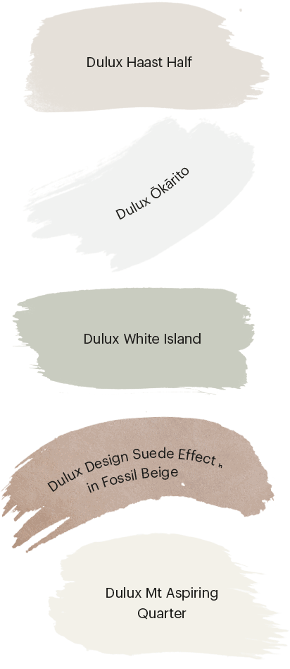
Why did you opt for Dulux Ōkārito for the interior walls? The hall proper gets very little sun, so we wanted a vibrant white that would lift the mood and make the room look brighter. I’ll never forget when we walked in and saw the space with the first coat on — we couldn’t believe how much it’d changed. It went from feeling drab, dark and cool with yellow stains from decades of cigarette smoke and dust, to clean, crisp and welcoming. The experience shaped the way I think about paint and the power it has to transform and define a space.

And why did you choose Dulux Haast Half for the bedrooms? The bedrooms are north-facing and get tons of natural light all day — the opposite of what we were dealing with in the hall. Dulux Haast Half is a gorgeous beige neutral that ticked all the boxes. It felt welcoming, but not too stark or reflective, and we love how it looks with Dulux Ōkārito.
How else did you use paint in this house? I decided to give our secondhand kitchen an update with paint and new handles, and it was an incredible transformation — and one that saved us having to invest in an expensive new kitchen. I used Dulux White Island from the Renovation Range and I’m so glad I took the plunge and used a soft green, as it works really well.
I also upcycled a preloved headboard for our daughter, Stevie, using Dulux Design Suede Effect in Fossil Beige, and did the same with a doll’s house using Dulux Mt Aspiring Quarter — which we chose for the exterior of the hall — plus a bunch of testpots in fun colours for the inside and Dulux Design Stone Effect on the roof. It’s been a big hit with her!
See Jess and Warren’s renovation in full in our June/July issue.
Want to try Dulux products at your place? Order free large colour swatches and buy sample pots and paint from dulux.co.nz.
Interview Alice Lines
Photography Duncan Innes
Dulux, worth doing worth Dulux and Colours of New Zealand are registered trademarks of DuluxGroup (Australia) Pty Ltd. Please note that due to limitations in the printing process, photographic and printed images and swatches may not represent the true colour. Always confirm your final colour choice with Dulux sample pots.