In association with Dulux.
Offering excellent insight as always into the wider world of interiors, the Dulux Colour Forecast 2024 presents a trio of palettes befitting both the 15th anniversary of this illuminating annual fixture and our Kiwi lifestyle. Based on year-round research into the latest local and global trends predicted to influence interior design and the way we live, this year’s curation is characterised by a collective appetite for positivity and spaces that nurture through texture, lightness and warmth. There’s an interesting absence of greys; however, many of the colours are themselves greyed-off to form ultra-usable mid-tones. That means fewer brights and pastels than in the past, but rich alternatives with a hint of nostalgia.

The world’s on the road again and the Journey palette’s along for the ride, picking up travel tips and cultural influences on a trip through yellow greens, dusty blues and decadent reds. Folk traditions and a hint of bohemian charm woven into this eclectic selection suggest a connection to craft, and encourage us to consider the odyssey of the objects we surround ourselves with, especially those handed down as heirlooms. The softness inherent in these shades makes them very user-friendly and sit well with vintage finds, and heavily patterned and textured furniture and fabrics.
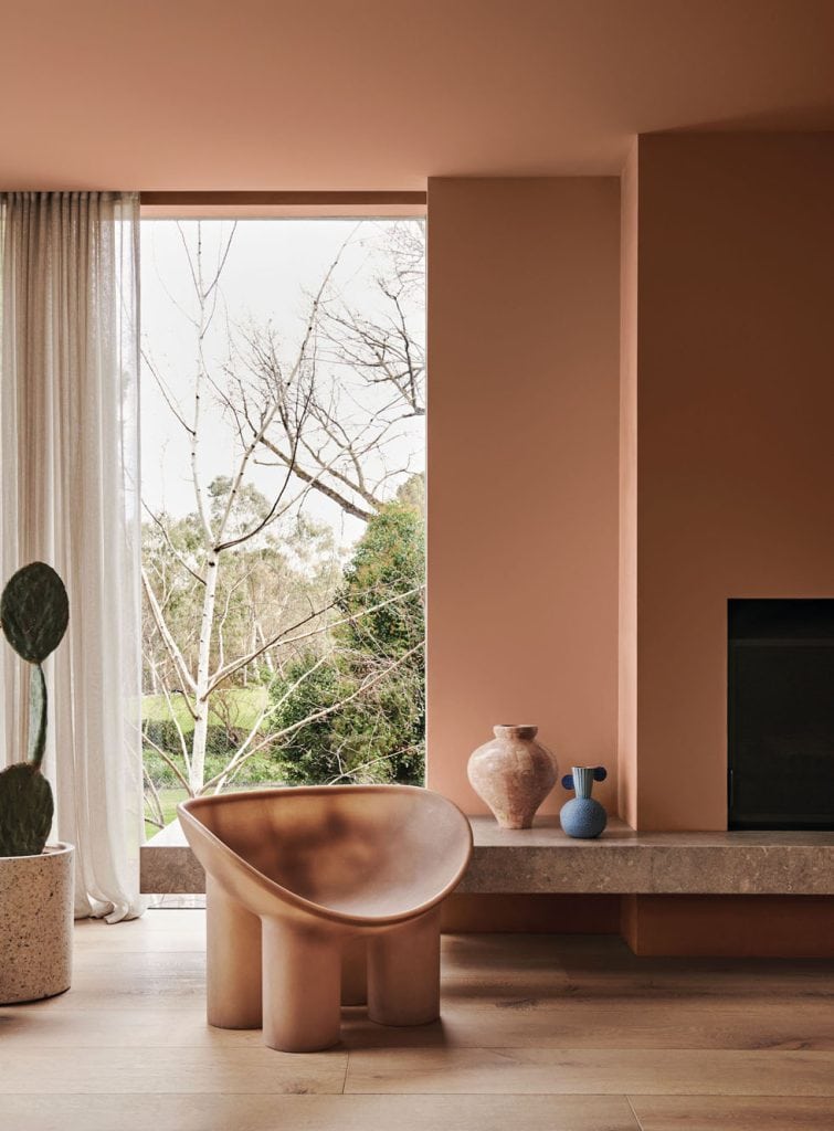
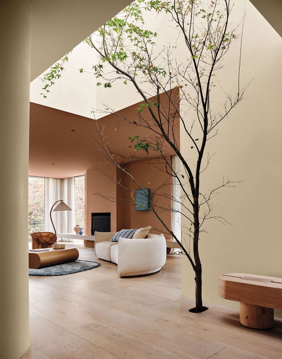
Promising to restore you with its warmth, the Solstice palette’s sun-soaked browns and clays combine with hues including watery blues and a cheerful yellow. Its inspiration is grounded in Scandinavian design, then layered with Mediterranean and African and Australian desert energy — a fusion that follows the sun and heralds happy days. Solstice is designed to evoke feelings of comfort and familiarity, to make you feel at home, and act as the ideal ally for natural, tactile materials.
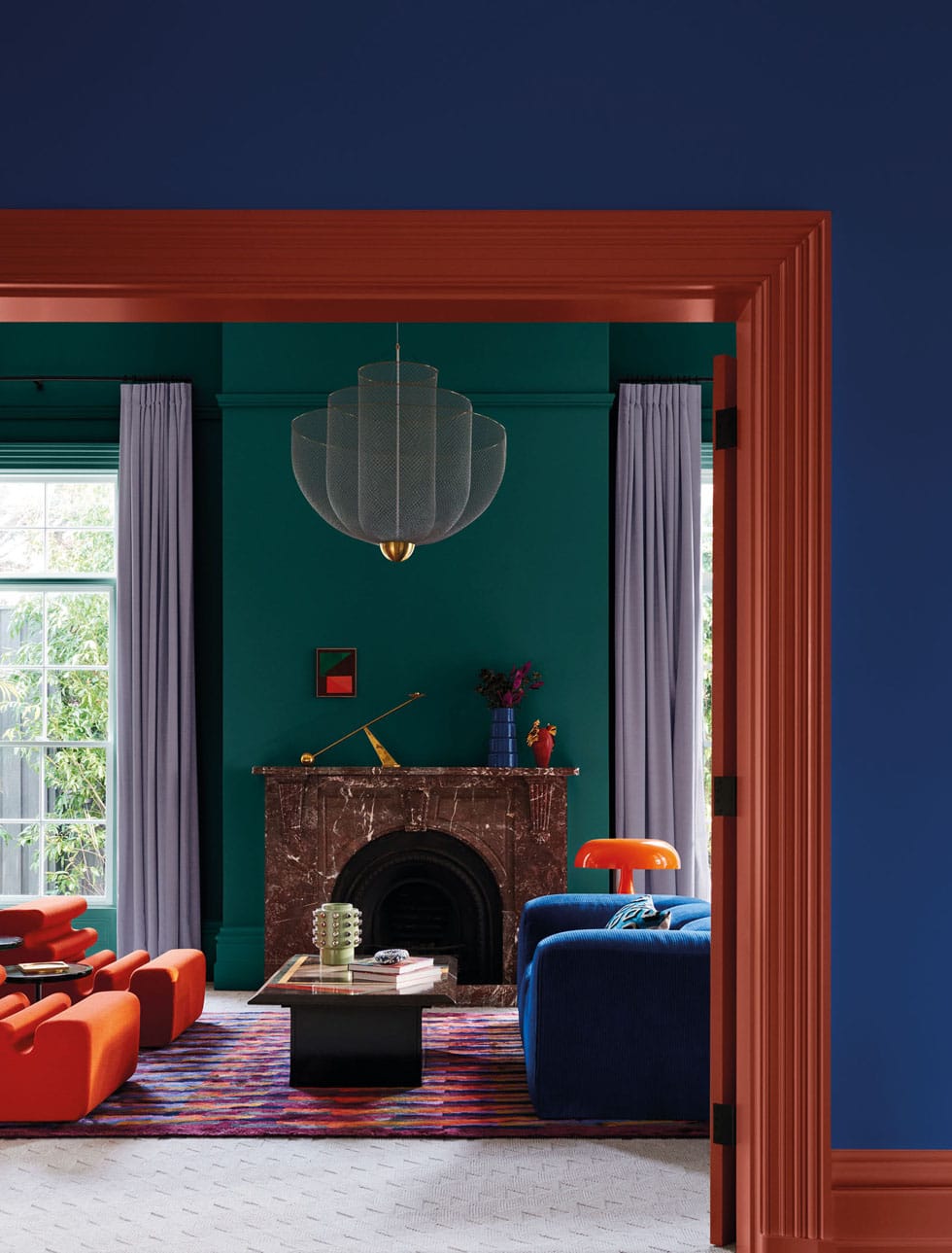
The brightest of the bunch, the Muse palette is both daring and doable, with a retro spirit that’s also unmistakably modern. Drawing on iconic designers and design details of the ’60s, ’70s and ’80s, it channels the expressive colours of postmodern homes and invigorates their contemporary counterparts. Intended to be a muse for your creativity expressed in fun furniture and finishes, its highlights include russet browns, rich tans, cool greens, clean blues and a lovely lilac.
