The other day, I was chatting to a friend about the challenges of decision-making when you’re considering updates at home. He mentioned he’d been looking for paint colours for his kids’ playroom and turned to Instagram to see how others ‘got the look’, only to spend ages searching for something he wasn’t even sure existed! Although doing some online research is a natural starting point for most of us, our conversation got me thinking that we shouldn’t be fooled into believing it presents a fail-safe shortcut. In my opinion, it’s always well worth setting aside some time to investigate paint options IRL and in your unique space. What does a colour look like when the light from your windows hits it? What mood does it create in the morning? How will it make you feel when you’re winding down in the evening? Is it comforting? Does it encourage connection?
Working with my hands helps me connect with my creativity, and I often find it’s a simpler route to a solution than a lot of time spent online. When it came to styling the kids’ sleep space for our latest studio shoot, my first port of call was a Resene ColorShop for a haul of testpots. Quite quickly, my sketches of bedroom scenes became workable colour schemes, and I was easily able to navigate which neutral shade would pair best with the bright yellow headboard I had in mind, and which complementary hues should feature alongside it without being dominating. See the outcome on page 34.
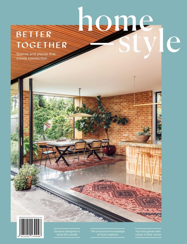
Getting things just right at home takes both time and effort, and it’s always interesting to see the different ways this manifests itself in the dwellings we feature on our pages. This issue, a common thread around the theme of connection was revealed, with many of the projects based on how the indoor and outdoor spaces bring family members and friends together, while also creating places to retreat to. Another similarity we noticed was that for these households, the concept of comfort has resulted in a move away from the typical notion of open-plan living — in these homes, equal consideration has been given to smaller ‘moments’ within larger spaces, via inclusions such as built-in window seats and kitchen islands that double as dining tables.
It’s inspiring to see homes being designed around the ebb and flow of daily life. No one configuration is right for everybody, but I’m a fan of where things are going. Enjoy the issue!
Editor Alice Lines

