When architect and director of Bureaux Jessica Walker first laid eyes on this modern, cedar-clad home in the seaside east Auckland suburb of St Heliers, she was not only excited to work with its owners for a second time, but also to seize the opportunity to do what she and her team do best: provide a full service from the inside out. Bureaux had already completed a holiday home for the couple and their two children, and now the pair wanted to downsize their Tāmaki Makaurau base. With its beautiful light, enviable view and leafy garden, this 2012 townhouse originally designed by Cook Sargisson Pirie Architects was selected as an ideal alternative to an apartment.
Stepping up to alter a relatively new dwelling designed by someone else is the architectural equivalent of stepping into someone else’s shoes. How do you make them fit? “You need to find yourself within the project,” says Jessica. “Our approach was to treat the home like a canvas, excluding the exterior and reimagining the lining of the house.”
Find themselves they did. Although they left the floorplan largely unchanged, the team (including architect Ella Lilley-Gasteiger and interior designer Madeline Caldwell) brought the interior back to its bones before meticulously rebuilding it — but it’s what they did before that that sets their practice and this project apart.
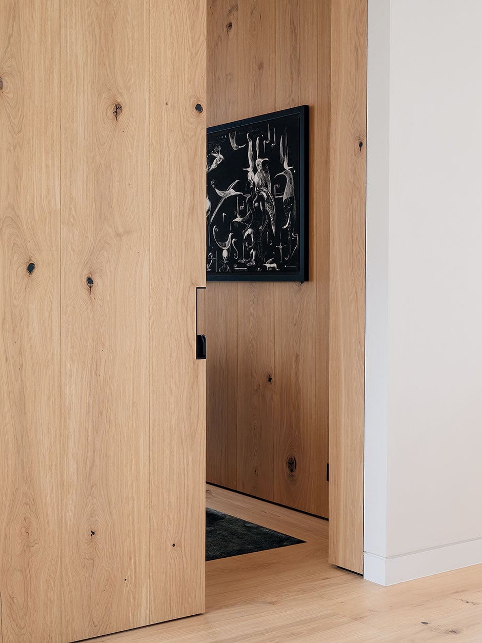
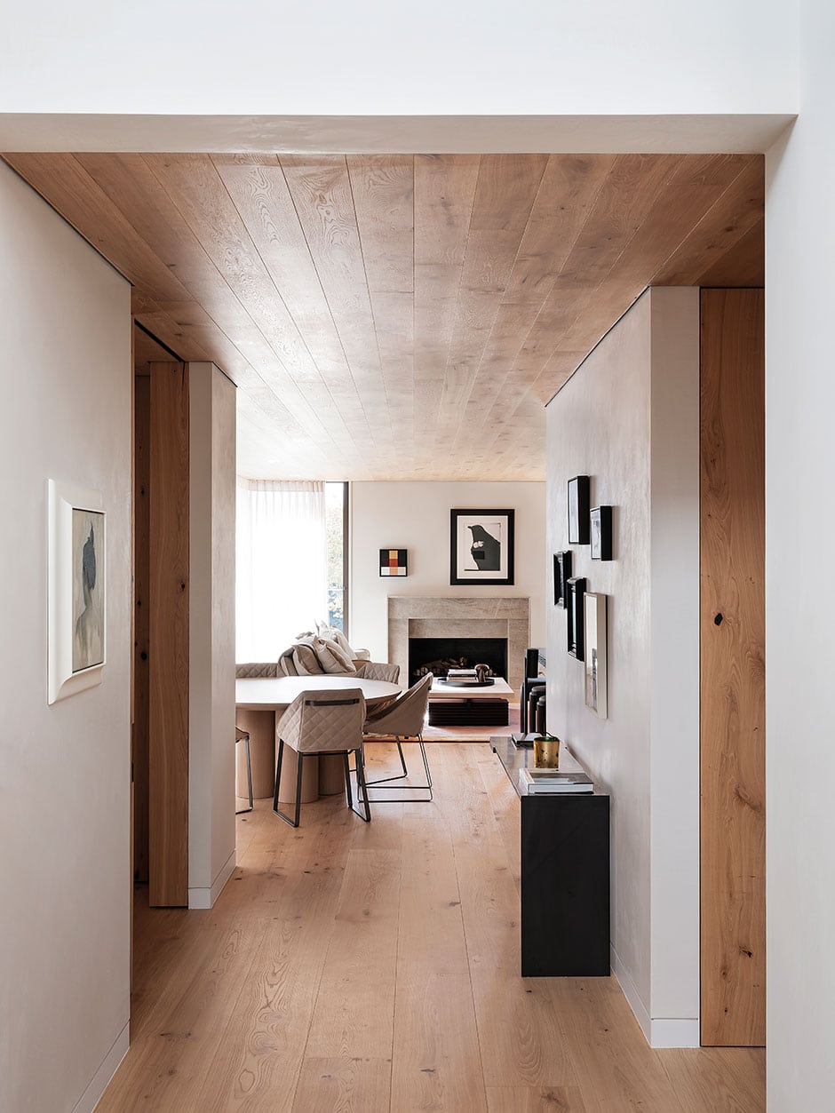
As an integrated architecture and interior design studio, Bureaux often create bespoke furniture and fittings for projects. Rather than applying interior details as a secondary phase to the architecture, they see it as one vision. Because of this, the team began by working backwards, from the inside out, carefully deciphering how spaces might be occupied and teasing out all the details to accompany their clients’ rituals of living. “We find it difficult to think about a room without considering how that room might be occupied,” says Jessica. “Behaviour informs how a space is designed, then the architecture is sculpted around it.”
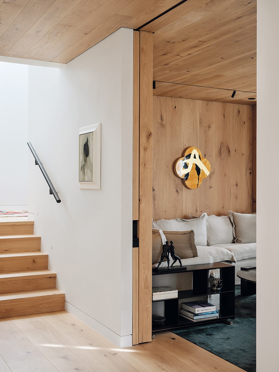
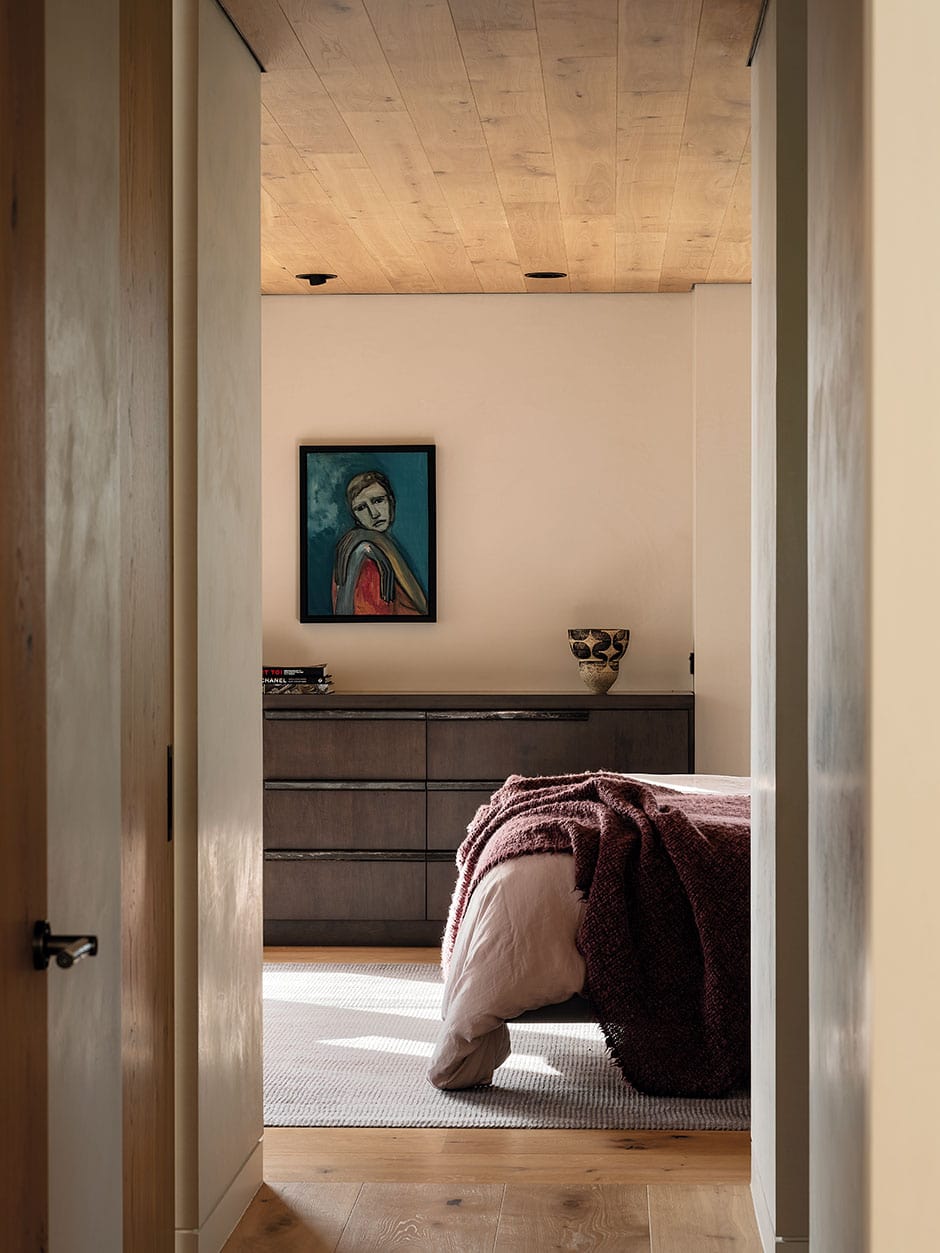
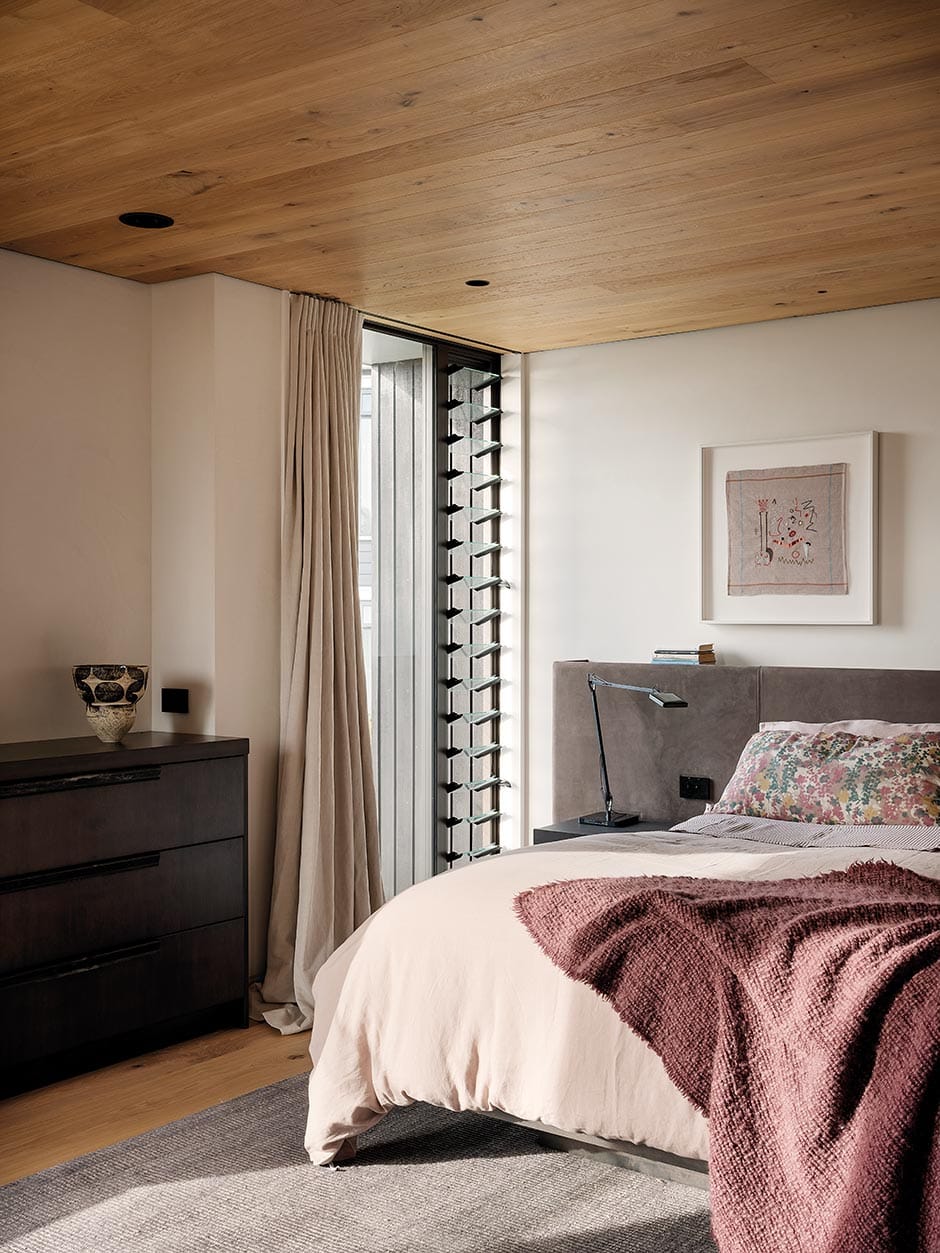
The entrance to this home sets the stage for what’s to come by introducing a concise material palette that draws you in. “The idea was to catch people between two horizontal planes,” says Jessica. This was achieved through the generous use throughout the home of oak timber on the ceiling and the floor (not to mention some of the walls). Many of the conventional doorways have been exchanged for openings edged with strong blade walls that more loosely divide the spaces. Along with intricate negative detailing on both the ceiling and the walls, this offers what Jessica describes as a “tectonic” reading of the spaces. A textured plaster finish on the walls honours the clients’ wish for dedicated surfaces on which to display their diverse art collection.
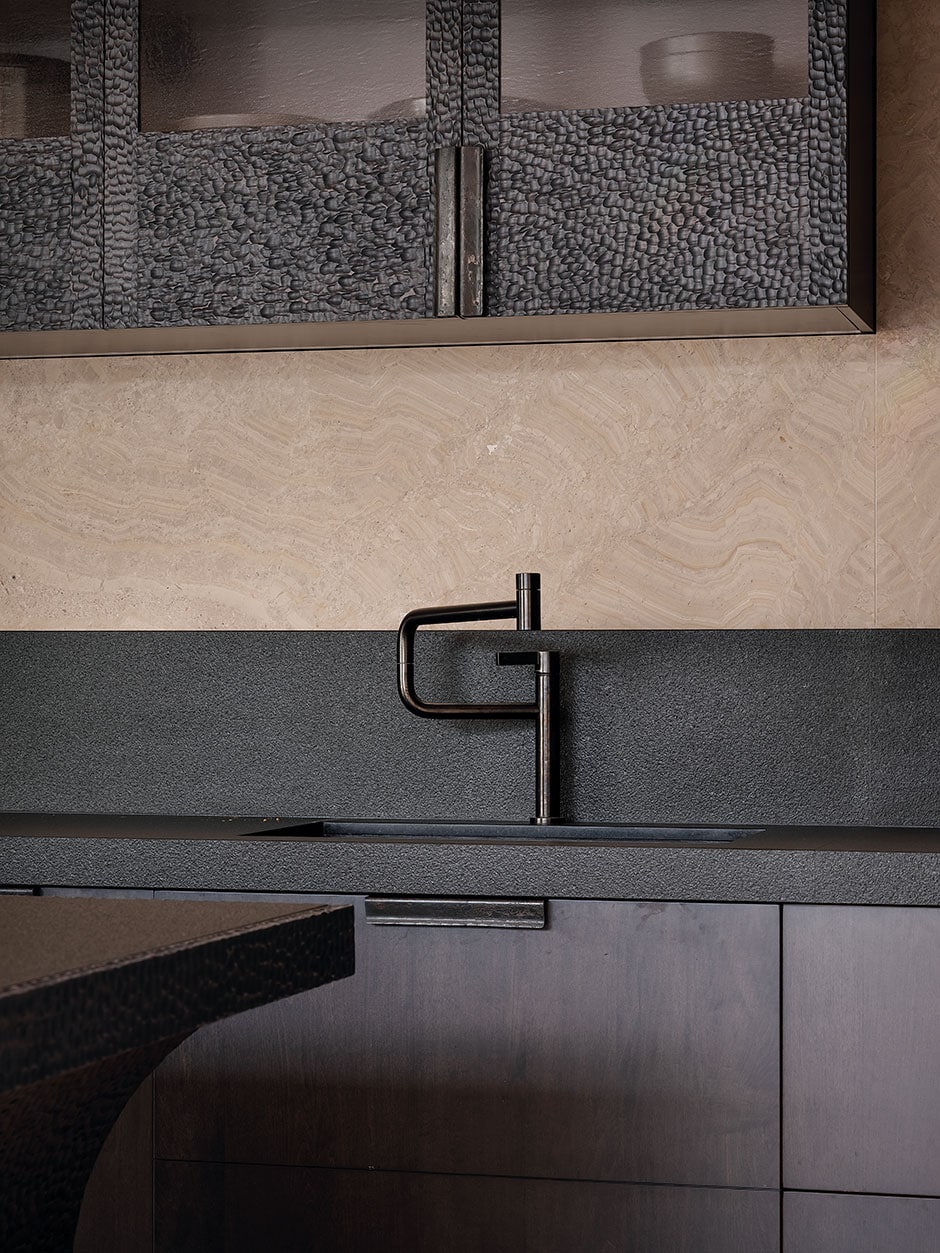
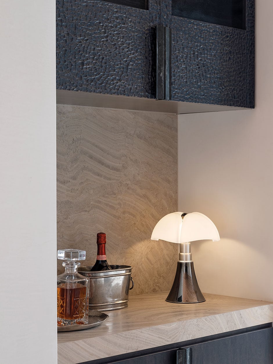
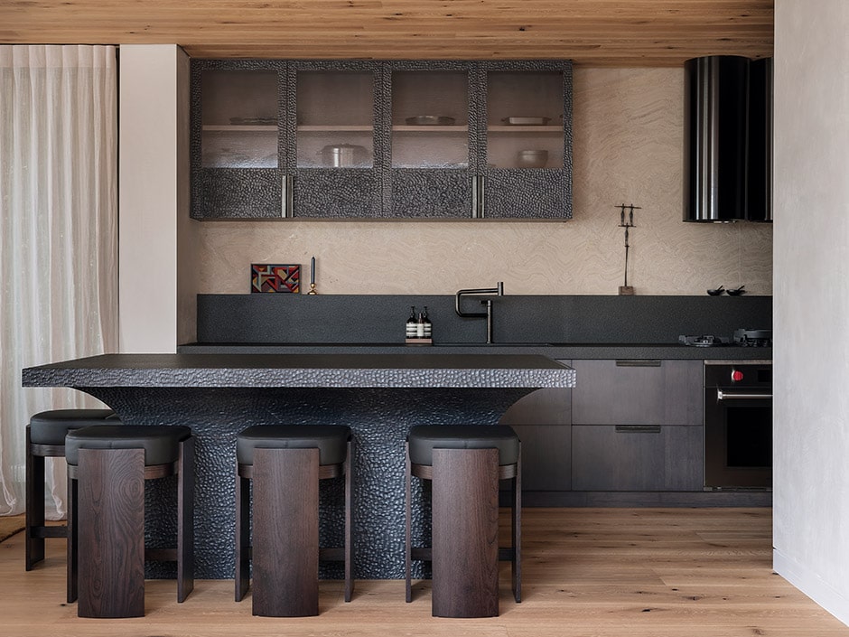
Adzed timber is used throughout the home, and it’s in the kitchen that it really sings. Every facet of the fumed maple cabinetry was hand-carved by DBJ Furniture. “Rather than rolling their eyes, they really relish the challenge of doing something they’ve never done before,” says Jessica. Also in solid maple, the matching island is sculptural in appearance yet deftly practical, concealing utilities including a dishwasher.
A similar sense of earthy serenity can be found in the adjacent main living space. After the creation of numerous prototypes, bespoke linen curtains by multi-talented fashion designer/craftswoman/painter Beth Ellery were carefully constructed to maintain privacy from the neighbours. The curtain tracks and lighting here have also been thoughtfully managed to
ensure the calm tranquillity of the room remains.
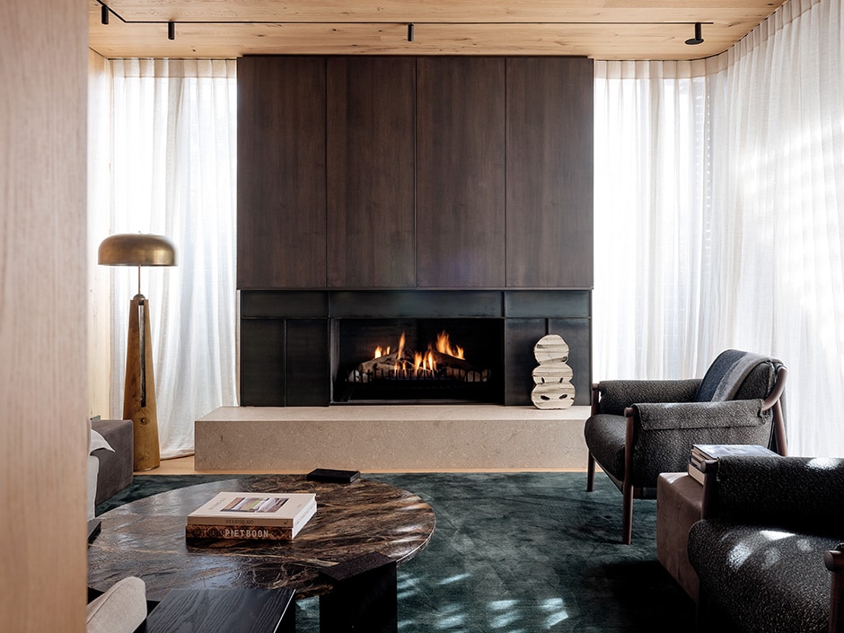
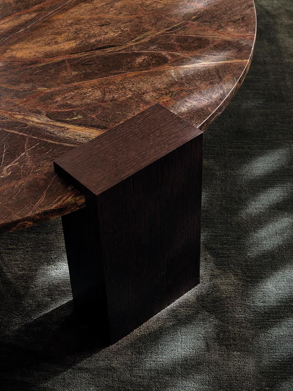
Complete with bespoke cabinetry to hide all the usual AV fandangles, the media room reveals another sophisticated Bureaux detail. Rather than have a carpet threshold at the door, they cleverly created a border of timber and inlaid the carpet — or more specifically, a luxurious silk rug in a deep sea green. A wide fireplace grounds this room with its steel surround and stone hearth, and the rich charcoal tones of fumed maple panels make an appearance in here too.
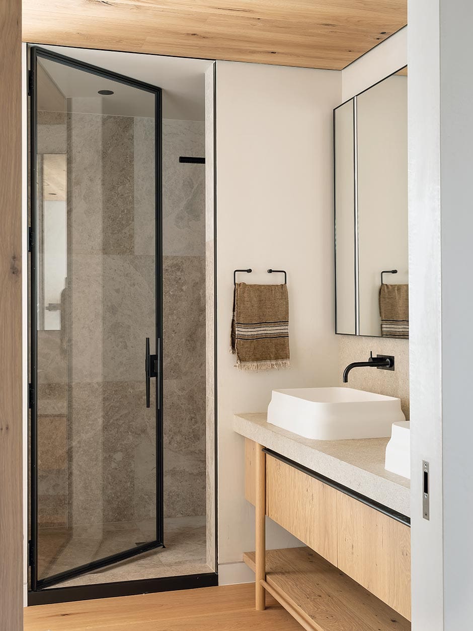
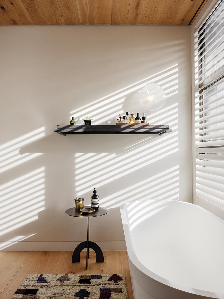
Bureaux’s level of care and attentiveness is equally evident in the powder room and ensuite. “I like bathrooms that feel like rooms, as opposed to service spaces,” says Jessica. “I’m a big fan of taking timber flooring through the bathroom with a rug, a side table — so it feels like a room you might spend some time in.” In this abode, the bathrooms very much feel like somewhere you could happily while away your time — perhaps in the ensuite’s deep bath with its view of the ocean through the shutters.
Every room in this house has its own character, and each has a part to play in a narrative carefully written especially for this home and this family. “There’s an identity that a project gets given that’s just theirs — it can be admired, but not easily replicated,” says Jessica. “What we give our clients and their interiors is their own language — we create it just for them.” In this case, it appears that language expresses this family perfectly.
Words Clare Buchanan
Photography Sam Hartnett

