During their first renovation, of a small unit in central Ōtautahi/Christchurch in their early twenties, Hat Hall and Karl Saunders painted a wall in their kitchen an eye-watering red. While the owners of architectural building co Built Chch’s current home was being constructed, they bided their time in an in-need-of-an-update dwelling with patterned brown carpet (not to mention screaming pipes, flickering lights, lethal stairs and doors opening straight onto the roof). Not before time, the interior aesthetic they now find themselves living with is decidedly more appealing.
The couple began this project as they do all their company’s design-and-builds: with graphic designer Hat compiling a moodboard of images and sourcing the products and people she wanted to work with, then checking with builder Karl to find out if it was all doable. “I pass the finer details to Hat and she leaves the more structural decisions to me,” says Karl. “I had to rein in Hat’s ideas a few times because of budget! But not a massive amount.”
With Built’s dream team of architectural designer Aaron Jones of Urban Function Architecture and interior designer Abbie Herniman of The Home Maker on board, the pair was all set to tackle their first-ever new build for themselves — after exercising some patience. In a lengthy process, powerlines draped across the front of the long, narrow Sumner section had to be buried before construction could start, and an adjoining dwelling initially proved a headache for Aaron, who Karl says had to do some fancy footwork on the original plan to keep the home’s site coverage down below “the magic 40%” necessary to avoid requiring the neighbours’ sign-off.
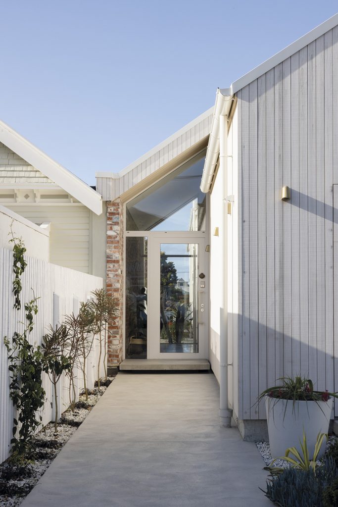
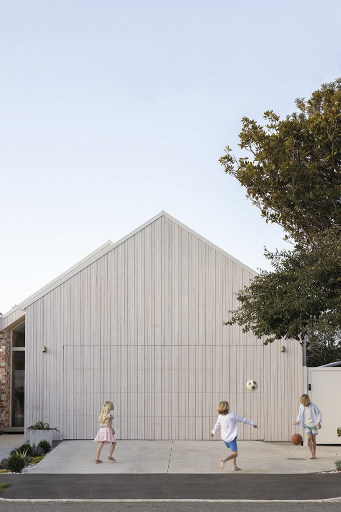
Crises averted and family home finally realised, the two-storey structure sees the street side of both floors dedicated to sleeping in the three bedrooms downstairs plus guest room upstairs, while the rear is reserved for living. “We love the simplicity of the gable form at the front, with the unassuming garage,” says Hat. “You don’t get much of an idea from the street what’s hidden behind it, although the view through the glass front door down to the back of the section hints at it. It’s very entertaining to see people walking past have a wee peek inside, then realise you’re standing in the hallway watching them right back — it’s voyeurism at its best.”
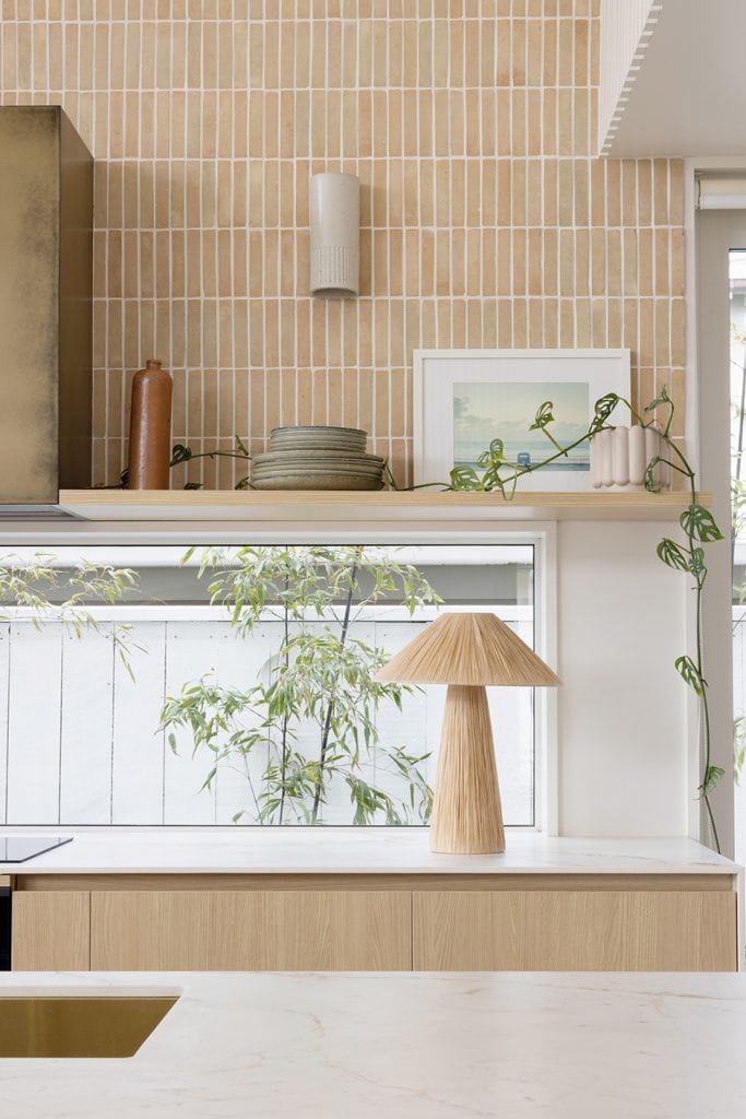
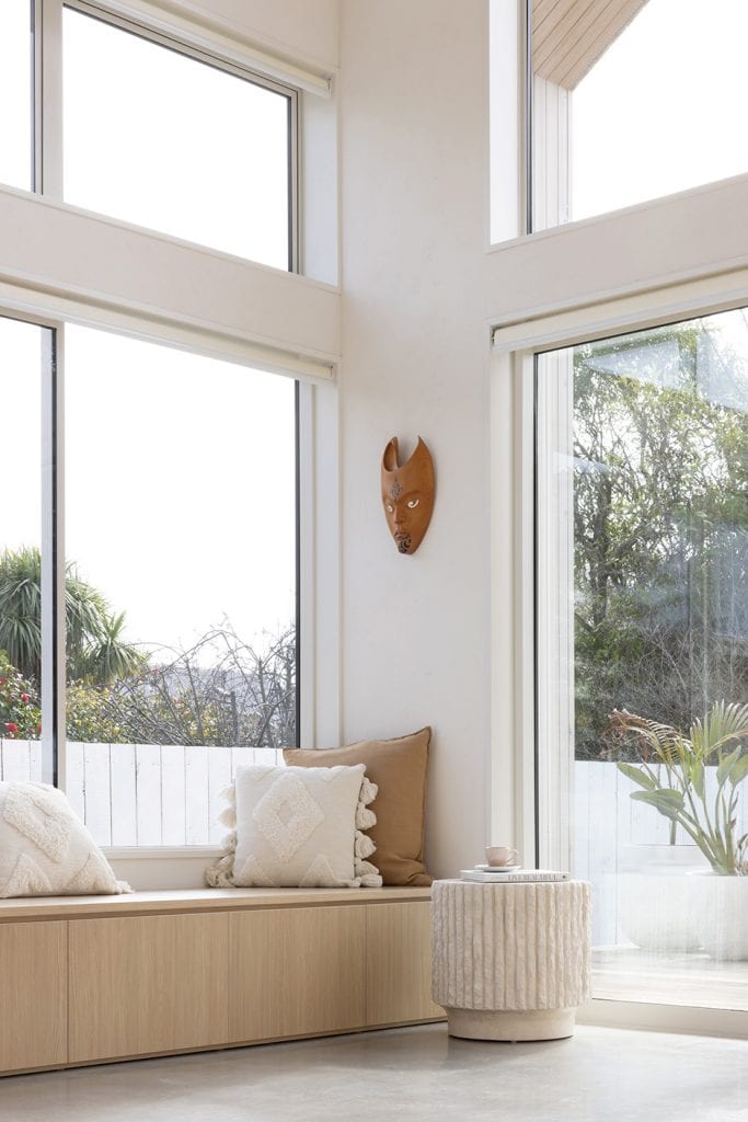
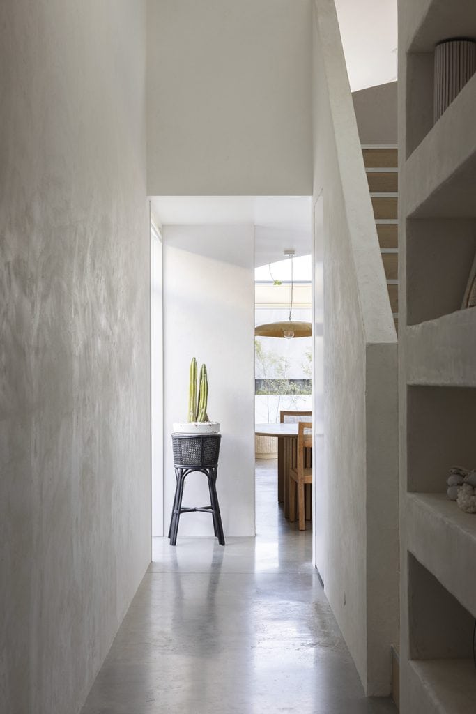
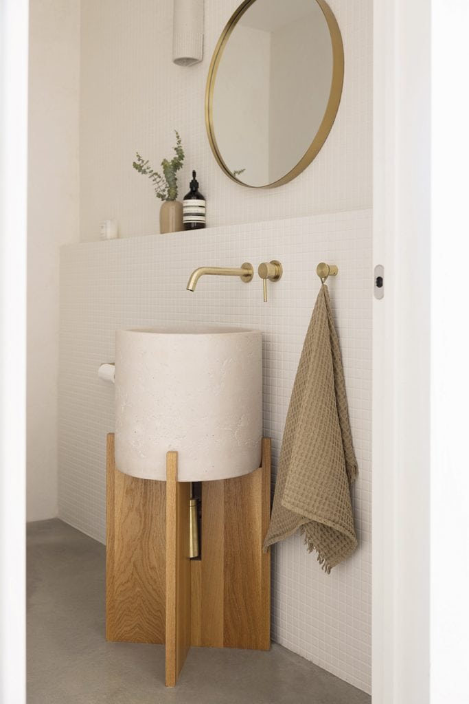
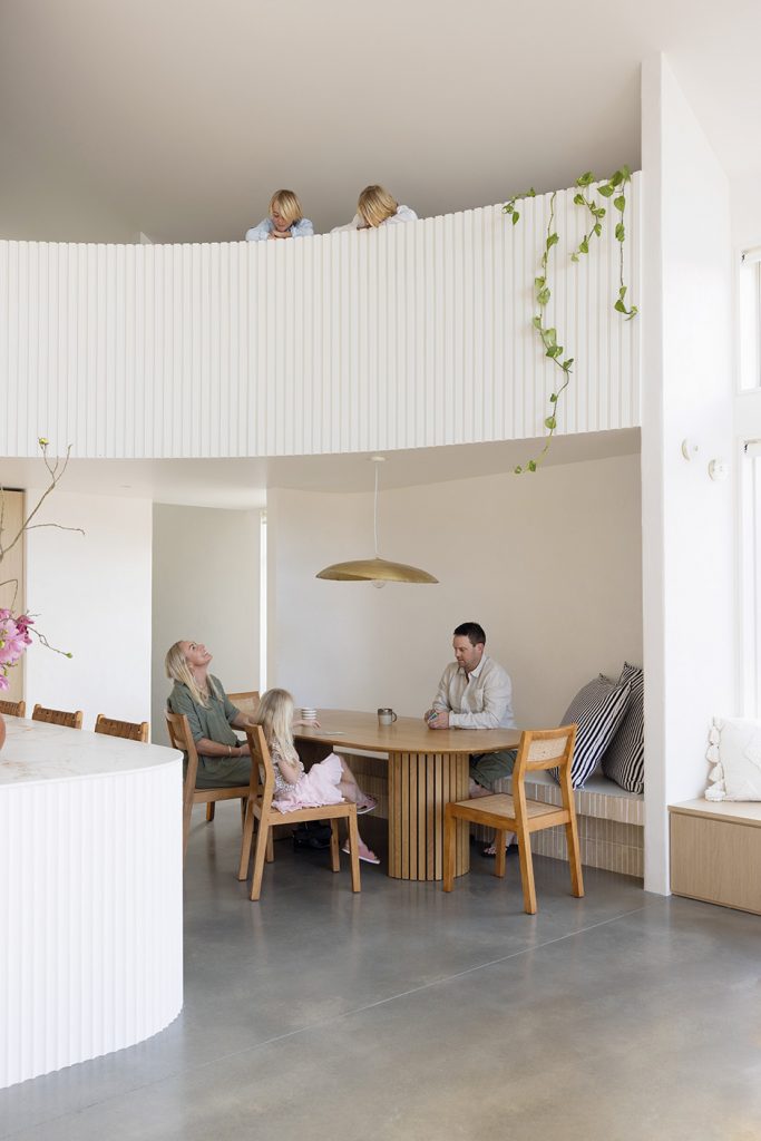
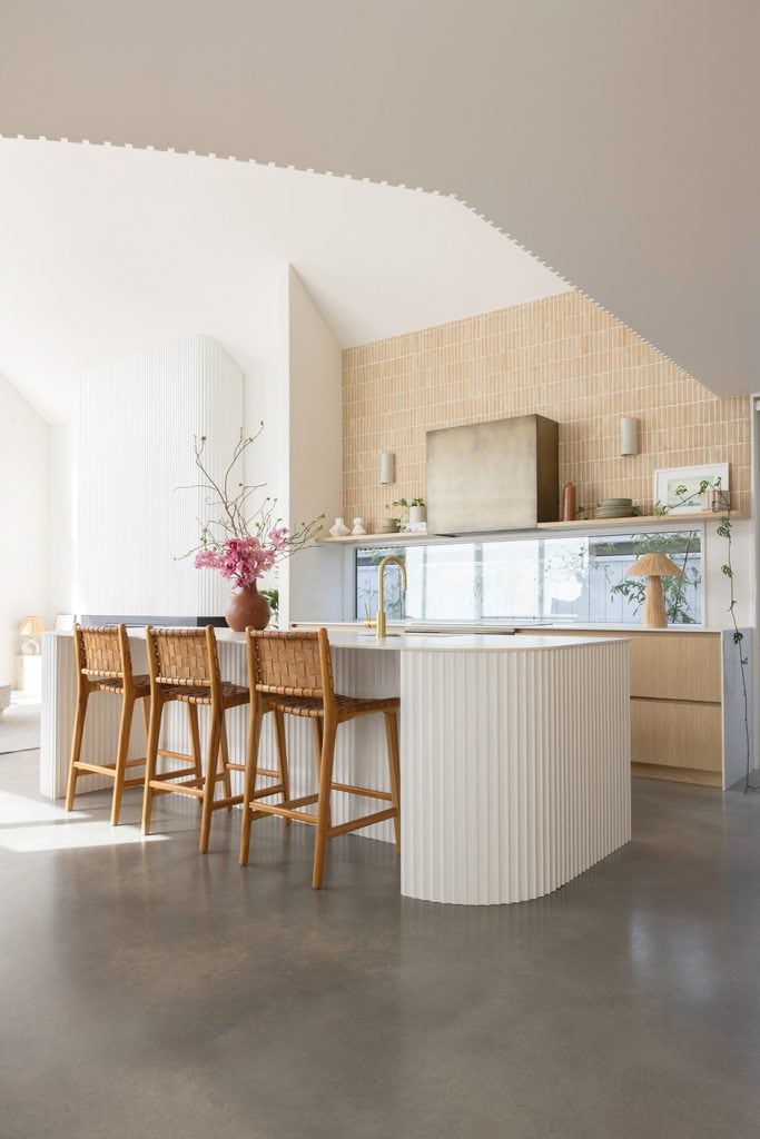
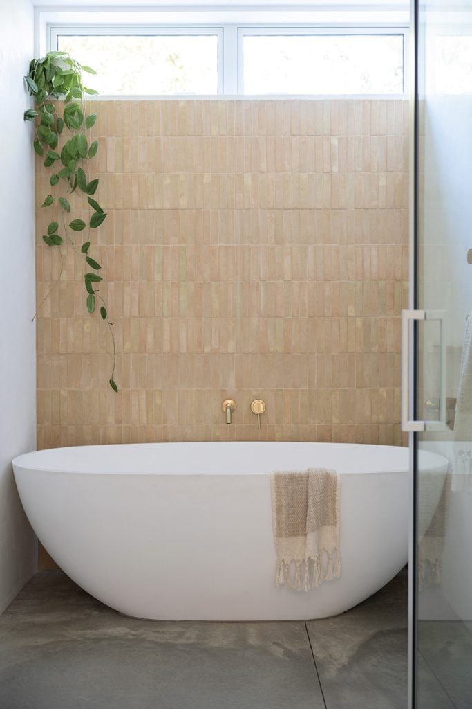
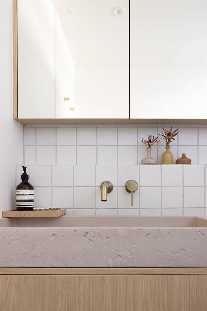
If passers-by were able to get a good gander inside, they’d see spaces that capitalise on the double-height void created by the roofline to produce a serene airiness. Enlisted to collaborate with Hat and Karl to give them a fresh perspective on their plans, Abbie championed a deliberately limited but highly textural palette of materials within the rooms to retain interest: rendered plaster walls, handmade terracotta tiles, concrete flooring and sinks, ceramic sconces and so on.
“The long, linear house was designed to best fit the section, so my direction was to soften the hard lines of the architecture and bring movement and texture into the design,” says Abbie. “I create interiors that are focused on evoking a feeling, and here we wanted to create a relaxed environment, so we used lots of handmade materials — nothing too perfect, which helps give a new build soul.”
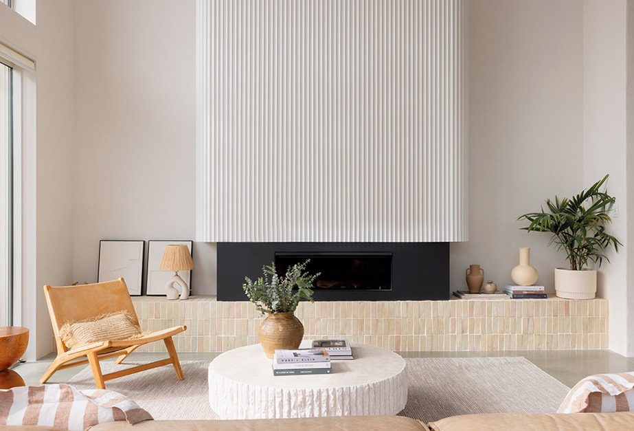
Abbie’s vision also ushered in curves — “nine in total, as one of Karl’s builders pointed out,” says Hat. “They might have been a bit of extra work for the guys, some of whom weren’t quite so excited by them, but they’ve added a sense of softness and look so good with the plaster.”
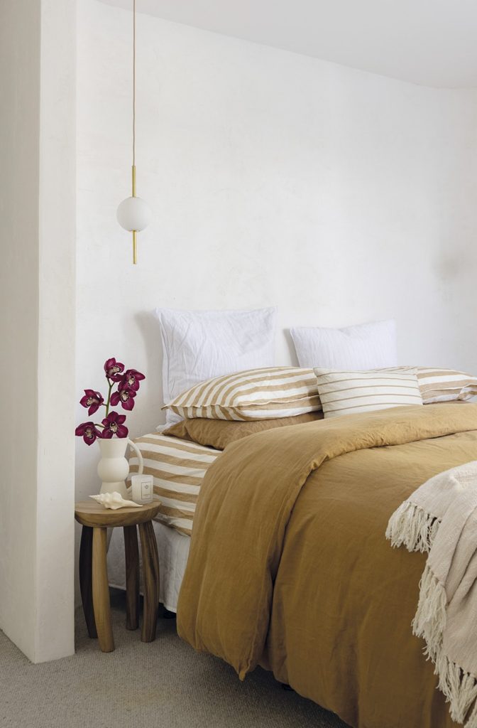
It’s all in a colour palette far removed from the aforementioned lurid red and dire brown, one Hat describes as autumnal: olive, beige, terracotta, creamy whites. “When I was a kid, my mum spent hours limewashing our old stone house a terracotta colour and painting the windowsills green, so for me it evokes a sense of nostalgia.”
Abbie really came into her own in the kitchen, enthuses Hat. “Initially, we didn’t have the curved mezzanine area above it and when she pitched this game changer, as she called it, Karl and I both fell in love with the idea. We crossed our fingers and toes that Aaron was going to be on board, and luckily for us he was, as it couldn’t have worked out better.”
“I was so thankful that Aaron was open and excited about the evolution of the design, and that he made it happen,” says Abbie. “That architectural change really inspired the rest. Curves all day every day!”
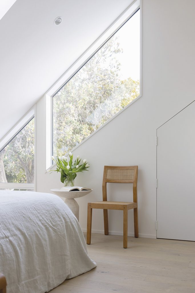
As well as a guest suite, office nook and second living space, the mezzanine level leads onto another highlight: a secret kids’ hang-out in the roof cavity. Accessed through a child-sized door in the guest bedroom and pull-down stairs in the garage, it’s the result of an idea Karl pitched to put function and fun into a disused space. “We had to ditch a skylight in the downstairs loo, but the appeal of a hidden room was too good to pass up,” he says. “It’s 18m2! You shut the door and can’t tell there’s a heap of noisy kids in there.”
Similarly maximising the available space, storage was prioritised at this address. Because of the intricacies of the project, it was three years before the family were able to move in, during which time they never fully unpacked. “I feel like we lived amongst clutter for years, and that was on our minds during the planning,” says Karl. “We have built-ins everywhere, there’s heaps of storage under the front deck, the loft above the garage is storage, and the garage itself has surfboard, bike, ski and skate racks for the ridiculous amount of sports paraphernalia that can be accumulated by a family of five.”
“We’re not naturally super-tidy people, so it’s been amazing to be able to throw things at endless cupboards and pretend we’re put together,” says Hat. “When people walk in, they say this house has a calm, spa-like feel. That’s good, because when you inject our family into it, with wrestling kids, competing devices with the sound up too loud, the fridge beeping because someone’s left it ajar and Chief Te Puke the dog manically chewing on things, it’s like the calm to our storm.”
Words Philippa Prentice
Photography Anna McLeod
Styling Abbie Herniman

