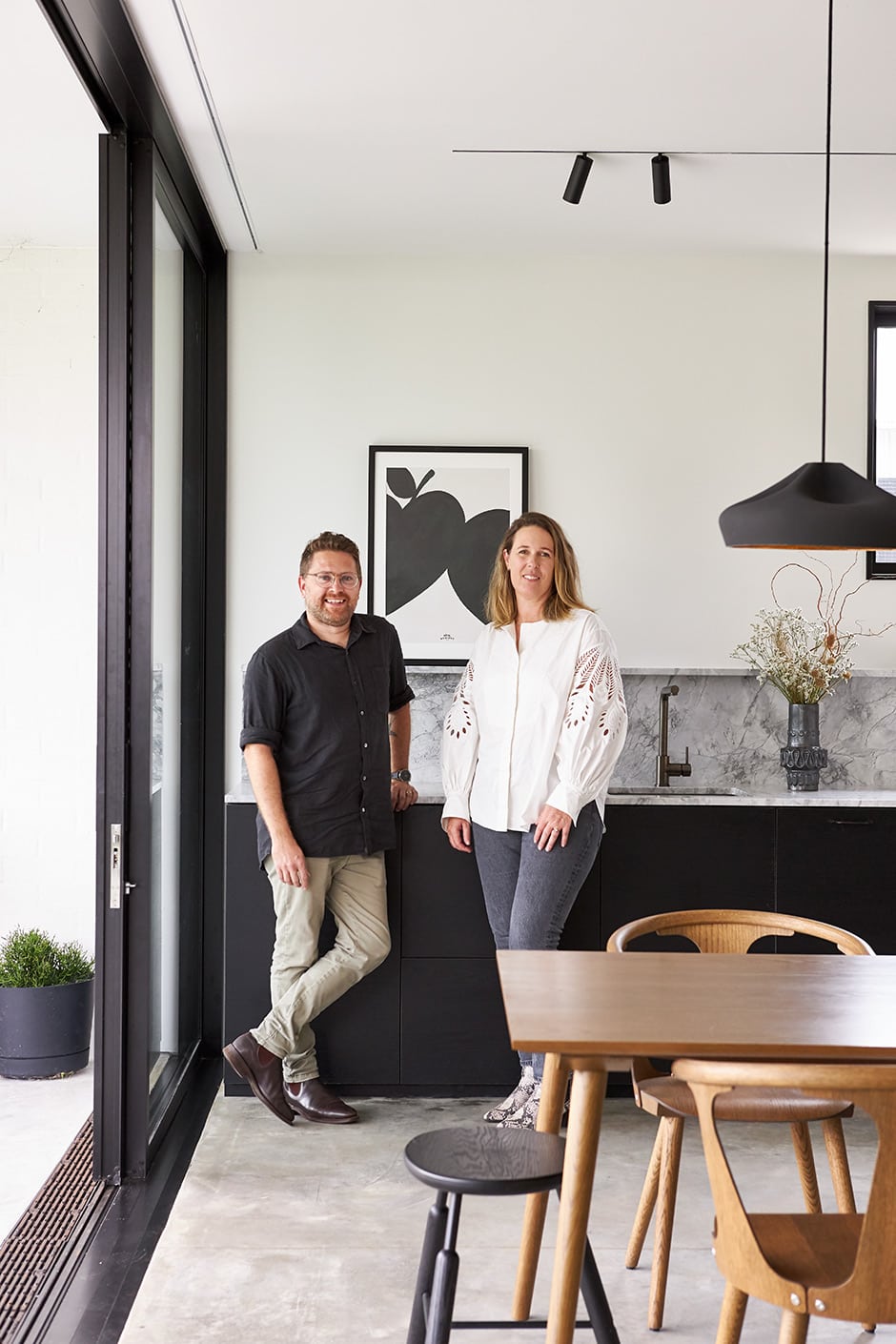
This home designed for her family is a true expression of her preference for pared-back and connection to outdoor spaces.
Some people like their architecture with all the bells and whistles front and centre. Others prefer buildings in which the expert solutions that enhance everyday life are skilfully hidden from view. For architect Rebecca Walker, less “Look at me!” is definitely more — and never more so than when it came to designing her own home.
“I like things that aren’t too fussy,” she says. “Sometimes it’s harder to get them looking simple, but that’s always my goal.”
Rebecca has lived at this Mt Albert address for 22 years, in a bungalow that became home to her husband Daimhin Warner and their children too. They all enjoyed the old house, but Rebecca feels strongly that Auckland needs more density, so they recently had it moved to the rear of the property. It was the first step in a thoughtful development that makes the most of the large site while providing the family with a more urban lifestyle — no more gardening all weekend, every weekend.
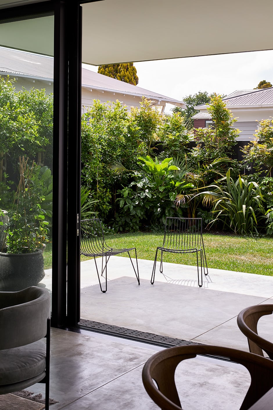
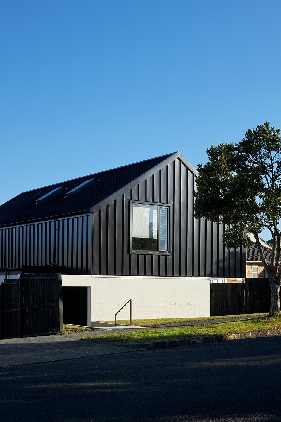
Translating her and Daimhin’s vision into architectural plans, Rebecca meticulously designed a three-bedroom home that presents as one simple form. Two L-shaped brick walls on the front and rear corners serve as enclosing elements, with floor-to-ceiling joinery set into them. A second storey floats above the first, with cantilevered overhangs that allow for a car to swing into the garage at the front, and make the low-maintenance courtyard usable year-round at the back.
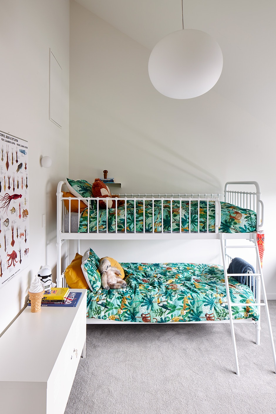
“The site is quite narrow, so the shape of the house was dictated by height-to-boundary controls,” says Rebecca. “We got around this by pitching the roof, and allowing the ceilings to follow the roof line. They’re quite low at the outer edges, then soar up to the ridge.
“With buildings close by, the other challenge was the view lines,” she continues. “We resolved this with the use of skylights and top-down blinds, so you can see the sky without losing your privacy. We particularly wanted a view out to the Waitakeres from the master bedroom and up to Mt Albert from the media room, and carefully placed windows have achieved this.”
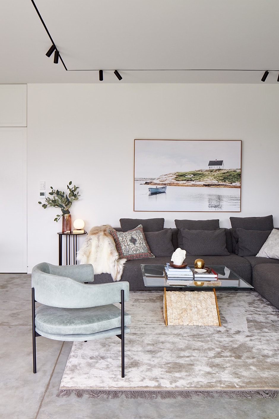
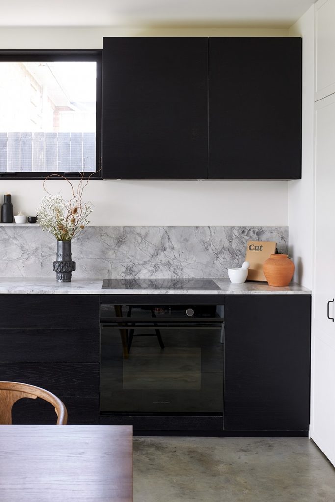
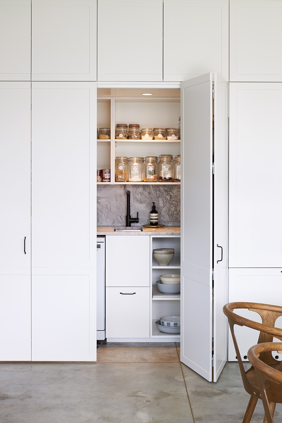
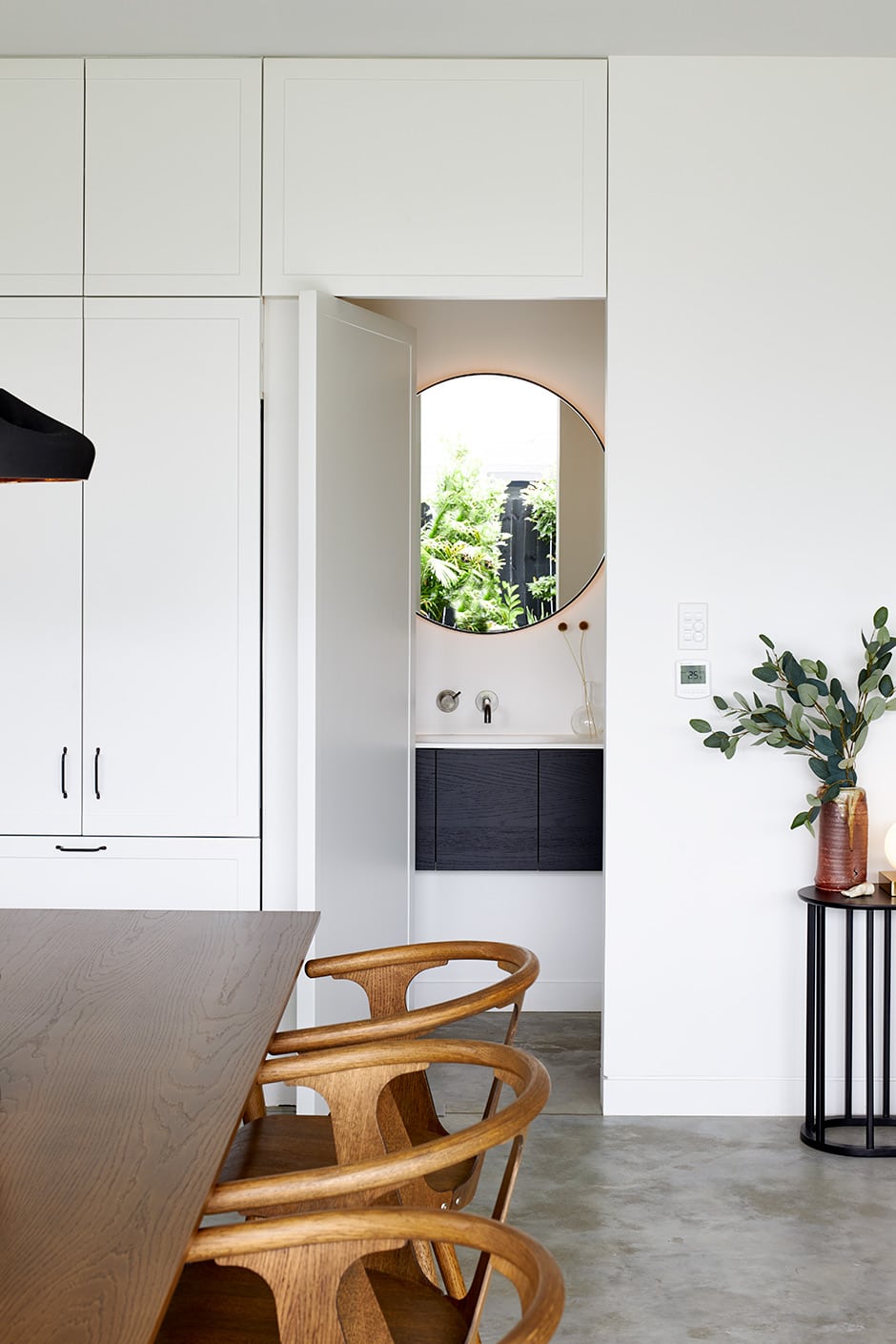
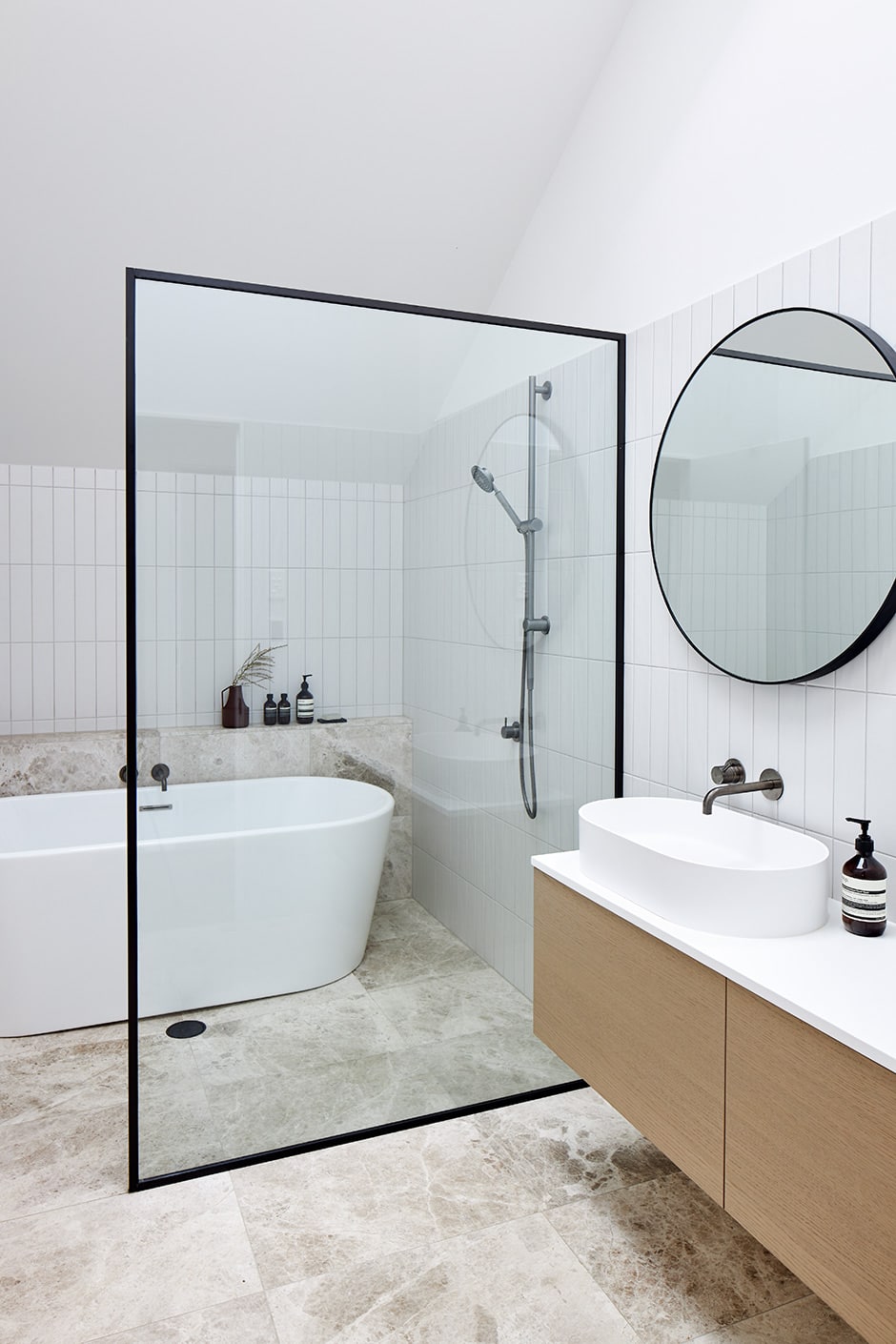
In keeping with her restrained approach, Rebecca concentrated on concealing and integrating as much of the functional detail inside the home as possible. Built-in cabinetry hides a scullery and powder room, and provides storage that removes the need for extra furniture, creating more room to move and entertain, and reducing visual clutter.
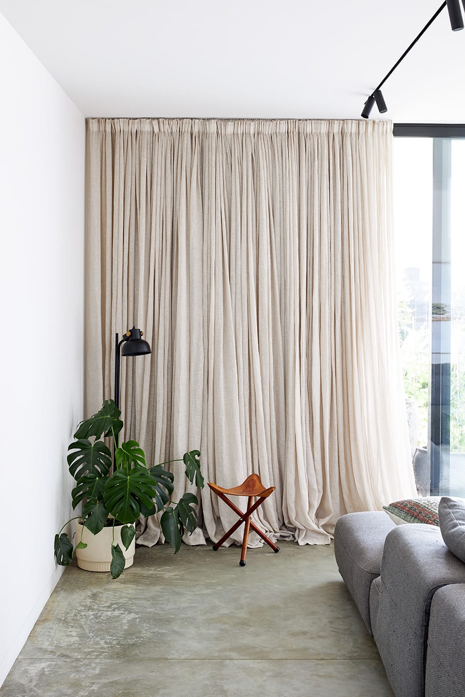
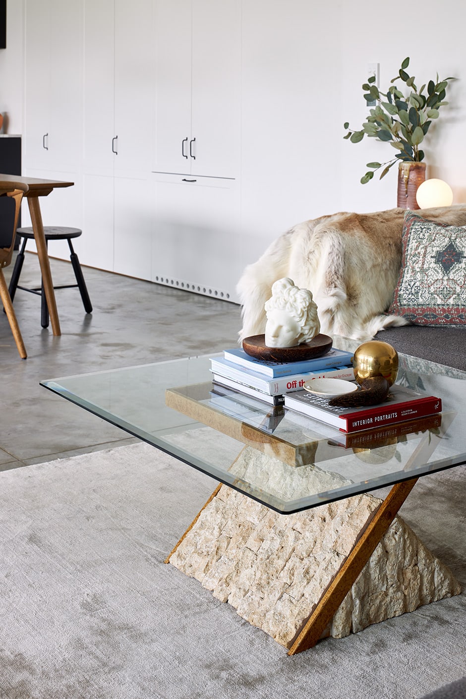
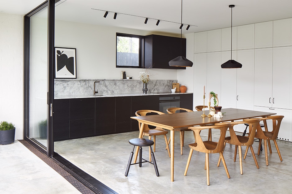
To stop the minimalist home feeling cold, the interplay of texture and colour was also a key focus. “I wanted to make sure we had lots of clean surfaces offset with textural ones, and went for a warm, tonal colour palette,” says Rebecca.
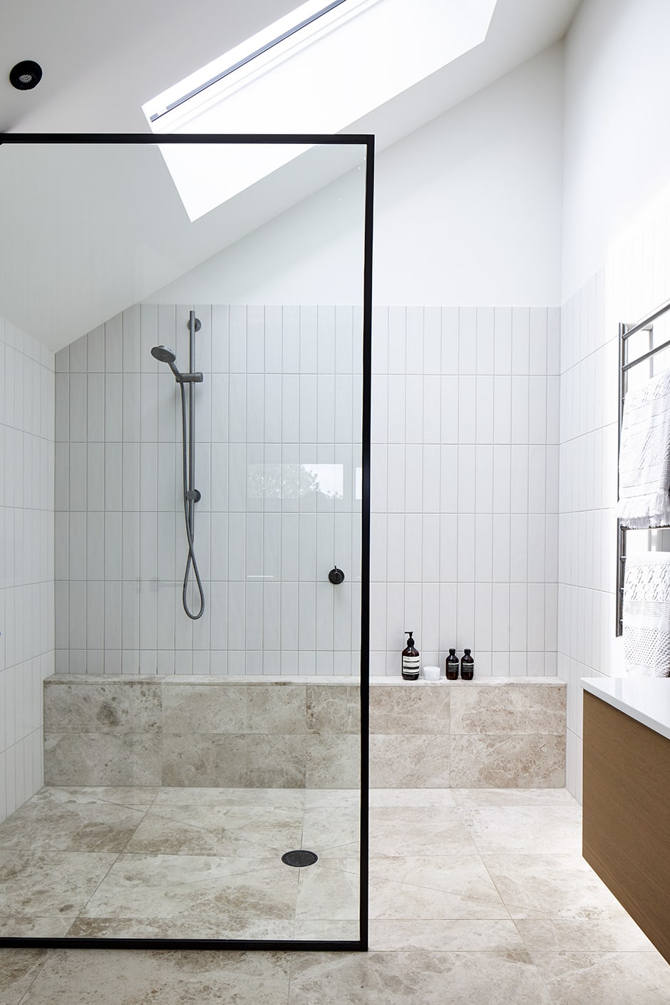
The décor in this dwelling is a moveable feast of well-crafted pieces that Rebecca loves to rearrange. Her styling is a constant process she prefers to set against a neutral backdrop, and a service she also provides for her clients, whom she assists with everything from master planning to furniture selection. On her own project, she managed the entire planning, subdivision, design and build process, and says it became all-consuming — in a good way.
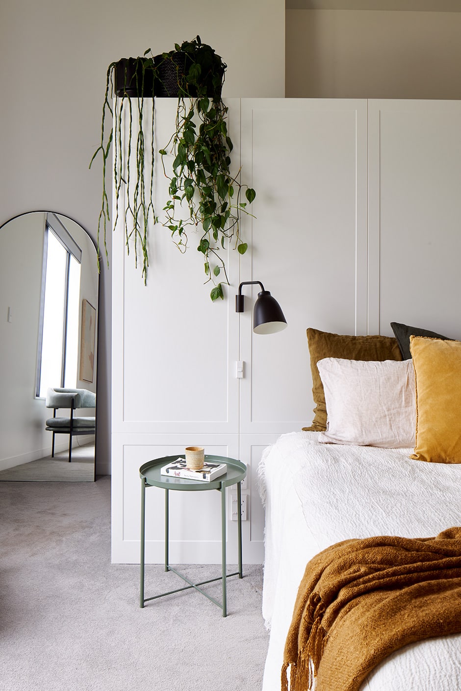
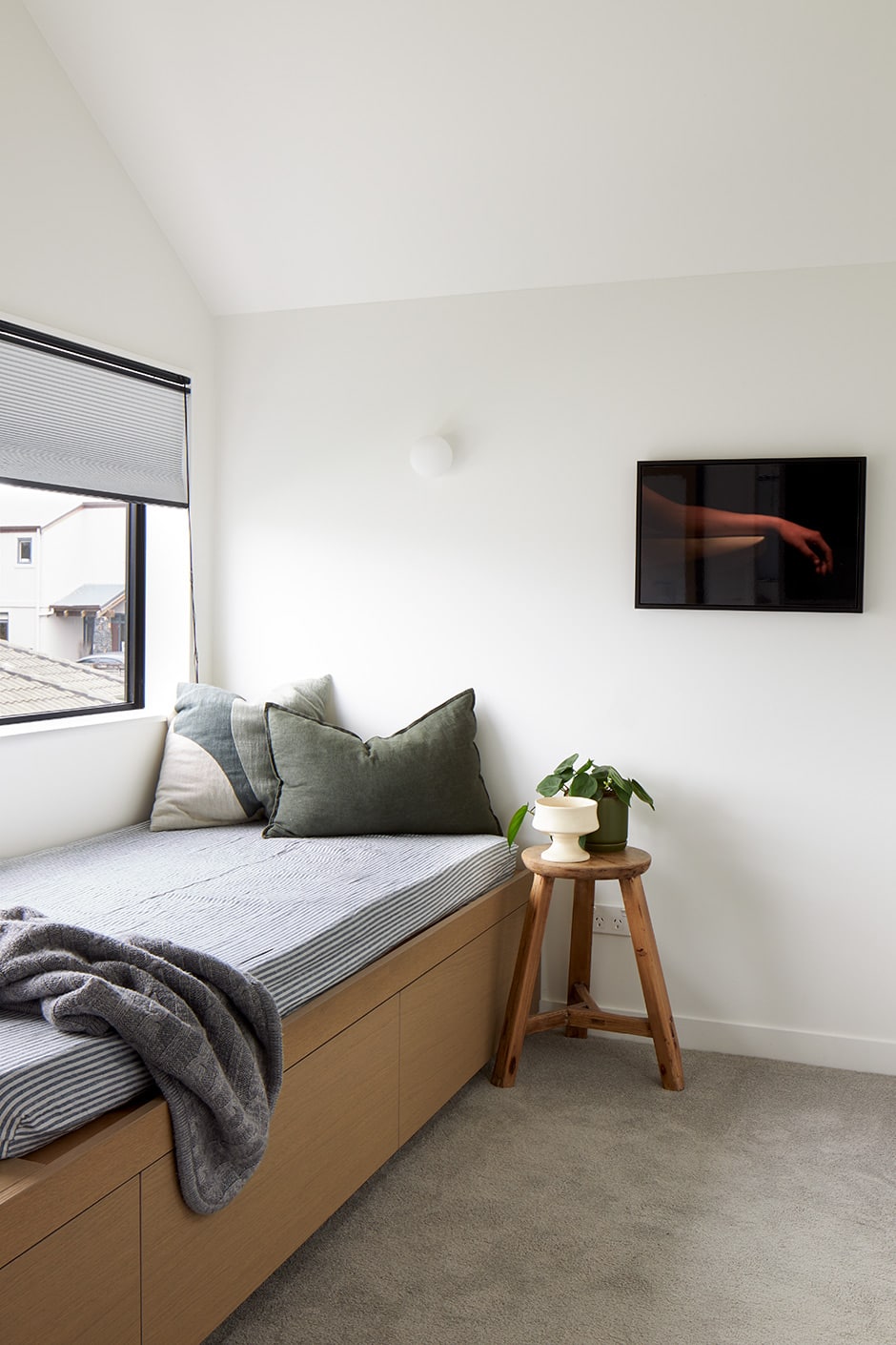
“I both felt the burden of and really enjoyed making all the decisions. Daimhin quickly realised that this was my baby. I’d say, ‘We have a decision to make’ and give him the options, then he’d choose and I’d say, ‘No, that’s the wrong option’! But it’s so sweet because he’s very design-led yet seems to like everything I do.”
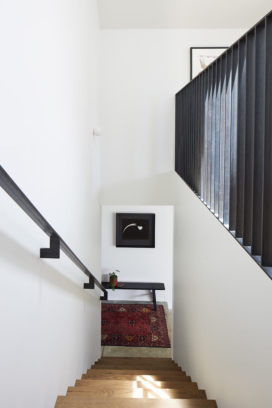
Despite the heavy workload, Rebecca’s not one to cut corners. Take the home’s central stairwell, for instance, which wasn’t meant to be a big deal, but became the single most expensive element and one of her best-loved spots.
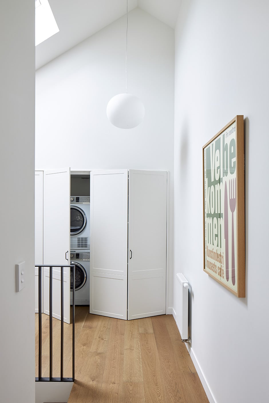
“The oiled-steel balustrade and handrail were a bit of a splurge,” she says. “I tried to do an economical solution, with a half-height wall with steel detail around it, but when I saw how it looked, I was like, ‘No, flag it, pull everything out.’ I really wanted the transparency. It was a bit nail-biting because it held everything else up while I quickly redesigned the stairwell, but the builders [Earlybird Construction] were patient and Powersurge are very kind and do all the last-minute steel nonsense I dream up.”
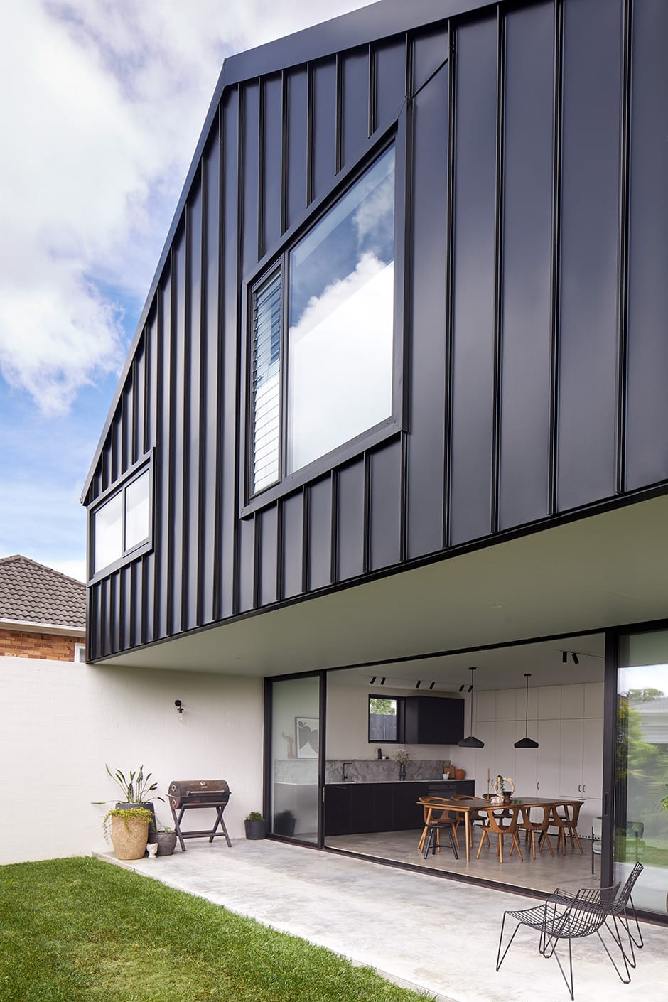
This sophisticated abode gives everyone in Rebecca and Daimhin’s blended family space to come together or do their own thing, yet isn’t so big that they feel disconnected. “I’m most proud of the harmonious feeling the house gives,” says Rebecca. “No matter how many people we have here, it seems to accommodate everyone, and that’s my absolute dream — not a house that looks a certain way for the sake of design, although that is important to me, but one that feels really welcoming.”
It’s a home that’s undoubtedly impressive, yet not in-your-face fancy. “I love the level of cohesion and detail — it’s absolutely my highest achievement to date — but I’m not here to impress anyone,” says Rebecca. “I feel like I’m at a stage in my career where I’m sure of what I’m doing; I want to do what I like and think looks good, and this is a pure expression of that.”
Words Philippa Prentice
Photography Simon Wilson

