Among the nuances of the past few years has come a deeper understanding of the comfort and joy our abodes can bring to our lives. We’ve recognised just how much good house-related choices have to offer.
One creative who advocates for the power of colour in evoking a positive outlook is architect Aaron Paterson, director of Tāmaki Makaurau/Auckland practice Pac Studio. Although he usually designs homes for other people, one of his recent projects was his own: the renovation (with builders New Wave Construction) of his family’s 1910 transitional Mt Eden villa, which as well as the construction of an extension, saw virtually every surface updated with paint — 17 hues all up.

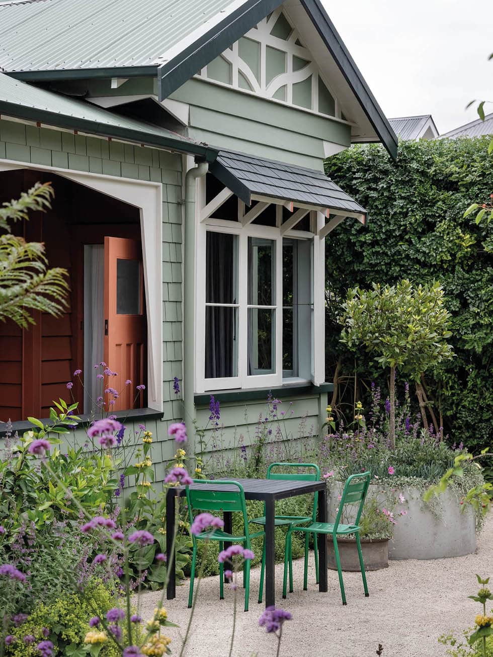
Aaron and his wife Kate’s approach is a refreshing take that embraces colour in a way that welcomes but doesn’t overwhelm. It’s a sign of exciting times for New Zealand homes, he says. “Everything was all white for years, which had its charms, especially for houses filled with art, but it became somewhat dull. Some of the houses Pac Studio is working on now feature colours that are really fun and daring. Paint is cost-effective compared with construction. You can easily repaint without significant financial loss if you don’t like it. It’s a DIY approach.”
The couple were living not far from here in Pt Chevalier when their need for more than their existing 90m2 of space became undeniable — for Kate, who’s a wheelchair user and required a home with a better flow to the outdoors, and for their teenage sons Oscar (17) and Ira (15), who were only getting bigger.

Rather than search in a particular suburb, they set their sights on purchasing the right villa wherever it popped up, since villas tend to have wide corridors and doorways that increase their accessibility. “Wide hallways allow for easy turning circles,” says Kate. “Villas are also quite close to the ground, making them easy to get in and out of.”
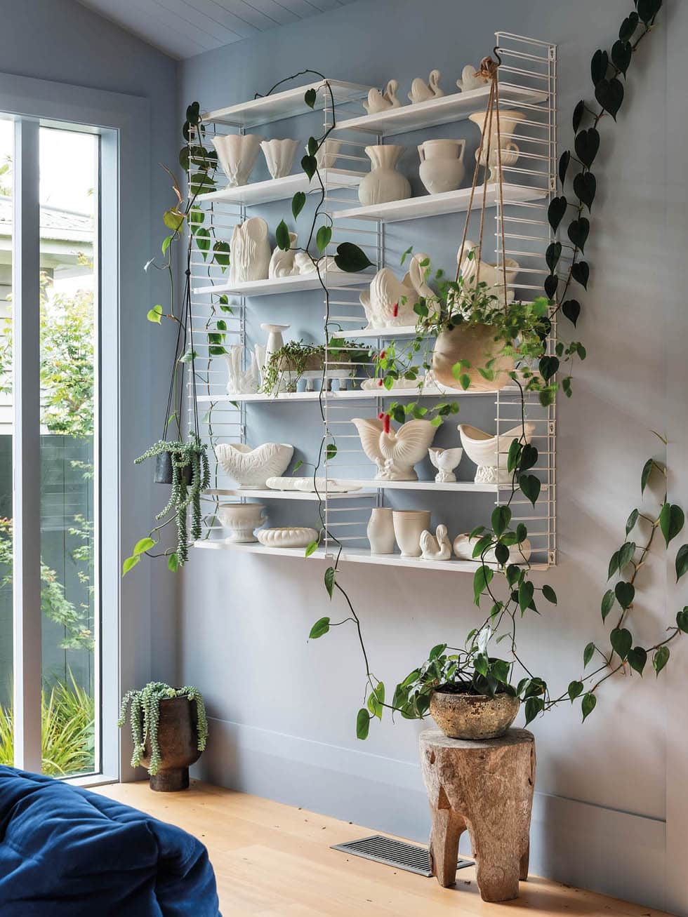
Aaron and Kate were drawn to this home by its flat site, large front verandah and inherent elegance, but they weren’t so keen on the small kitchen being at the middle of the house and the fact that at some stage, the villa had been divided into two flats, resulting in lots of doors. “We envisioned transforming it into a beautiful house nestled within a garden,” says Aaron. “The goal was to revitalise it, using colour to highlight its quirky features.”
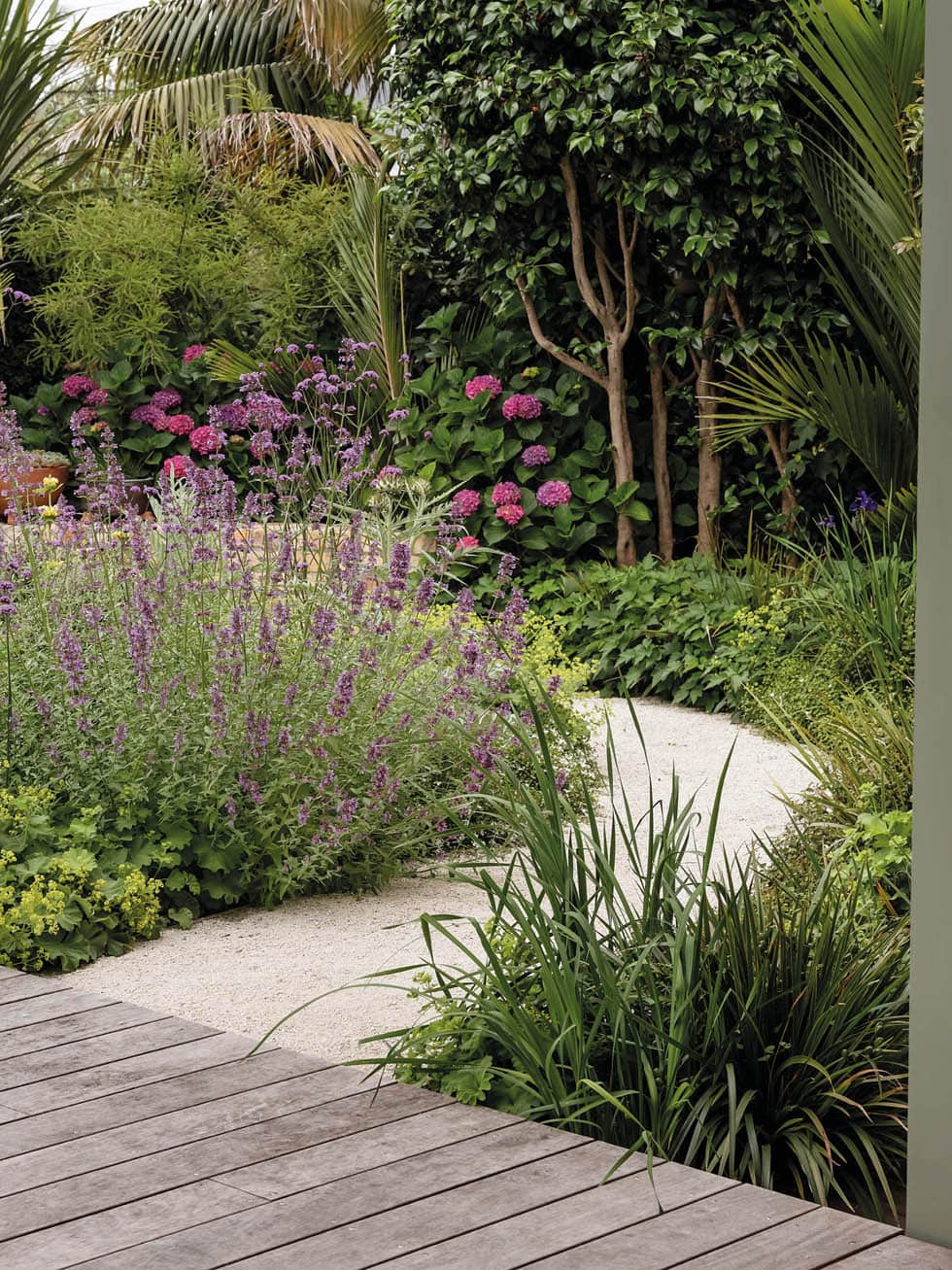
Aaron reconfigured the interior spatial arrangement to improve its flow, moving the kitchen and living spaces to the back of the house, where ramps now connect to a flourishing garden by Xanthe White Design and Worth Landscaping (as seen in our October/November 2023 issue and online), with circular pathways and waist-height planters. That left the front of the dwelling to house four bedrooms, which each embrace colours that are playful but ultimately calming. Aaron describes the strategy simply: “We just tried different things in different rooms.”

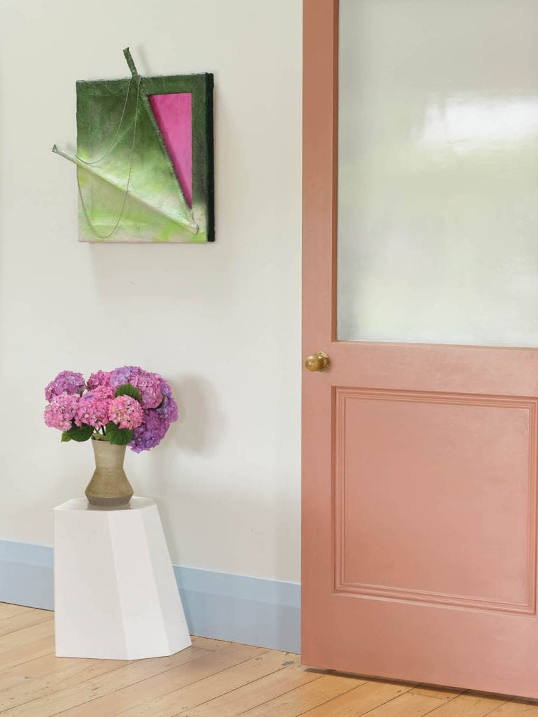
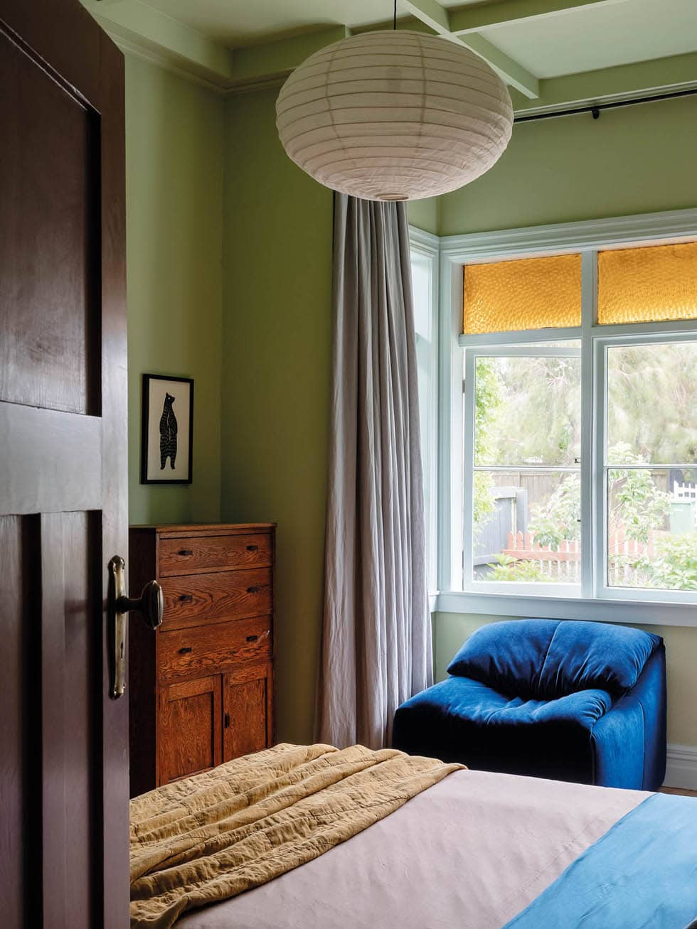
In Kate’s colour-blocked bedroom, peaceful green envelopes the ceiling, walls and skirting boards. In Ira’s room, they painted the trims spearmint, which works well with his amber window panes. In his and Oscar’s bathroom, pink, green and blue look as if they’re made for each other. “We didn’t do any work to this room as we plan to alter it eventually, so we went nuts on colour instead,” says Aaron.
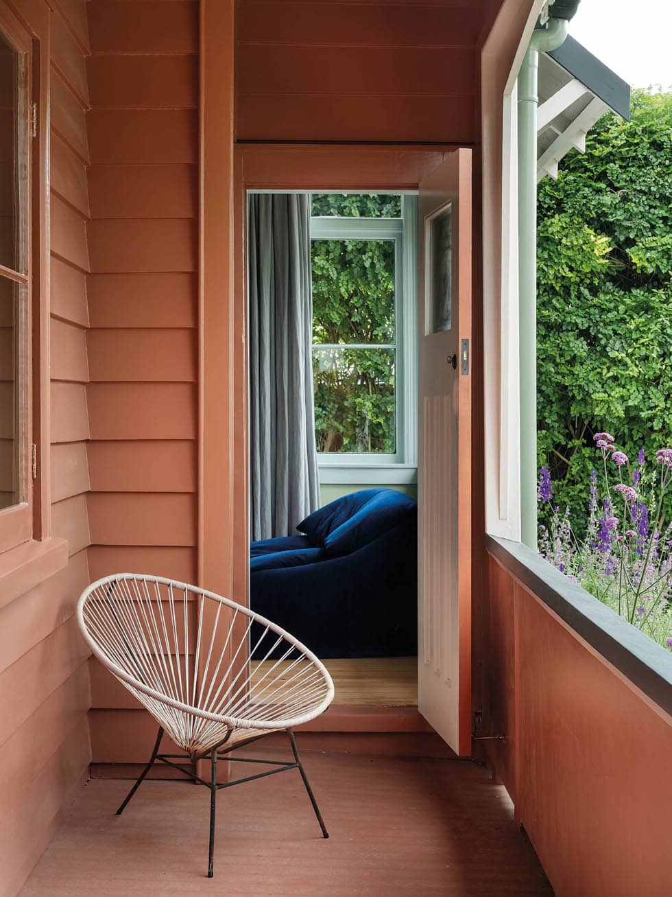
All of the shades Kate and Aaron chose are dusty with grey undertones, which allows them to harmonise despite the different spots they inhabit on the spectrum. “If you stand in any bedroom and look out beyond the doorway, the hues on the hallway walls present a colour journey for the eye that ultimately works,” says Aaron. “You wouldn’t necessarily think pink and clay go together, but when you put them beside each other, it’s relational. You’ve got different planes of colour, and they’re all framed by other colours, and they have to work together — otherwise, it’d be chaos.
“The shades are distinctly architectural, blend naturally and can be mixed freely,” he continues. “This approach is inspired by Le Corbusier’s architectural polychromy concept, in which colour is used to add volume to spaces.”
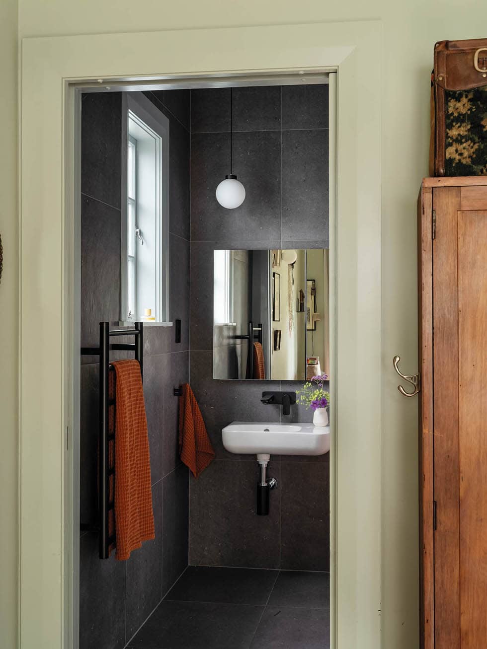
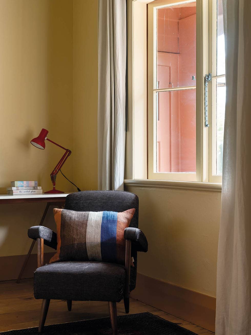
Of the white that remains in the home, Aaron says it’s handy when you place different hues next to it because it’s good at reflecting them. “Just like when you put different types of colour next to each other and it changes the relationship, sometimes you can use white next to a colour and it changes the tone.”
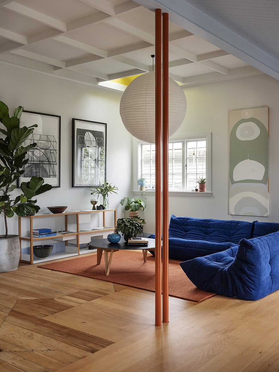
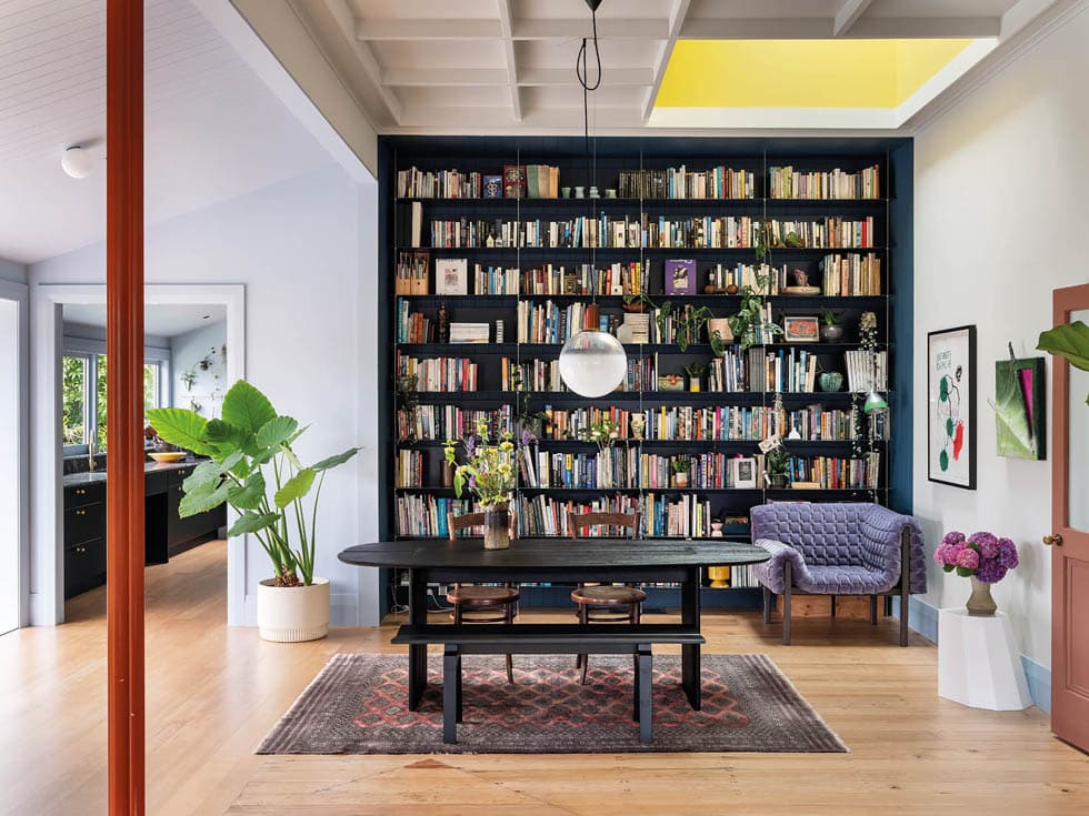
Le Corbusier’s ideas about bouncing light off surfaces are actioned in the two skylights that have been cut into the ceiling grid of the dining and living spaces and painted with a yellow hue that beams down into the room. “Taking into account the house’s orientation, the light wells are positioned to allow direct sunlight,” says Aaron. “They get morning and afternoon sun, and due to their angle, you get a really good, cutting light that changes the tone of the room. It’s a yellow light, which you associate with the sun, so you feel as if you’re always outside. It gives a golden glow that’s really lovely.”
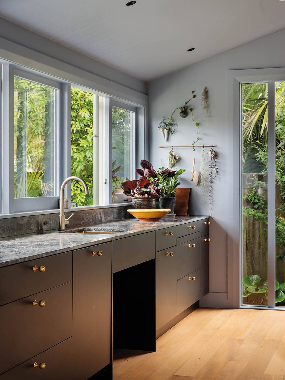
Also in this space, a chimney was removed and replaced by two poles that the couple painted a burnt orange. From here towards the back of the house, marking the new extension (which ended up being relatively small, since the house was already a generous size), the rest of the living space and the semi-connected, accessible galley kitchen are painted pale blue. Here, the lean-to has been rebuilt and features tongue-and-groove panelling to tie in with the home’s precious heritage.
“We’ve jumped all over the colour wheel here, but it all works because tonally [the shades are all] quite similar,” says Aaron. Using this century-old villa as their canvas, he and Kate have taken a more-is-more approach that shows just how much of a joy colour can be.
Words Catherine Steel
Photography Sam Hartnett

