Magazine

A Ponsonby villa renovation full of surprises

Maximised spaces, enduring materials and beautiful design make this architectural project by Jose Gutierrez something very special.

Business-as-usual in the front and party-ready in the back, there’s more to this villa than anyone would suppose from the street. Thanks to a thoughtful renovation driven by the finest design details, it gently embraces the best of both while catering impeccably to its inhabitants’ interests.
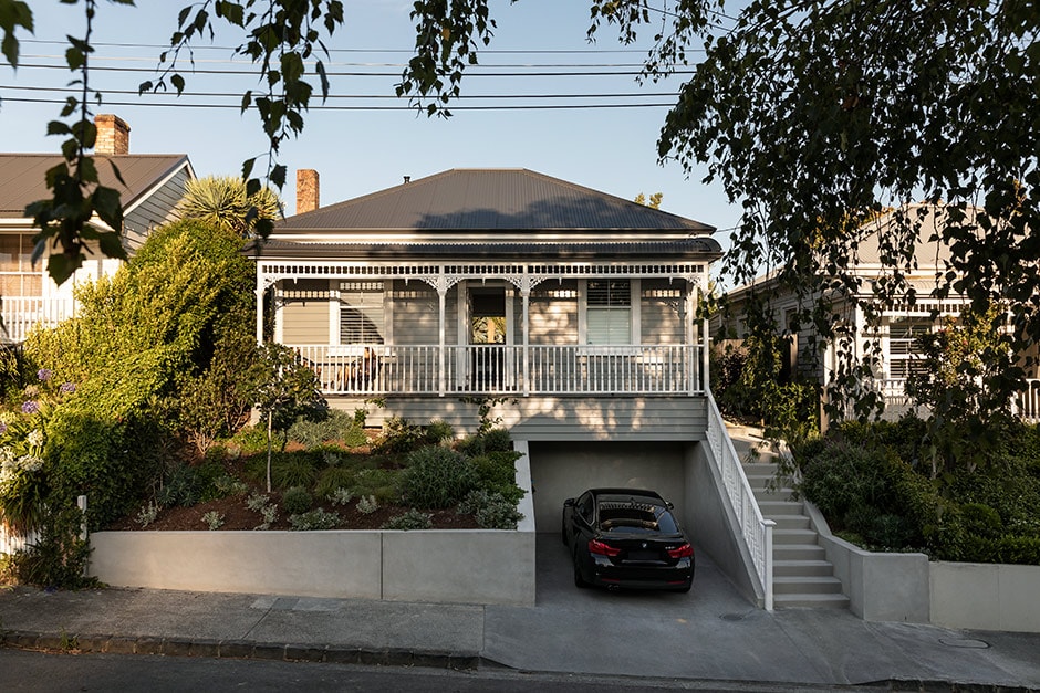
Looking pretty passé after an update in the early 2000s, the circa 1910 Ponsonby villa wasn’t Amber Coulter and Andrew Lewis’s dream home when they discovered it, but they signed up knowing one day they’d make it ‘them’. Eight years after moving in, they moved out into a rental across the road, ready to roll with a reno. 

MAIN IMAGE Landscape with Figure Reflecting on the Confines of Space by Alan Ibel from Sanderson Contemporary catches the light in the living area. ABOVE The design and elevation of the home’s frontage remains completely unchanged (the only additions to this area being an off-street carpark and concrete staircase); it’s painted in muted grey Resene Stack, with Resene White highlighting the intricate villa detailing. Amber says she and Andrew love the playfulness of this light-dark contrast between front and back.


Along with builders Crate, cabinetmaker Cameron Grey and landscape designer Andy Hamilton Studio, Jose Gutierrez (who’d previously designed two award-winning office fit-outs for their insight agency TRA) was their go-to collaborator, leading the architectural design. “Jose is an old friend of ours and although they say never to work with friends, children or animals, it suits us!” says Amber. “There’s mutual trust and respect from day one and we have lots of fun.”

ABOVE The extension’s dark shell (in Resene Cool-Colour Black) is alleviated by the lightness of the interior materials (including American oak, custom-stained veneer by Cameron Grey, anodised aluminium joinery and steel) and predominantly concrete outdoor elements.

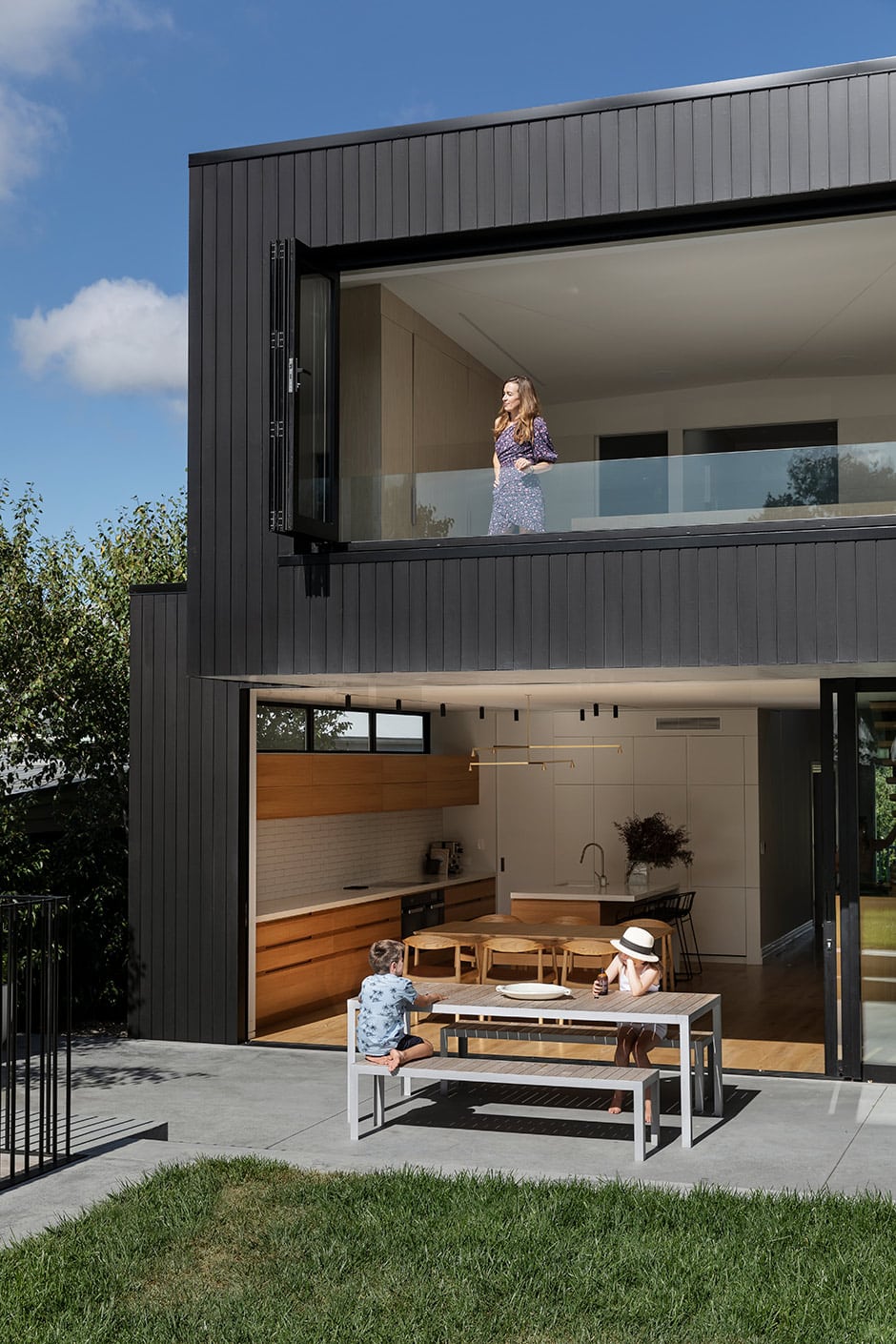
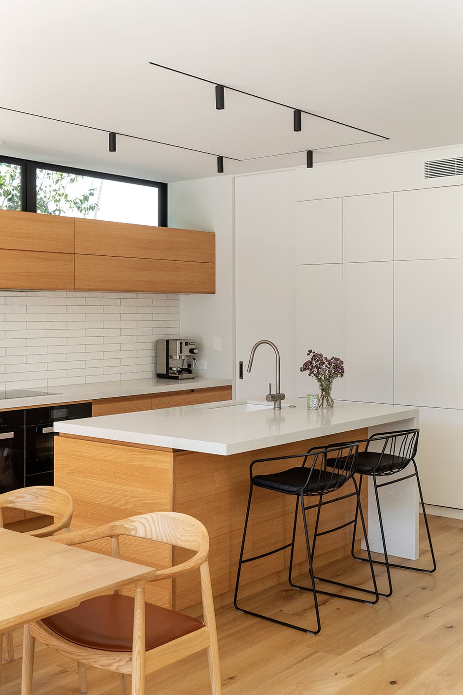
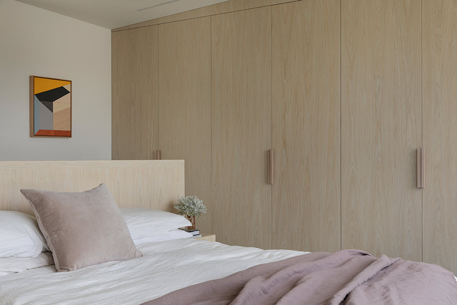
The overall vision was to create something beautiful from a design point of view that championed flexible, maximised spaces and enduring materials. This saw the home almost completely rebuilt — apart from the facade, where the villa’s traditional elements were carefully restored. Inside, the original floorplan remains at the front, but beyond this, two stacked monolithic masses house new living, dining and kitchen spaces, plus a new playroom/guest bedroom, master suite, library and study. All this flows effortlessly into the reimagined garden, with pool and entertainment areas that have fast become low-key party central.

ABOVE With a raised lawn, pool and spa at the rear of the section, “It’s a good party house,” says Amber. Previously based in the UK, Andy Hamilton was the ideal landscape designer to inject hints of English country garden into this Ponsonby plot, which the couple wanted to be less well-behaved buxus and more useful. “We love being able to walk from the kitchen directly out to pick ingredients,” says Amber. “We have vegetables, herbs, feijoas, lemons and limes out the back, and out the front we’ve got fig and orange trees.”

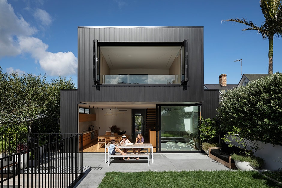
Intentionally juxtaposing old and new, the home’s facade is painted grey and white, while the pared-back black exterior of the extension sets the new architecture apart. “The complete contrast works because it’s such a surprise,” says Amber. “People are a bit shocked when they first come in, as you have no idea from the front.”

ABOVE The interior colour palette sees a grey base warmed with oak, sage and lilac accents. “We made the decision to replace pretty much all of our existing furniture in one go, so the renovation had a fresh and integrated look and feel,” says Amber of her decorating strategy. “Jose designed much of the cabinetry and we also chose pieces from BoConcept, ECC, Homage and Simon James.” Some of the other items seen here include cushions from Città, an IC F1 floor lamp by Flos, vintage ceramics from Babelogue, a pedestal bowl by Rachel Carter, and vessels and objects by Monmouth Glass Studio.

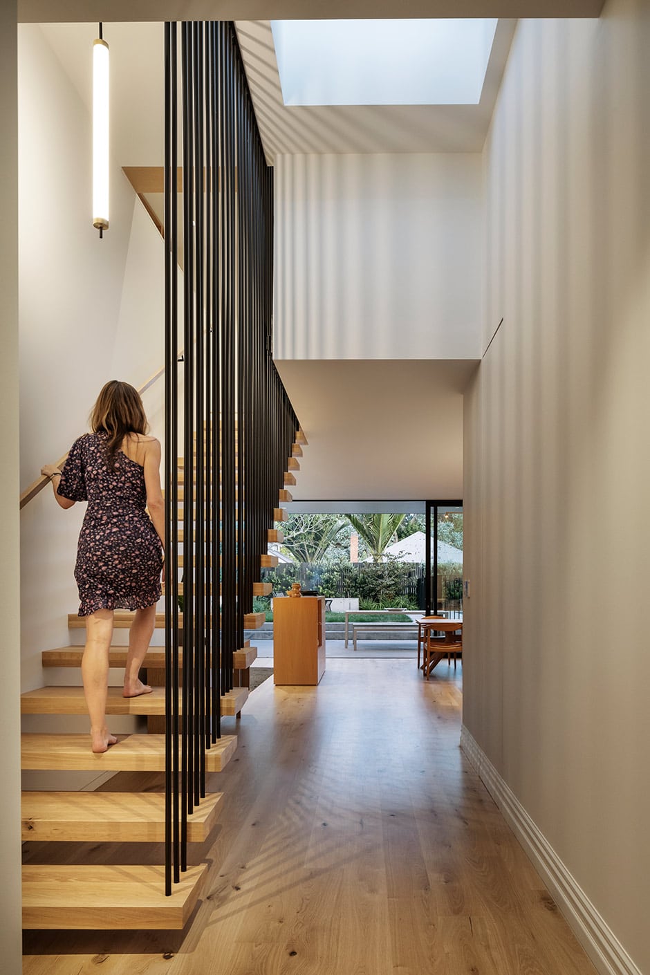
The couple had done their dash with dark spaces and low ceilings, so they wanted the interior to feel as light and open as possible. Expansive stacker doors, cleverly placed windows and supernal skylights help to achieve this, including a 6m light well that spans the full length of the living room, casting bewitching shadows at all hours. 

ABOVE Doors by APL open the living spaces to the garden and can be stacked left, right or centre for maximum flexibility, while hidden blinds by SP Blinds double as a movie screen when drawn; here you can see the film projector in its built-in cavity. The family’s extendable Cross dining table is by Case.

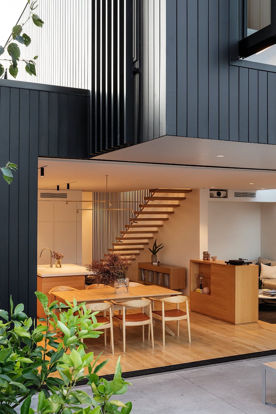
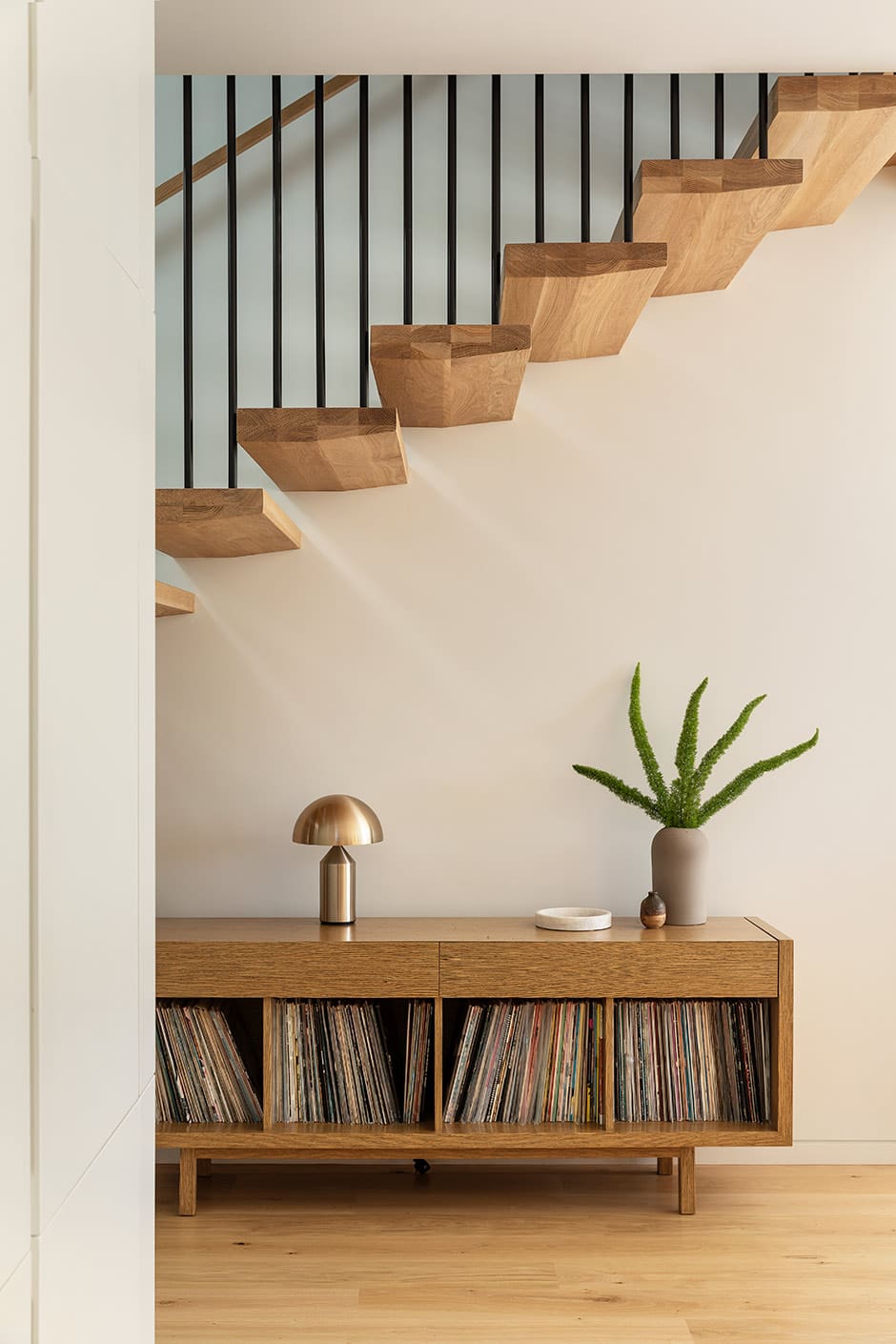
The slender floating staircase too is designed to amplify the spaciousness of the architecture. Ascending to the home’s new second storey with the utmost grace, “it’s like a piece of art,” says Jose. “My favourite part is the tension created by the gap between the first tread and the floor — the cantilever enhances the sense of space.”

ABOVE “Out comes my inner Nigella,” says Amber of cooking in the generous kitchen featuring Natura Bianco tiles from Artedomus and Calacatta Nuvo benchtops by Caesarstone. She loves the butler’s pantry for stashing away essentials, and the furniture-like island is another favourite — its cupboards were designed to hold her collection of royal-family china.

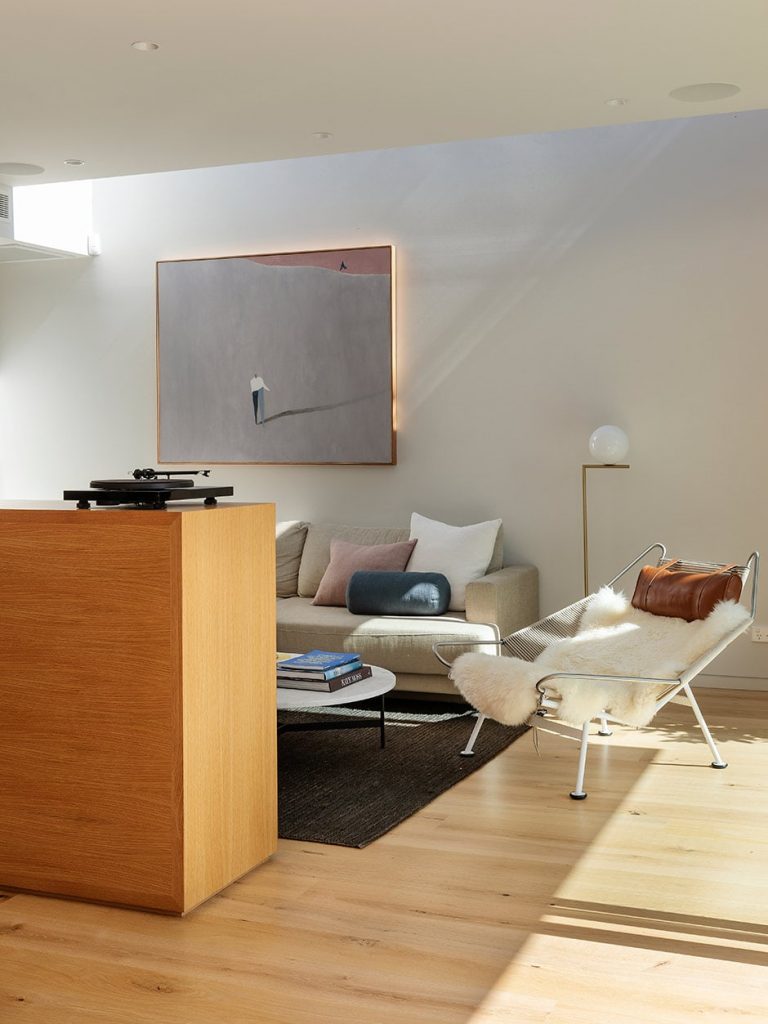
Jose’s attention to detail is equally evident in the cabinetry he custom-designed for this home, all of which references a hero piece on the lower floor. “A few years back, I designed a credenza for Andrew to keep his turntables and record collection in,” he says. “Since then, his collection has grown, and this need to house additional records turned into a piece of furniture that defines the lounge area. It also houses a TV and audiovisual equipment, and has a display space.”

TOP The kitchen is set up to run along the southern wall of the extension, with no direct natural light, so Jose inserted a line of opening windows above the cupboards to introduce diffused light while grabbing some of the greenery and blocking out the neighbours. ABOVE MIDDLE On this credenza by Jose sits an Atollo lamp by Oluce from ECC and Dome vase by Kristina Dam Studio. ABOVE Visible the moment you step inside, the staircase sets the tone for the aesthetic experience throughout the house. Lit by an Art Deco pendant light by Baulmann from Lightplan, it’s composed of oak treads and steel rods that accentuate the verticality and height in the central part of the house, and echo the materials used elsewhere, including the pool fence. Seen in the background of this photo, the delightfully deceptive coffee table/fire pit is by Kettal from Studio Italia.

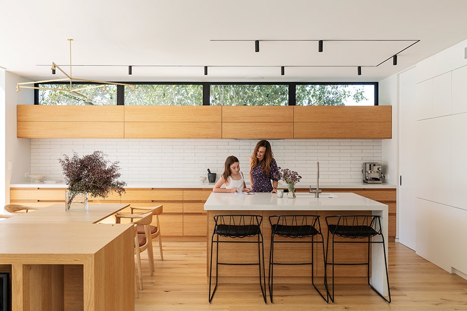
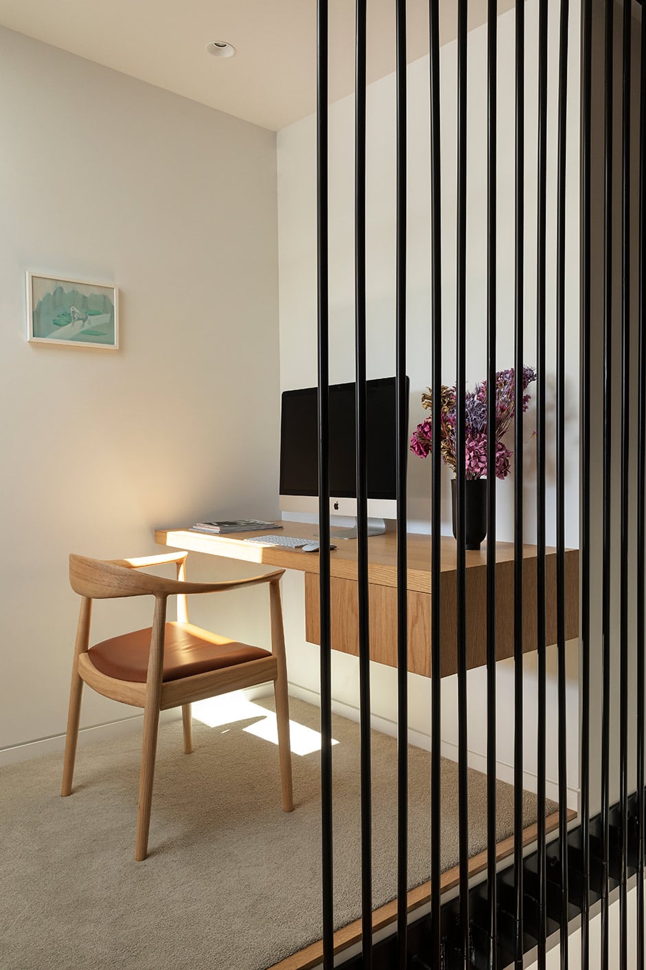
Amber adores the way this adroit house reflects how she, Andrew and their children India and Rafe live. “We designed it mainly around our interests,” she says. “We love cooking, so we wanted a big kitchen. We’ve ensured we have enough room for our books and records, and we love movies, so we’ve got a built-in projector that beams them onto the blinds in the lounge. Our extended family often comes to stay, but rather than having a spare room that’s unused a lot of the time, there’s a fold-down bed in the kids’ playroom, with a shelf on the back and a wardrobe on the side. We’ve got an Asko drying cupboard in the laundry for the kids’ sports gear and wet shoes, and outside, we have a fire pit that looks like a coffee table, but you pop the top and it’s a fire that we can congregate around at night. So it’s also about flexibility — even our pool has an in-built spa.

TOP The couple’s bed faces the rear of the site to capture the views of the city. His-and-hers wardrobes along each side of the room frame the bed, which backs onto a headboard with built-in side tables and storage, and on either side of the window are his-and-hers dressing table nooks. The Kinetic Over Stasis II artwork is by Louise Tuckwell from Sanderson Contemporary. ABOVE MIDDLE Shelving in the new library holds books and displays ceramics by Rachel Carter and woven baskets by Ruth Castle. ABOVE The 1.2m height of the couple’s headboard means it acts as a divider that defines the space between the private realm and this study nook at the top of the landing. Jose designed the built-in desk, to the left of which hangs I’m Beautiful No Matter What They Say by Saskia Leek from Art & Object.

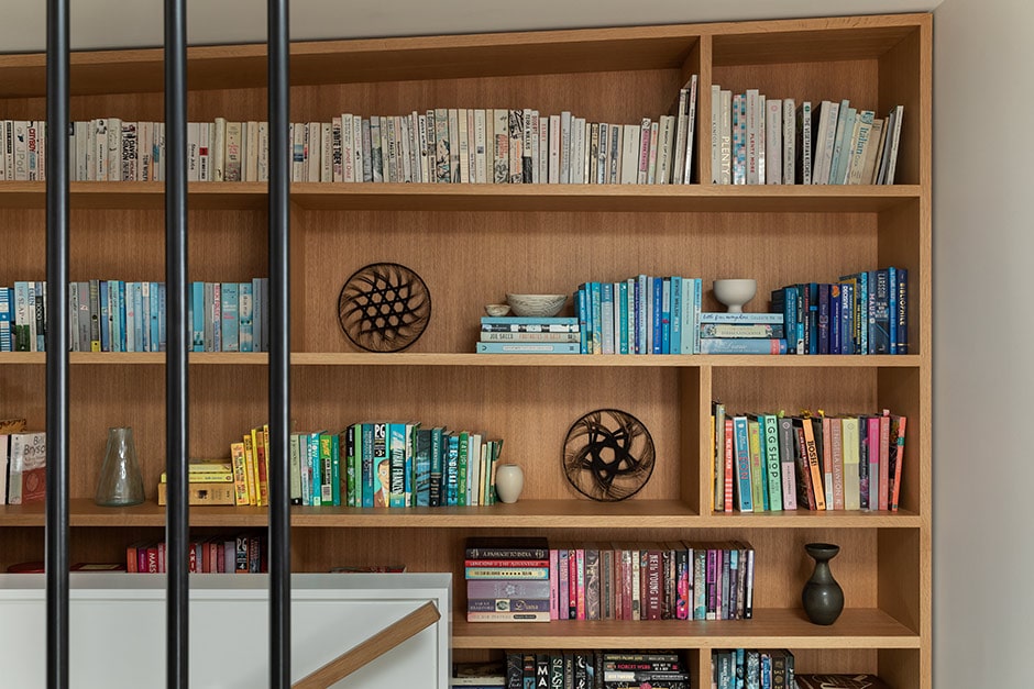
“One thing I’ve learned from Jose over the years is that good design has longevity,” she continues. “You don’t actually need a huge house, you just need well-designed spaces. Being around good design makes a real difference to how you feel.”   

Words Philippa Prentice
Photography Sam Hartnett
Styling Alice Lines

Filed under:

error: Copyright The Pluto Group Ltd 2022 - contact us for usage licence

Homestyle shares
modern ways
to make a home
in New Zealand


Sign up to receive the latest in your inbox

Thanks for subscribing to Homestyle's newsletter - we'll be in touch soon.