Gemma Rasmussen and Caleb Gordon bought their home sight unseen, trusting in its hidden potential. With Mark Leong of Studio Myla, they’ve turned wasted space into a successful new layout.
It’s a leap of faith that would make most homebuyers baulk, but Gemma Rasmussen and Caleb Gordon didn’t set foot in this home before they bought it. Living in Sydney at the time, they’d always planned on eventually returning home to Aotearoa. Their move was fast-tracked by Te Whanganui-a-Tara/Wellington’s skyrocketing property market. With the Tasman Sea hindering open home visits, their search relied heavily on property listings and photos, bidding and losing on multiple homes before this two-storey house in Island Bay came up. “I slept like a baby the night before the auction because I thought we had no chance of getting it,” remembers Gemma. “We bid over the phone during my lunch break and were genuinely shocked that we won.”
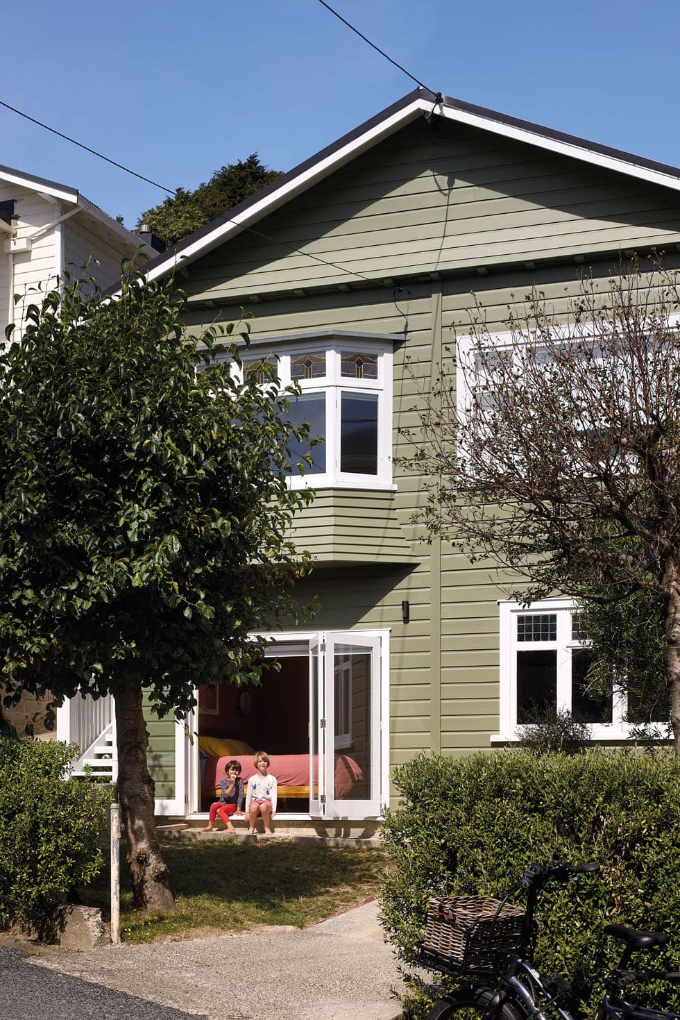
When they finally visited in person, first impressions were tempered. “Well loved” is how Gemma diplomatically remembers the home’s dark warren of small spaces. It had two bedrooms, a bathroom and lounge crammed across the top floor, with an unused, externally accessed garage and storage/office underneath. The place lacked pragmatism — yet it was rich in potential. “It sat on a quiet street with a big, beautiful backyard and north-facing sun hitting the front of the home,” says Gemma. “So we started dreaming up plans with Mark Leong of Studio Myla straight away.”
Although extensions are often the go-to for adding space, that’s not how this story goes. Instead, Mark turned his focus inwards, capitalising on the home’s underutilised footprint and overhauling the layout. “The old house presented itself as big to the street, but everything was concentrated on the upper storey, so there were a lot of potential opportunities to explore,” says Mark.
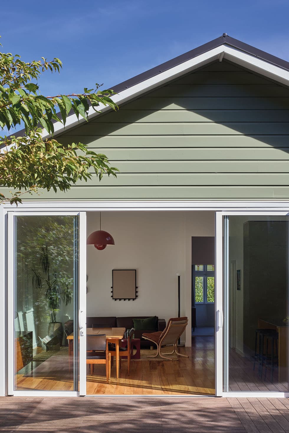
Honing in on the key moves that would create that necessary room within the existing envelope, Mark’s first play was to bring the damp, dark ground floor into a habitable state and then connect the two levels with an internal staircase.
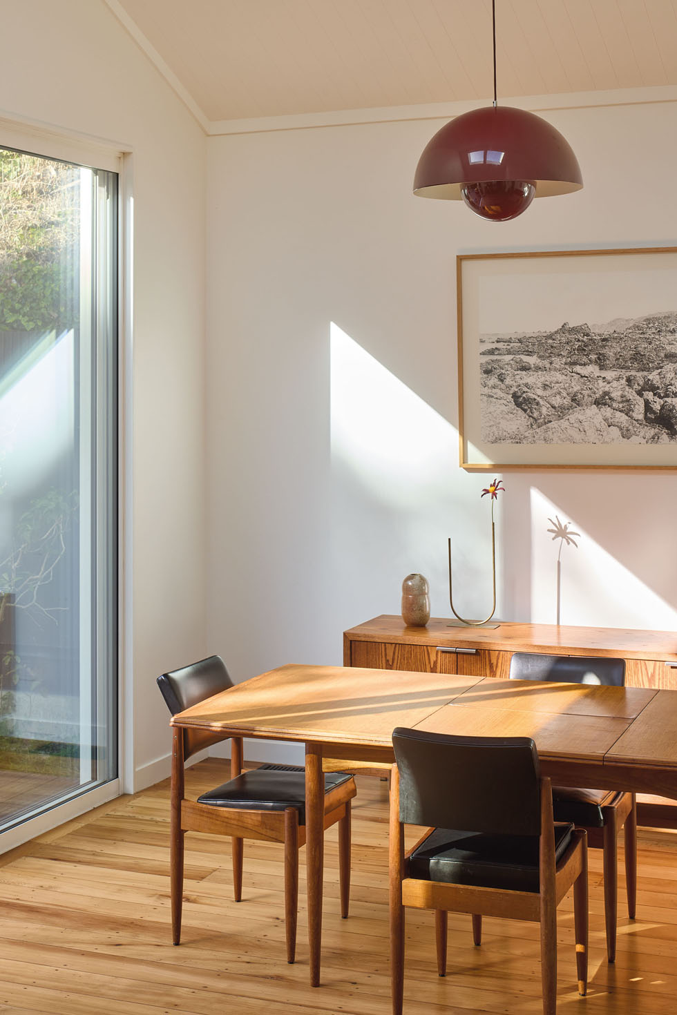
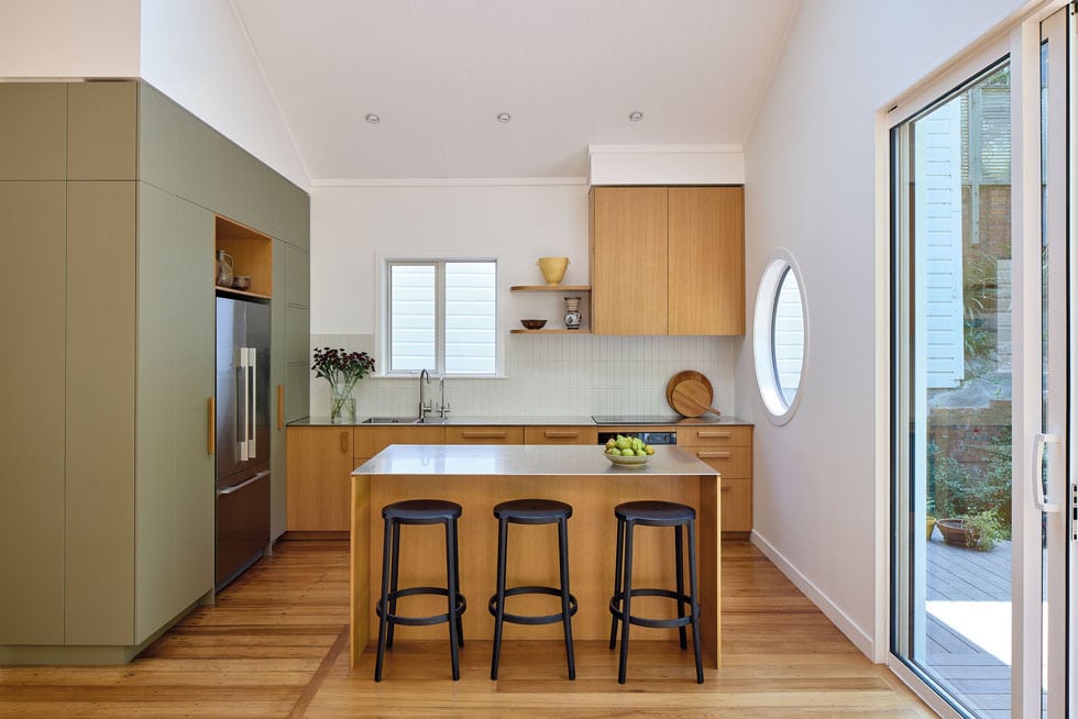
“The lower level was essentially untapped, and though it’s not massive, Mark thought hard about connection and utilising that room to the best of its ability,” says Gemma. Resuscitating the space with a fresh floor slab, plumbing, insulation and glazing, the home’s entire floor plan was then sensibly rearranged to align with the needs and lifestyle of its new whānau. Two bedrooms, a bathroom and an open-plan kitchen/living/dining area now lie across the top floor, with two additional bedrooms, an ensuite, rumpus room, storage and workroom below. “It’s hard to believe we fit it all in,” says Gemma of the new arrangement. “But the house works really hard and feels very spacious to live in.”
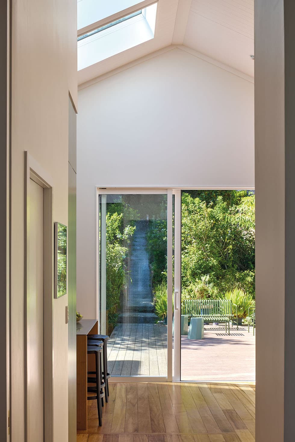
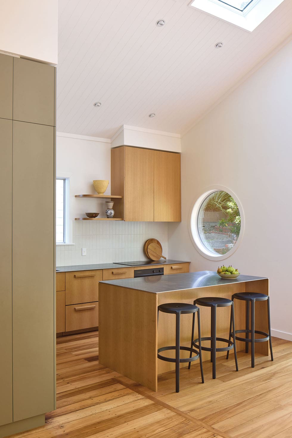
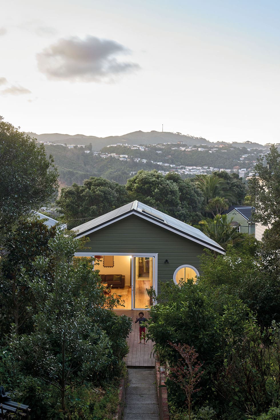
Mark’s second move was to explore the vertical space. Lopping off the existing roof, he replaced it with a new profile that absorbed the attic, introducing fresh volume accentuated by side-by-side skylights. Where the original layout lacked any true connection to the backyard, new glazed doors now slide open to a generous deck that bridges the home and wild, terraced landscape.
After years spent renting in metropolitan cities with limited outdoor space, the sprawling garden was a major drawcard for the young whānau — albeit daunting. “The sheer scale of it was a bit overwhelming, but we’ve got a plan with Xanthe White Landscape Design, and we’ve started the planting journey now. It’s a work in progress, but we’re getting there,” says Gemma.
The garden inspired the couple’s decision to paint their house in Resene Siam, a bold green choice. “I knew I didn’t want a white or grey house, and finding the right tone took some time, but when I saw this one, I instantly loved it,” explains Gemma. Others did not. Parents and friends were wary, questioning the couple’s choice, but they held firm and their bravery paid off. The muted tone emphasises its connection to the landscape and has intrigued many door knockers about the hue.
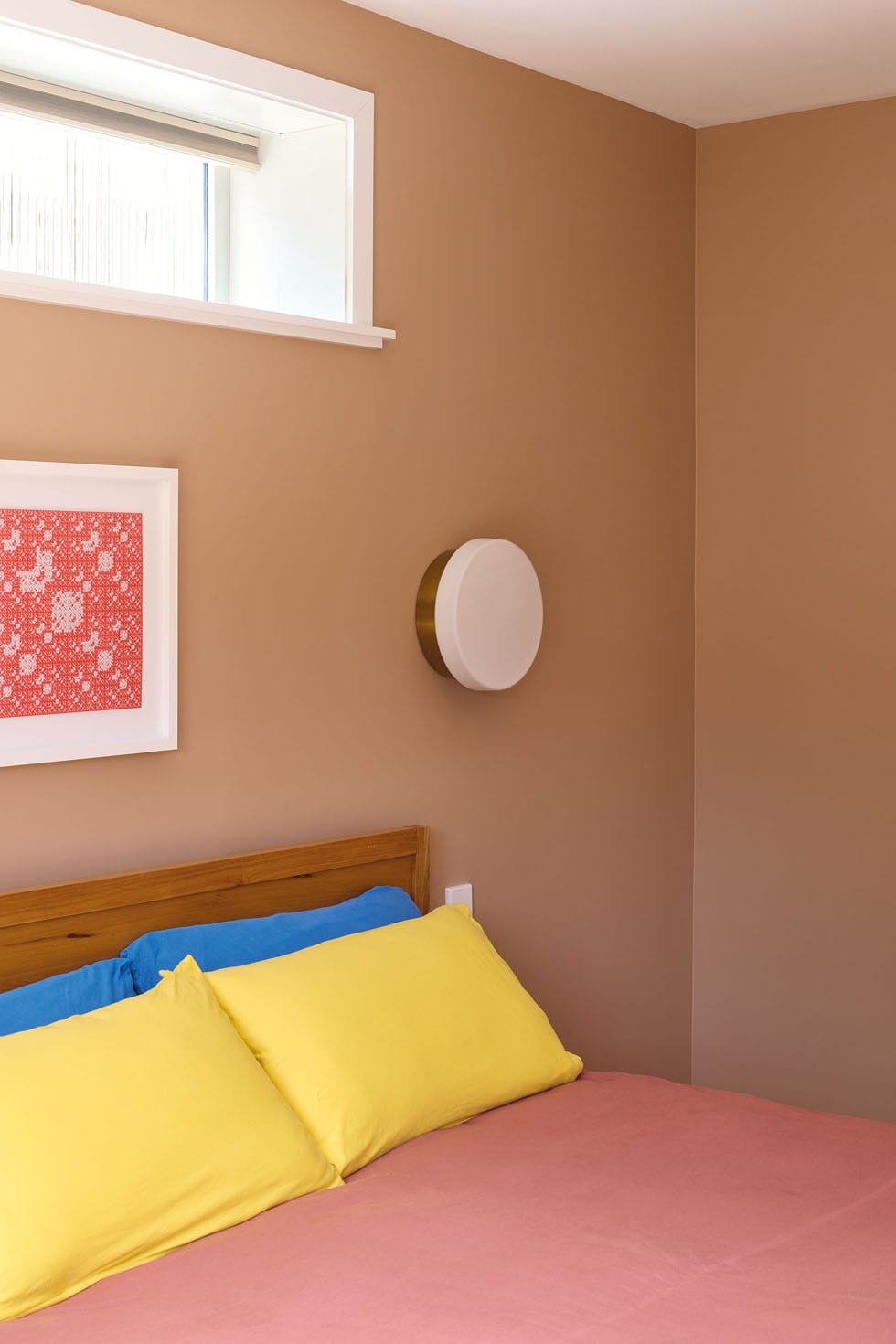
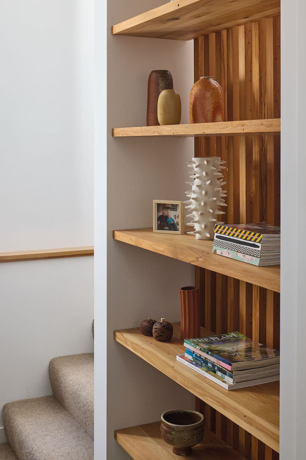
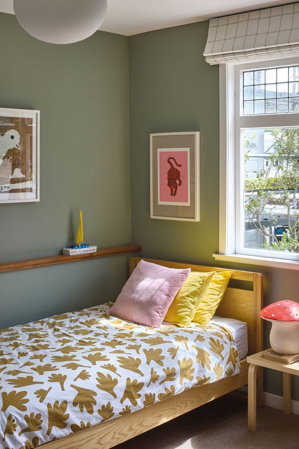
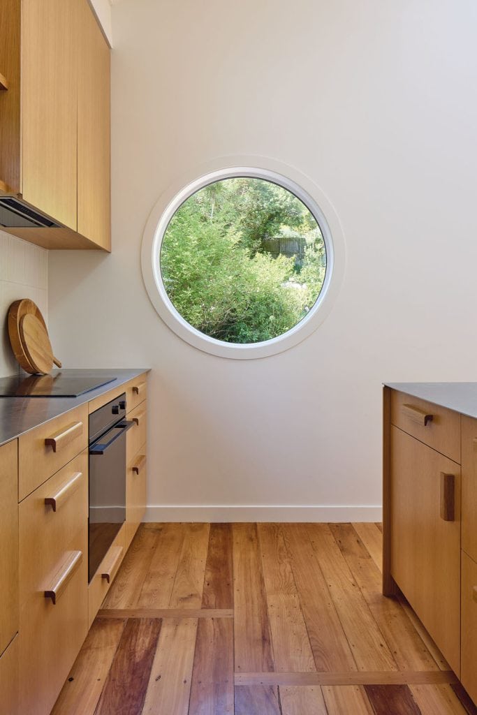
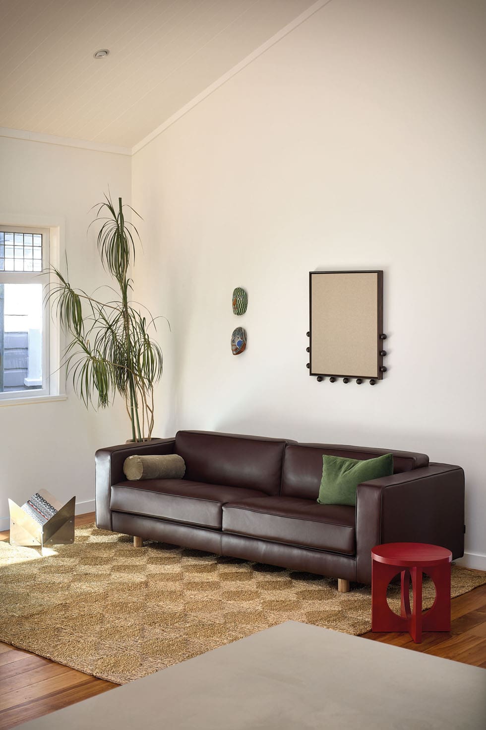
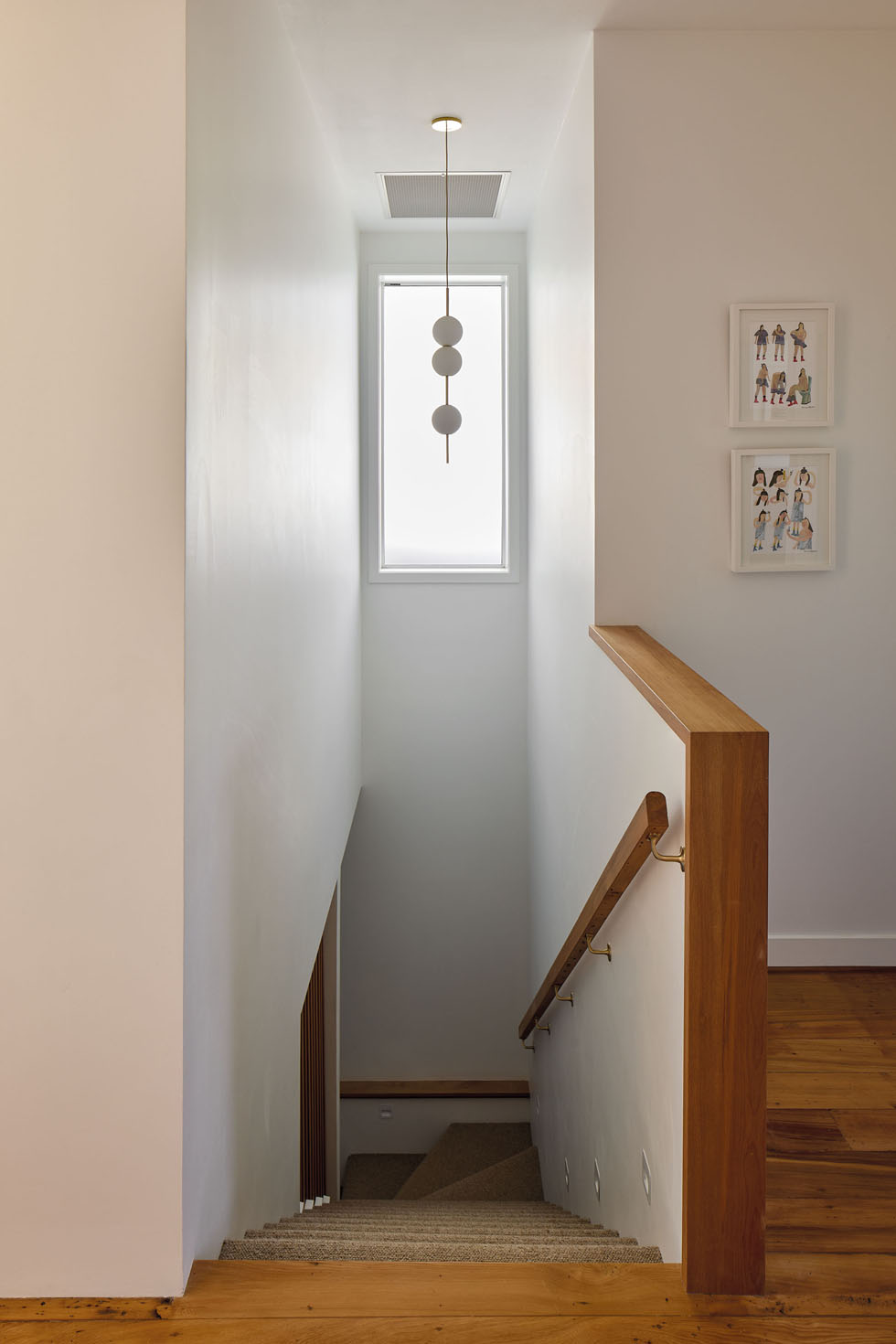
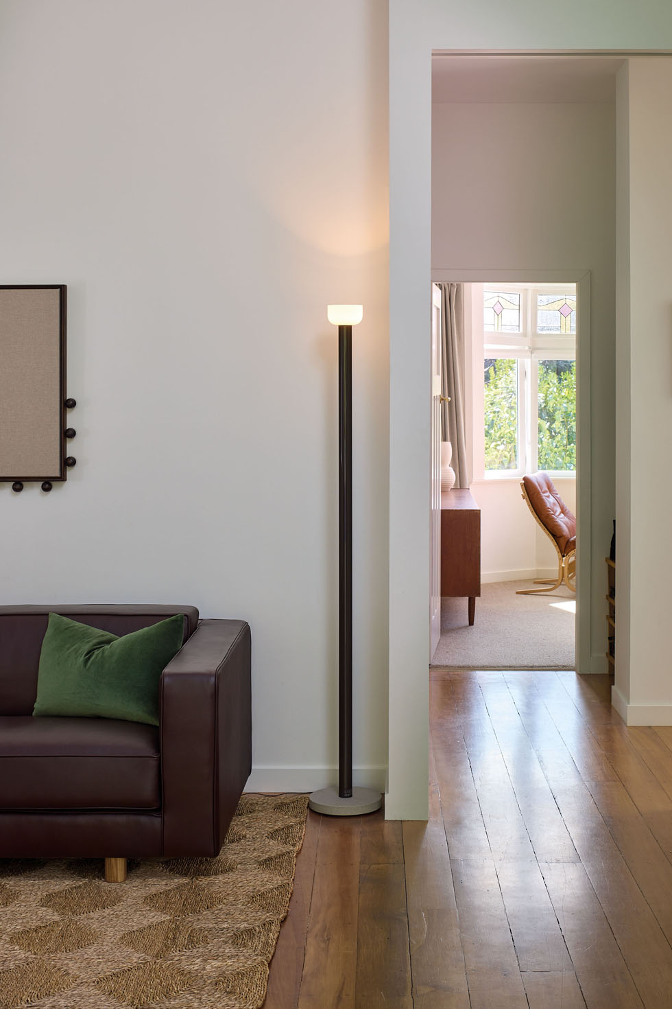
The colour continues inside, settling comfortably within a palette of timber, stainless steel and brass accents. Fresh materials have been introduced with sensitivity to honour the heritage of the 100-year-old home in what Mark calls an ‘easy blend.’ “I wanted to create a harmonious transition between old and new, nothing too jarring,” explains the architect. Original stained glass windows remain, existing mataī floorboards were restored, and timber reclaimed from the old roof has been repurposed in the stair railing and bookshelf, all sitting agreeably within the fresh, open layout the growing whānau required.
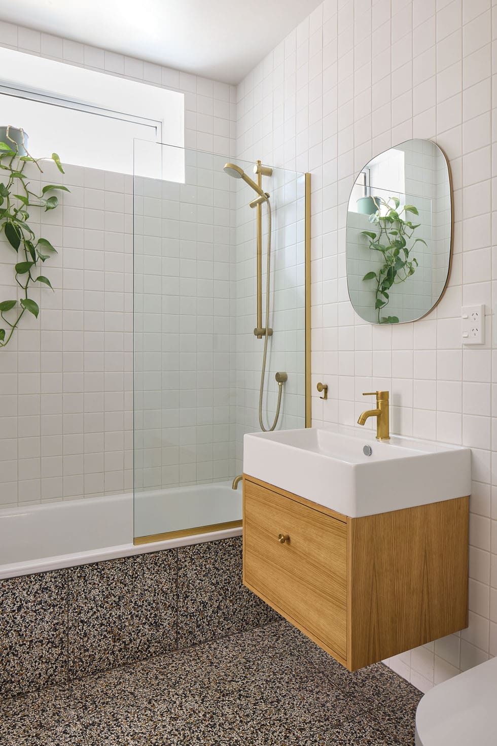
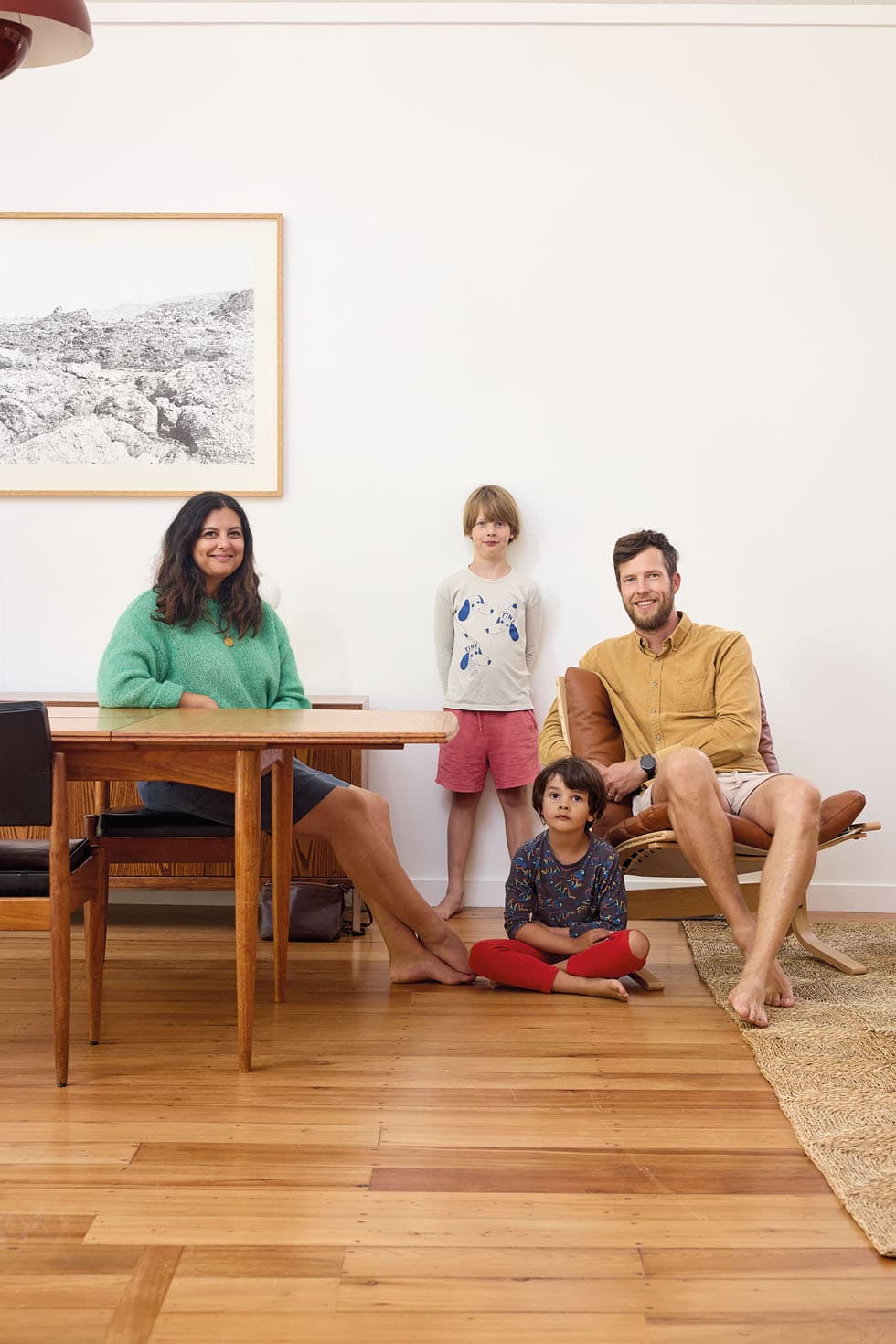
Gemma and Caleb didn’t fall in love with this home before buying it. They needed a house, and this one fitted the brief. Slowly and respectfully, they’ve transformed that poorly planned two-storey house into the perfect setting for their family. The innovative renovations, born from Mark Leong’s deeper philosophy of “making the most of what you’ve got”, have almost doubled the home’s usable floor space, and with another baby on the way, it’s sure to be put to good use. “It’s a place for us, a place for our children,” says Gemma. “And we’re not going anywhere.”
Words Harriet Cowie
Photography Simon Wilson

