A Devonport villa’s transformation tells a coming-of-age story, blending rock ‘n’ roll with British heritage.
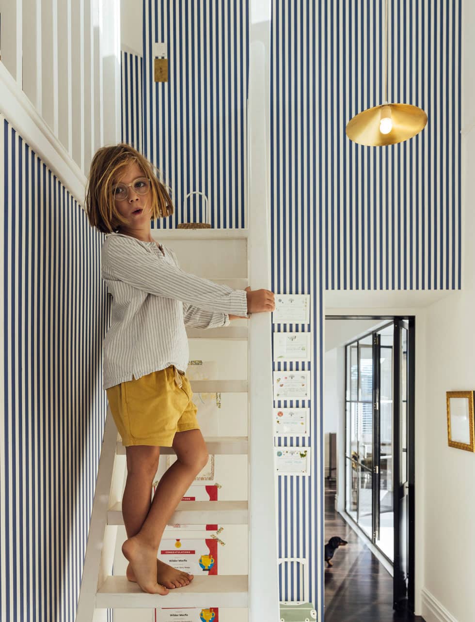
On any given morning at Rebecca and Michael Macfie’s place, the doors to the back balcony are flung open, Patti Smith wafting from the record player, while their kids — Wilder (7) and Romy (3) — boogie their way through breakfast. This idyllic scene belies the effort it took to get here — even for a couple of professionals. As the talented duo behind Macfie Architecture (specialists in heritage villa and bungalow renovations), they know full well the highs and lows of the process.

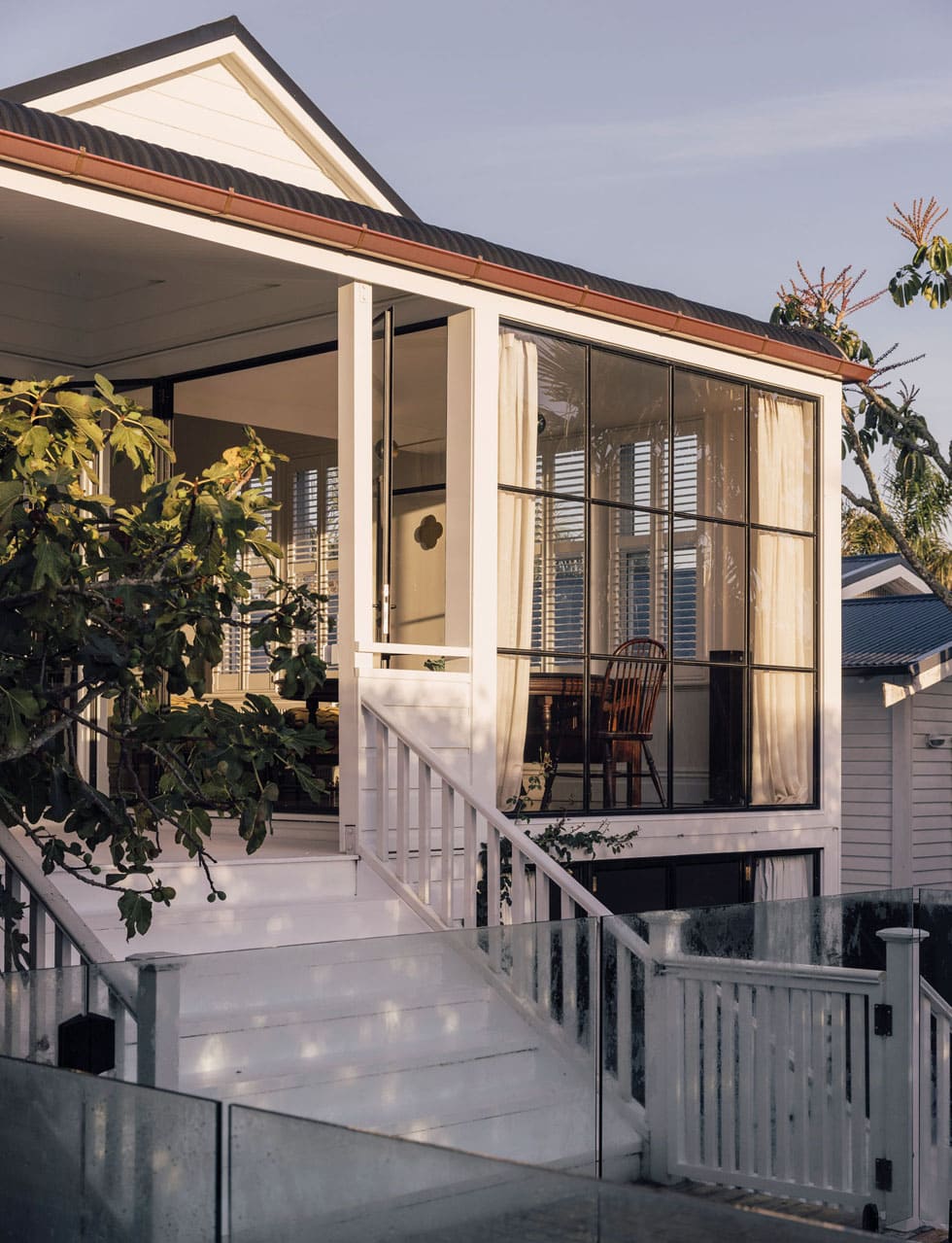
Naturally, in their line of work, Rebecca and Michael see many houses each year, but this one stood out. Charmed by the ‘witches peak’ and angular roof, and it’s location in the Tāmaki Makaurau/Auckland suburb of Devonport, they began dreaming of a life for their family here.

“We had moved back from Australia to East Auckland because my mum was unwell,” says Rebecca. “We wanted to be close to her but were unhappy there as we missed the Melbourne lifestyle where you could bike and walk everywhere. Out there, you had to drive to do absolutely anything. My dad, who’s English, always said he wished he lived in Devonport. My parents promised, ‘If you buy a house there, we’ll follow you.’ We loved being close, so we thought, great, we’ll buy a house there, they’ll follow us and we’ll live in this little village together.”
Built in 1904 by the area’s developer, the house was one of the first on the street. Despite a renovation in the late ’90s, much of its original grandeur remained. The fact that it was perfectly liveable but not too ‘done’ helped too, as they wouldn’t feel guilty about making their own changes. So they bought the quirky villa and began planning their very own character update, starting with simple aesthetic improvements until they could really perfect the bigger changes.
First on the list was repairing the badly painted black lounge wall. Their plans to take things slowly were thwarted by a major levelling issue that would need remedying if plastering said wall was to happen. “If you dropped a marble in one corner, it would roll its way right down the hall,” says Rebecca. Exposing one problem while fixing another became a pattern, leading them to draw up concepts to raise and re-roof the house, refit the interior and add a studio and laundry underneath.
Describing their creative partnership, Rebecca says, “I’m very visual. He’s very technical. I’m like, ‘Lets do a spiral staircase’, for instance, and Michael will put pen to paper to see if it will fit. That’s where we work well together.”
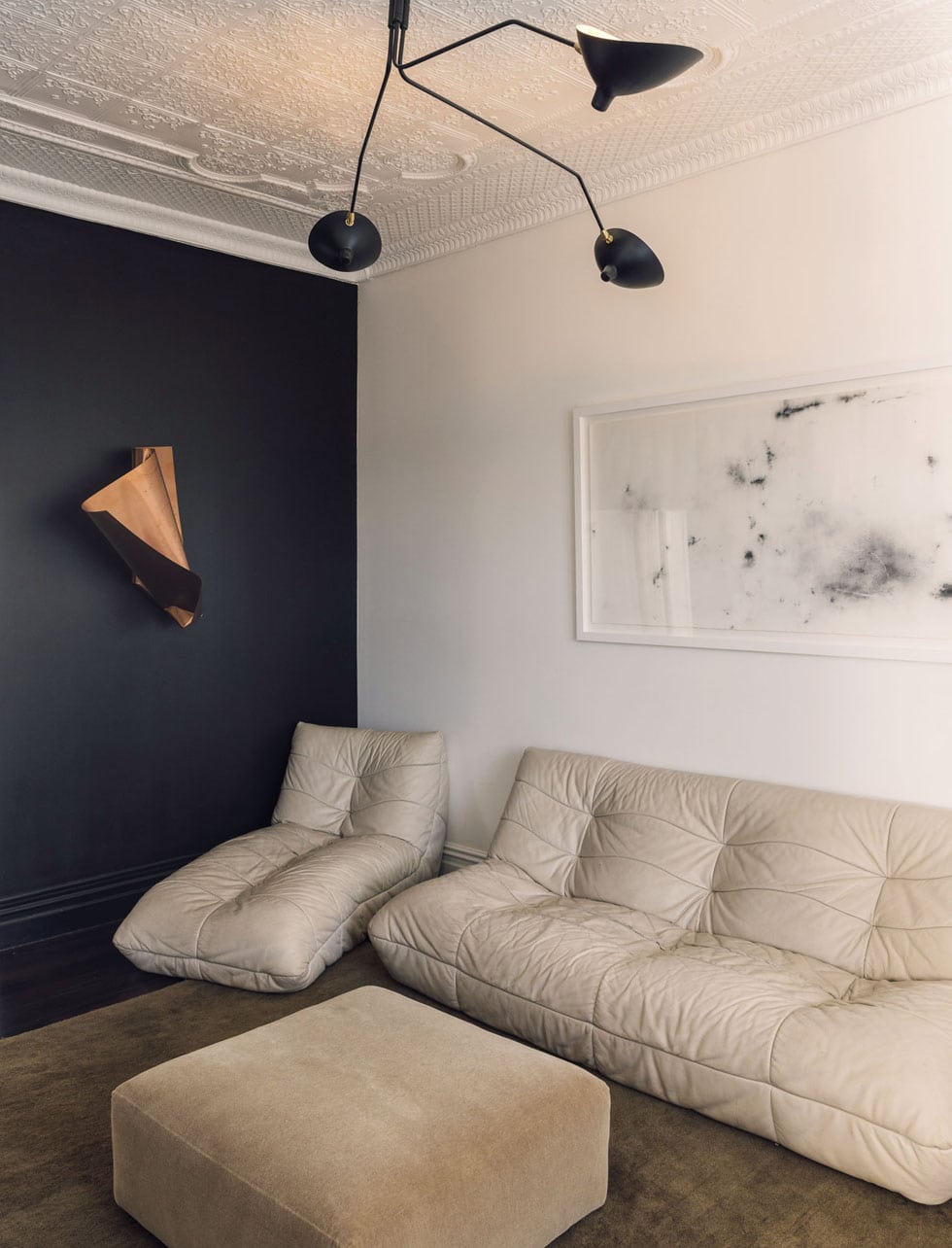

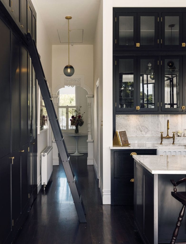
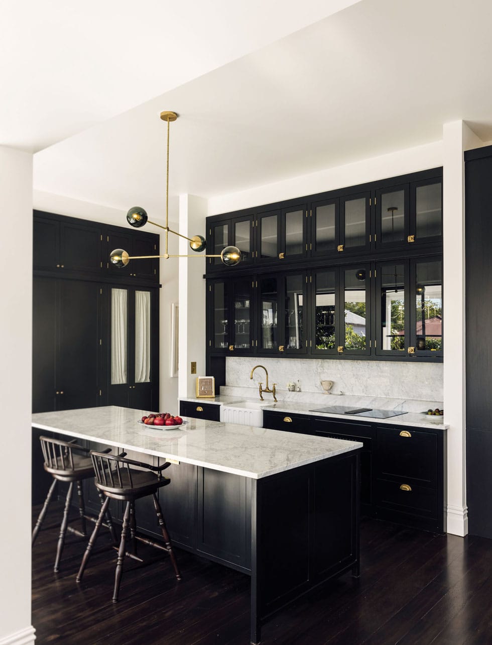
Rebecca describes herself as very texture-orientated and is consistently considering the push and pull between refined and organic. If something will patina — that’s her go-to surface. She knew she wanted a Victorian witch kitchen and the interior mood flowed from there, with a shared aesthetic that could be described as a finely tuned balance of antique meets rock ‘n’ roll. “The original concept included big French doors, then we realised the best view from the house is of Mount Victoria so we thought why not have a wall of glass with black steel joinery?” says Michael.
The fixtures fit perfectly with the kitchen where black-on-black-on-black floors, cabinetry and furniture play up to the vintage apothecary theme. “The floors were like a peak ’90s red-orange hardwood. It was a toss-up between a forgiving neutral brown or a darker, more striking black. Because aesthetics rule in my mind, I was like, yes, I’m going to go for the high-maintenance black,” says Rebecca. “I don’t regret it at all. It enhances the expansive feeling with the four-metre ceiling. Even though this house is petite, the stud height makes each room feel striking in stature.”

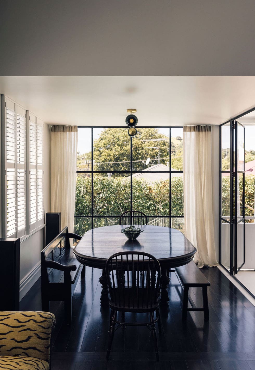
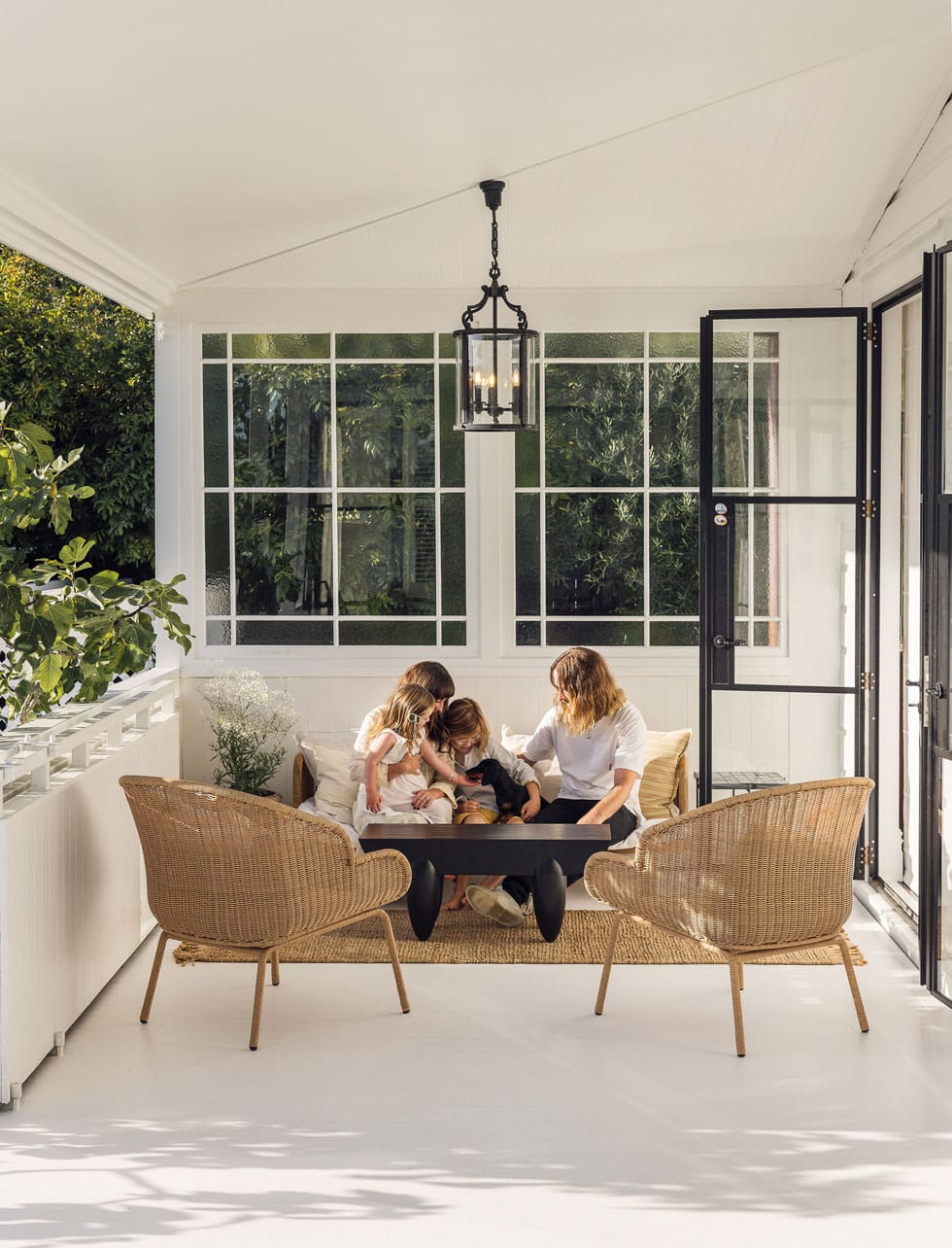
Stepping out onto the balcony sees a shift in the spectrum to white on white, and the couple rave about how this deep, covered conservatory-like space has been a year-round godsend for entertaining the kids — especially with all that rain recently. A dining room extension wrapped in the steel Crittall-style joinery now intersects the northwest end of the balcony to create a space for the family to share meals around a table together.
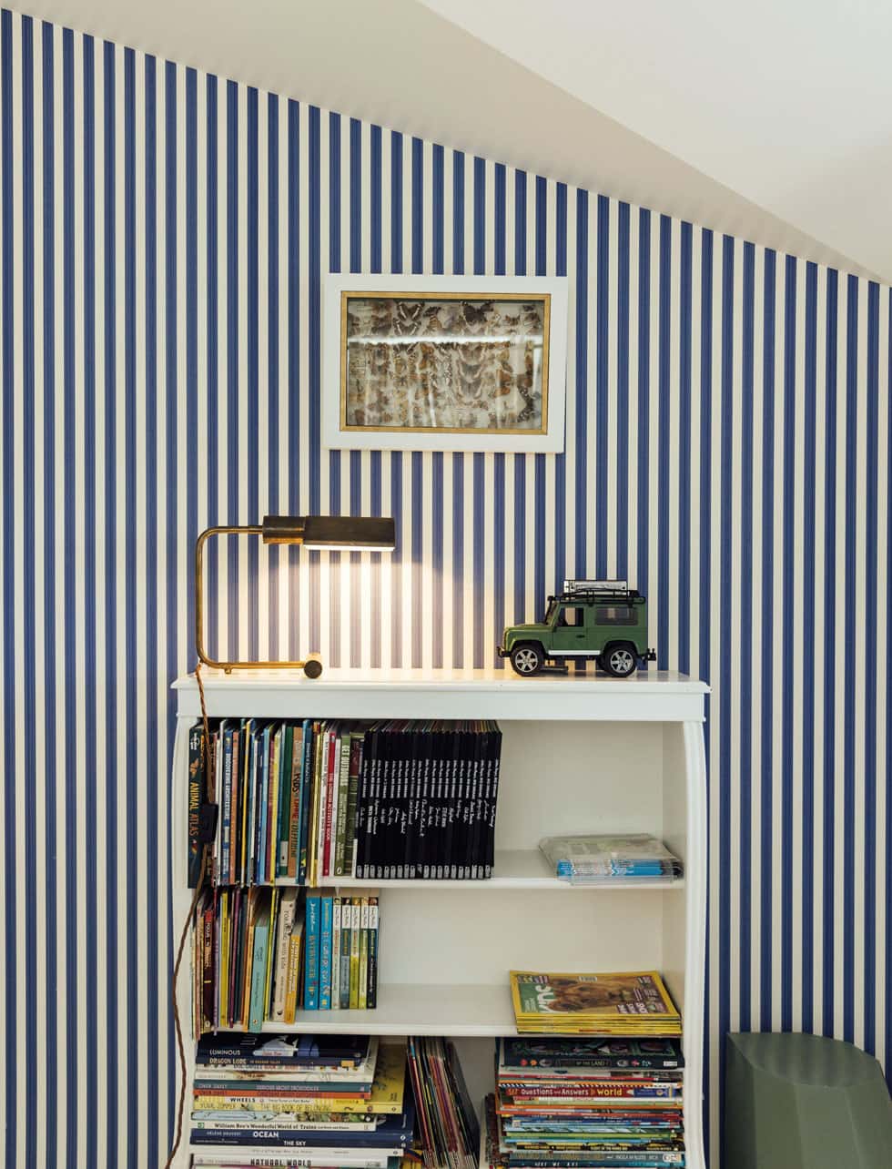
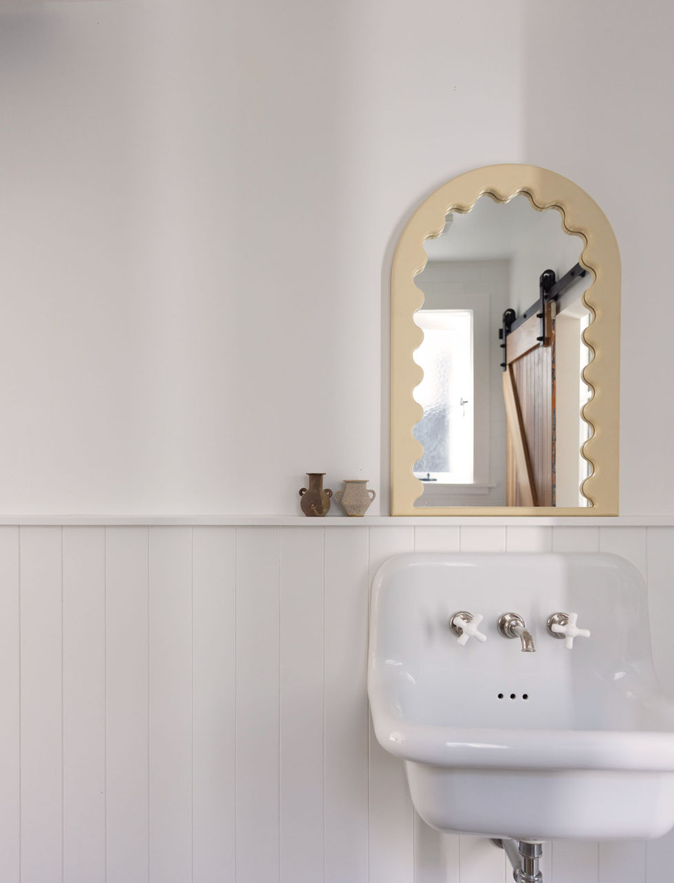
Hidden behind saloon doors, Wilder’s bedroom and a bathroom are both accessed from the kitchen. “When I’ve shared pictures of this space on Instagram, with the doors closed, people think we have a larder behind them,” says Rebecca. “It’s been a clever way to disguise how small the space really is.”
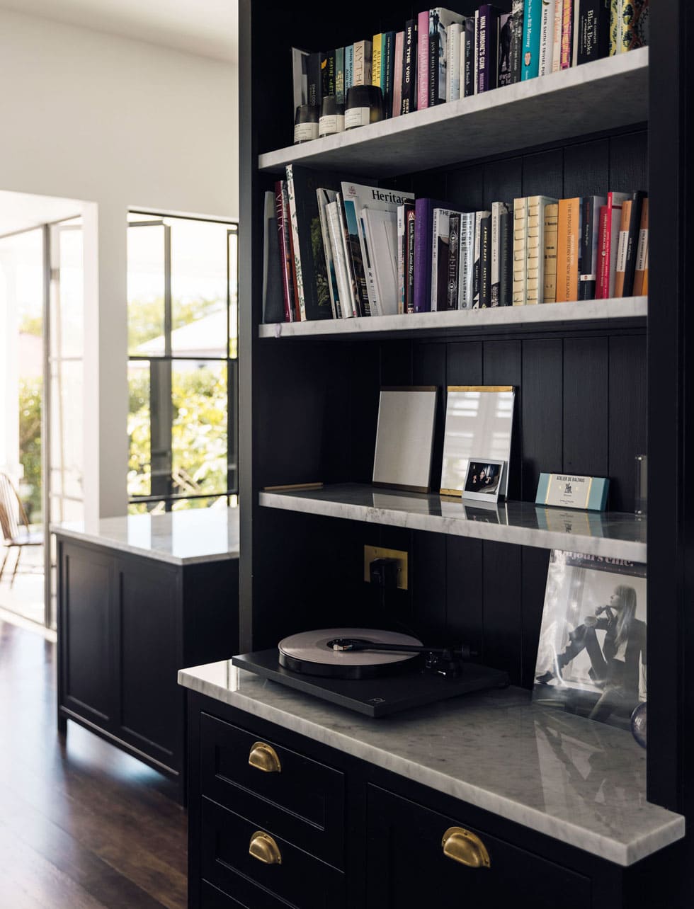
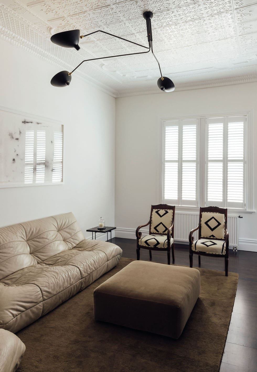
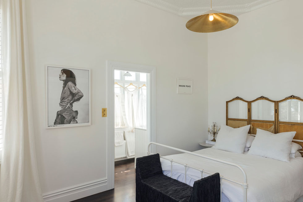
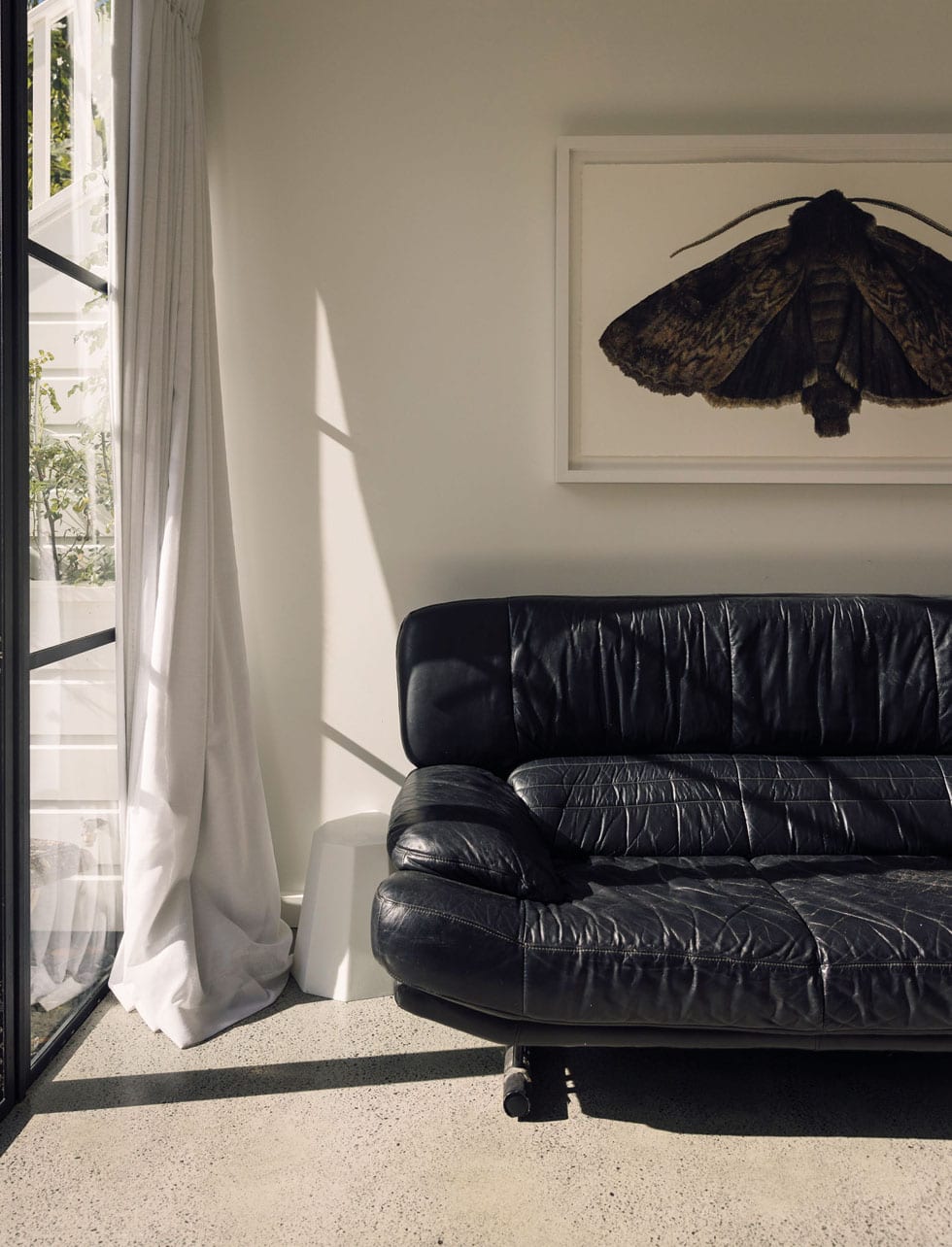
Around the corner, the living area is a snug haven perfect for cosy winter evenings and lively conversation around the fire. Custom-built shelving rising from floor to ceiling, houses an extensive vinyl collection that Michael has meticulously organised by genre.
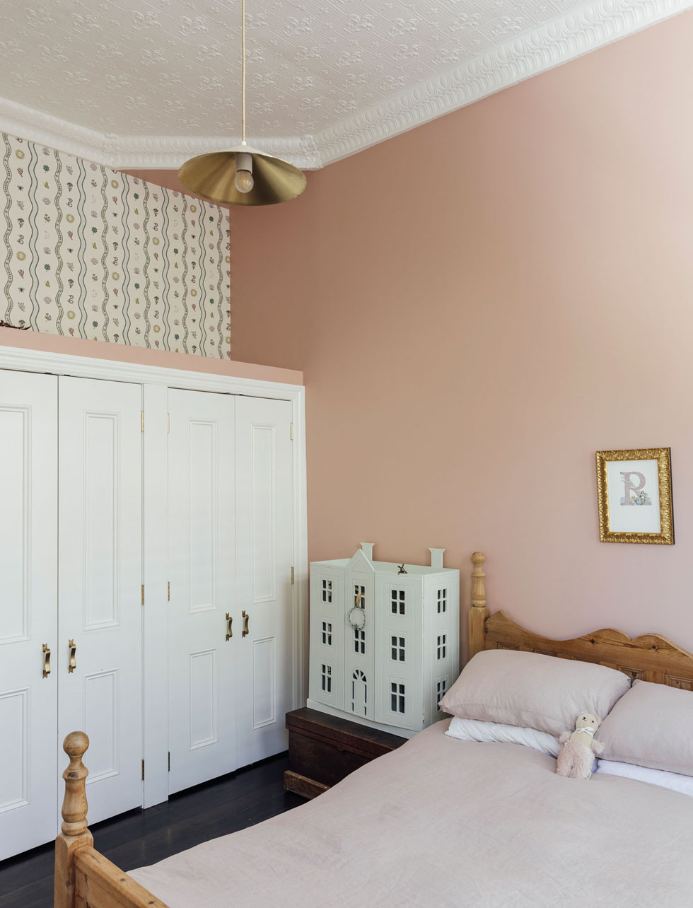
as a focal point plus a bespoke artwork above the bed, the room’s aesthetic is harmonised by Aalto Half Treaty — a pink hue created in collaboration with Sarah Jayne Kavali. The addition of a vintage bed from Her Harvest and a dollhouse from Trade Me completes the charming set-up.
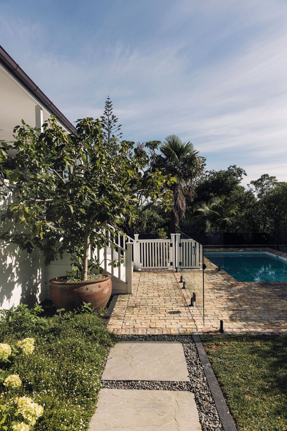
Landscaping was an unexpected yet delightful part of the process. Desperate to replace a troublesome shell path, they enlisted the help of Xanthe White Design to create an overall plan for a sensory garden, rich with herbs and plants that attract bees and other insects. “Xanthe and her team embraced this vision, filling the garden with wandering jasmine and espalier trees,” says Rebecca. “Our goal is for the kids to pick, smell and bring herbs into the kitchen. I love this enhanced connection with nature.”
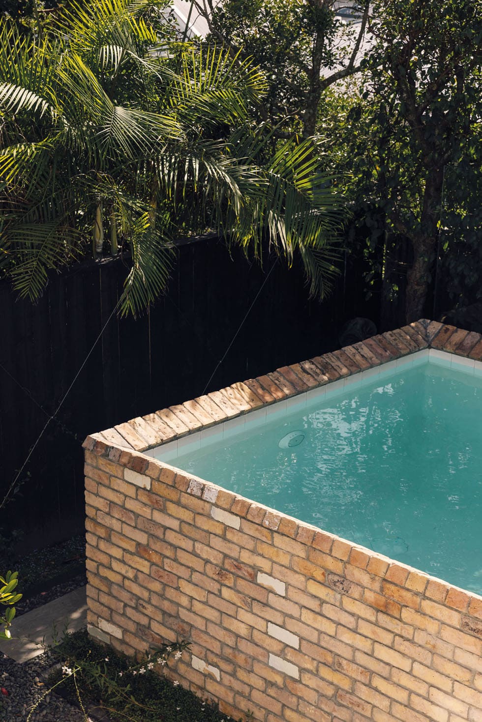
Collaborating with Natural Gardens on the hard landscaping, they added raised-brick flowerbeds and detailed paving options using recycled bricks sourced from the Britomart Hotel site. Realising they had plenty on hand, they even decided to surround the pool with them, creating an eye-catching infinity effect at one end.
“I don’t believe homes need to be huge,” says Rebecca. “A refined small house suits us now, though I might rethink this when we have teenagers. The downstairs space future-proofs us for that though and, in the meantime, it’s the ideal spot to have family come and stay.”
The couple loves living in this neighbourhood where Michael skateboards to work and back for school pick-up, and Wilder’s classmates are over the road or just around the corner. During the holidays, there’s often two or three kids popping by to play, parents calling out over the fence for dinnertime. When the fig tree is fruiting, Romy will be out delivering bags of them in her toy pushchair and, as Rebecca says, “I can’t be without a café where I can get a soy latte at the end of the street.” It’s everything they wanted for their family.


The opportunity seldom presents for them to do a project from end to end; usually other people’s furniture and tastes come into play. As a result, Rebecca and Michael have found the process of renovating for themselves hugely gratifying — a chance to fully express their design vision. They’ve infused their love of British heritage and rock ‘n’ roll into every corner. This villa isn’t just a house, it’s a memoir for the Macfies, a place where old meets new and every day feels like a perfectly curated playlist, ready to be enjoyed.
Words Alice Lines
Photography Duncan Innes