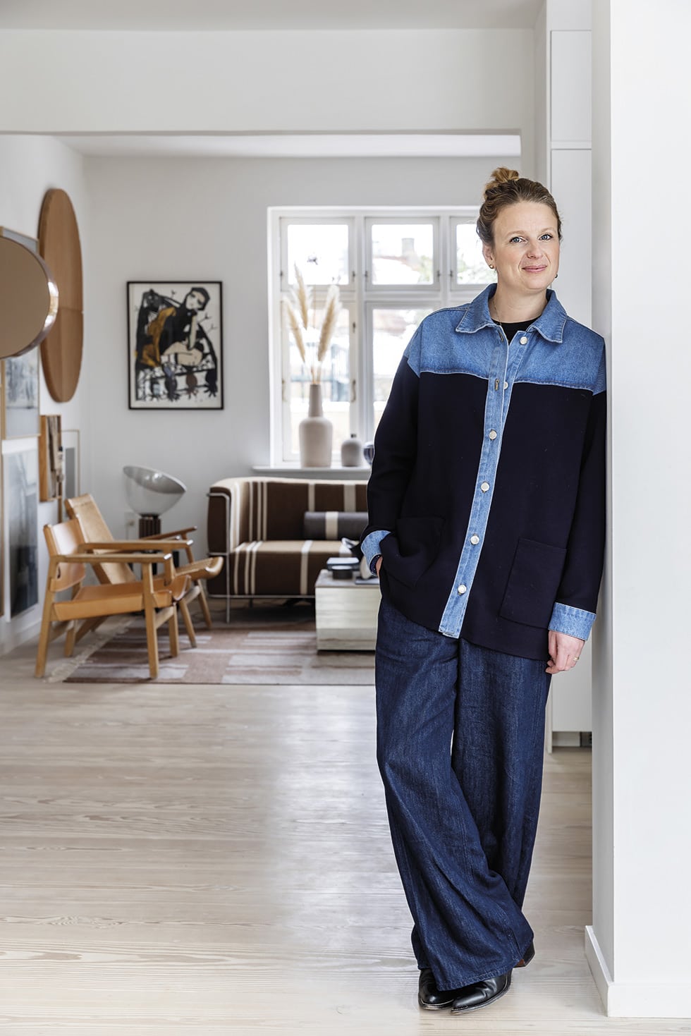
Stepping inside the 1929 villa where designer Kristina Dam, her musician husband Ketil Duckert and their children Vera (12) and Nord (7) have lived for the past few years is a sensory experience. The color palette of the three-bedroom home on Amager Island in Copenhagen, Denmark is soothing and natural; instead of turning up the colour, Kristina has toyed with form and materiality to create a kind of artistic minimalism that could be construed as Japandi, in which the hallmarks of Scandi design blend with a Japanese sensibility.
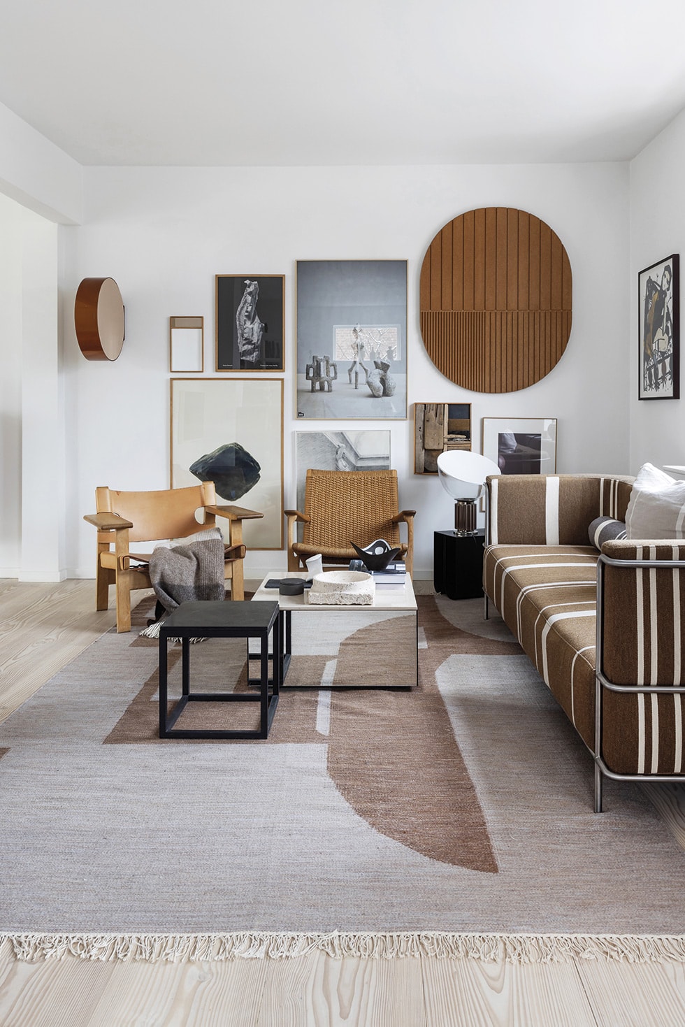
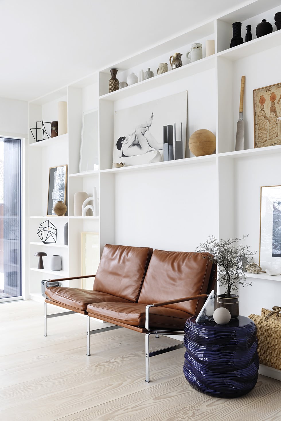
Kristina’s considerable skill is exemplified in the living zone, which she says was the trickiest spot in the house to decorate. Needing to define a small area in a larger open-plan space beside the thoroughfare to the kitchen, she finally feels she’s succeeded in getting everything fitting together well to create the ambience she seeks, through combining organic and angular shapes and a diverse range of materials.
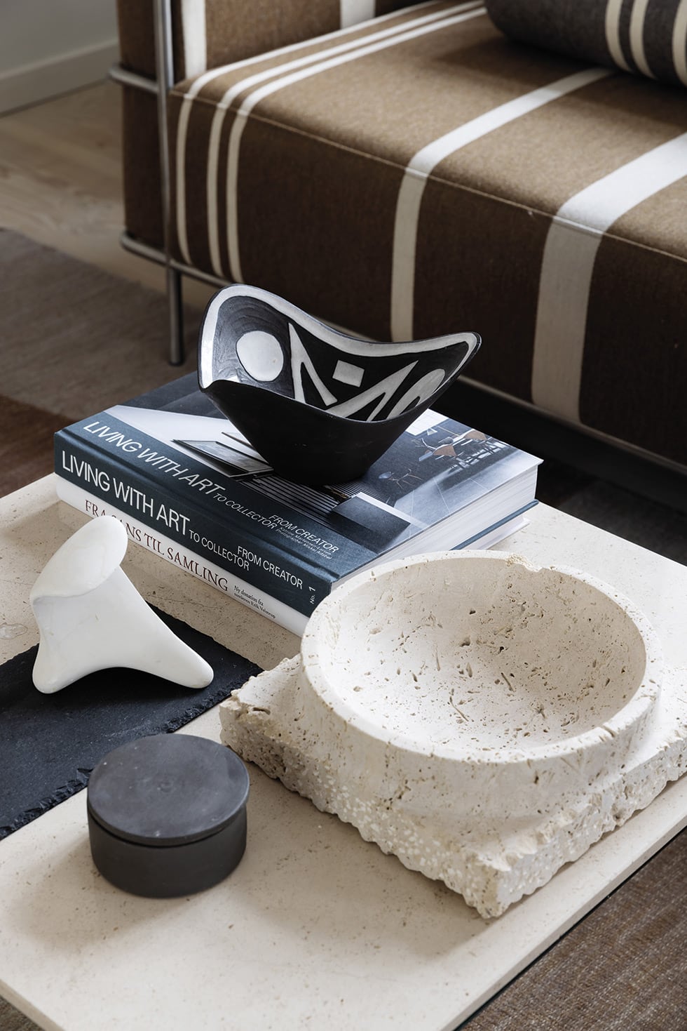
The hero detail here is the array of artworks she arranged to form a large-scale installation. When asked what the trick is for making a gallery hang such as this come together so well, the graduate of the Royal Danish Academy of Fine Arts for Architecture & Design says, “For me, it’s about making sure there are works of different formats, structures and surfaces represented on the wall, and something organic. The frames could have something in common or not. I’ve chosen various narrow wooden frames and stuck to tranquil tones because I want a calm and harmonious overall expression, but I’m also an advocate of doing it in other ways where it’s visually more wild.”
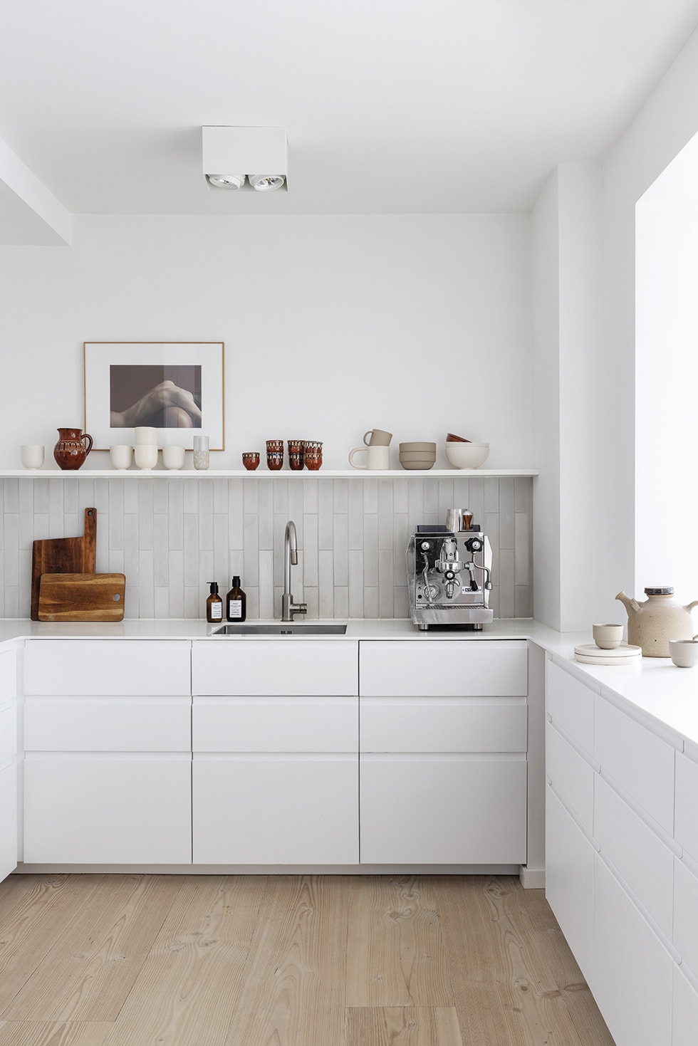
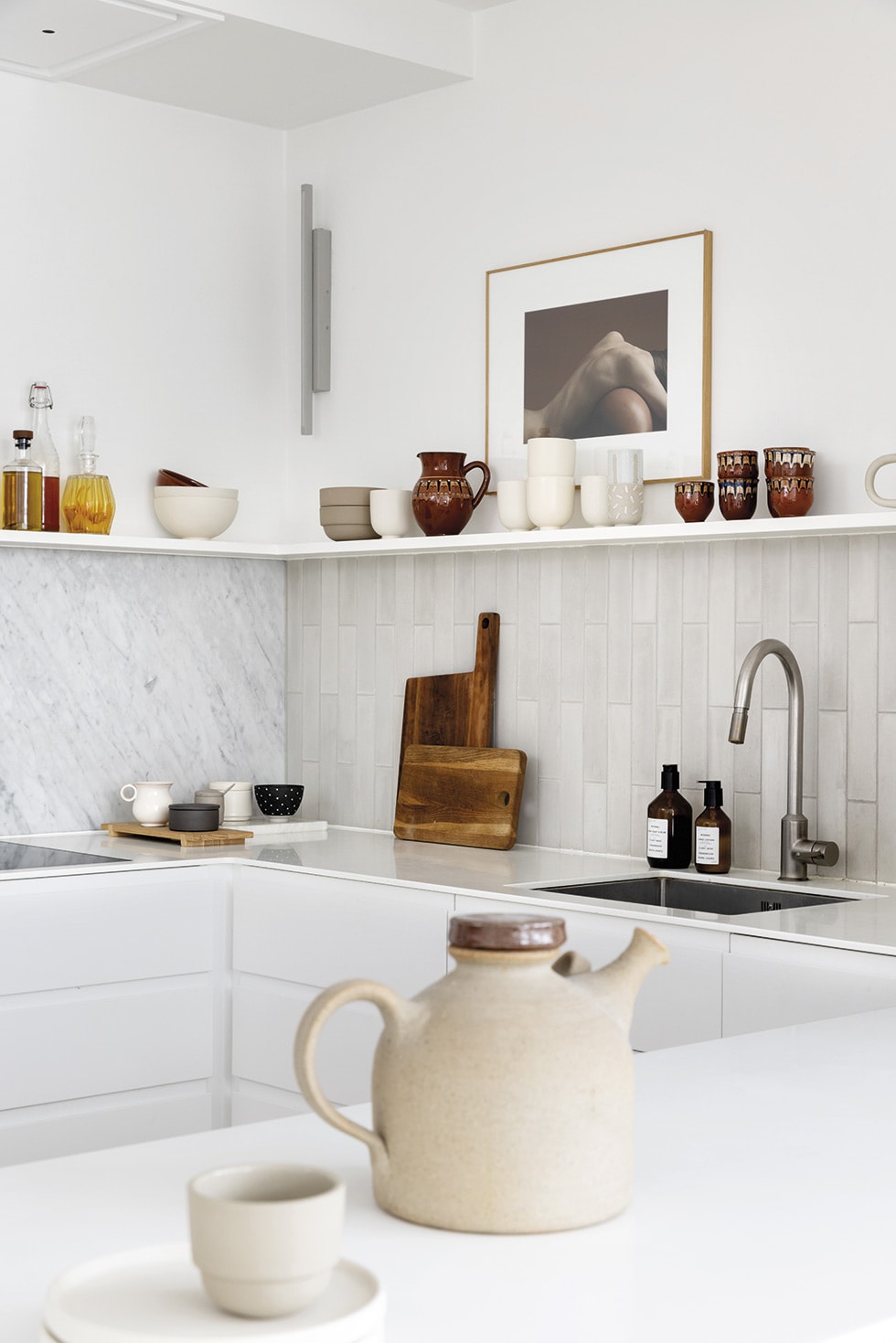
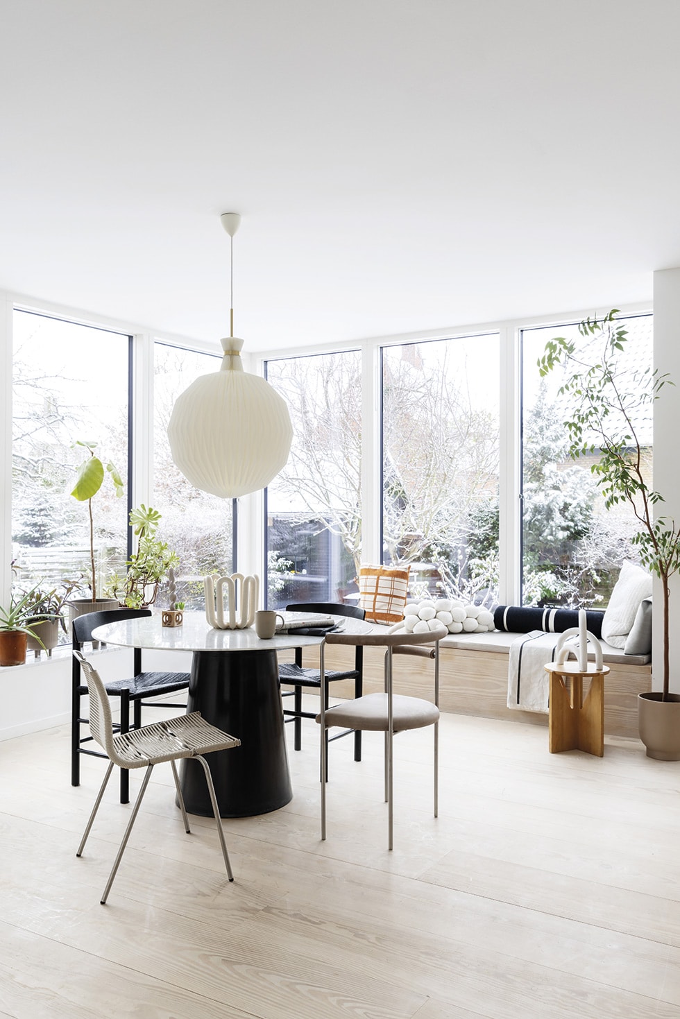
The dining area is Kristina’s favourite space. She especially loves the window seat on which you can laze and gaze out into the garden. It was important to her to install comfortable seating in this area, so the family can hang out together without having to cram around the dining table.
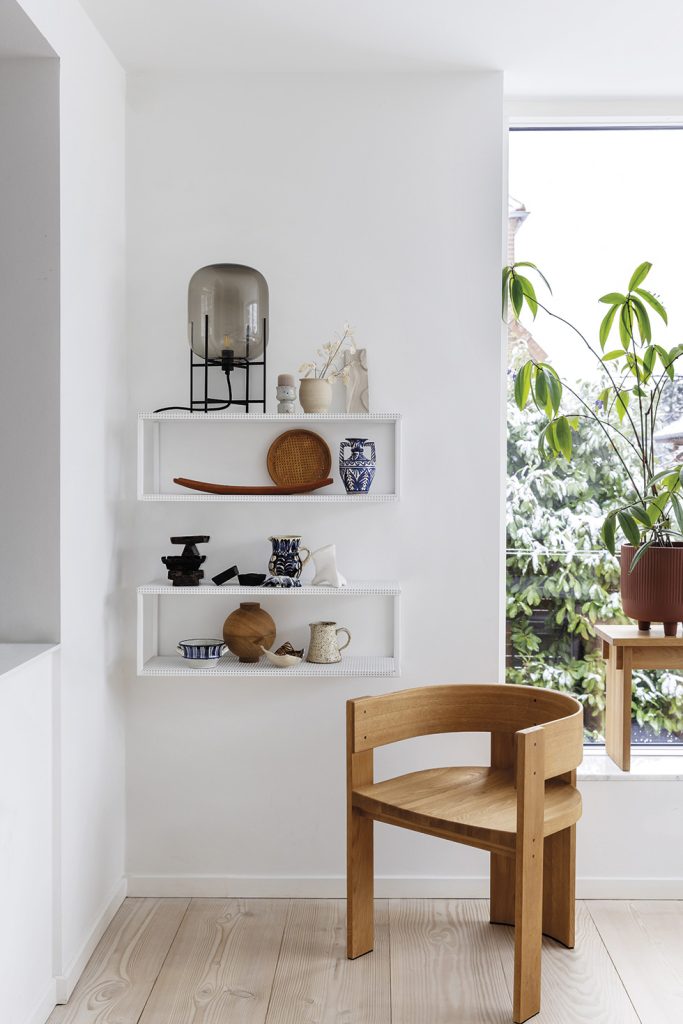
Another cherished feature in the dining area is the shelving unit she had built to fill the entire wall, with acoustic boards behind it to improve the sound in the open-plan space. On its shelves and others throughout the house, Kristina displays collections of crafted objects, often gathered when she’s on the road.
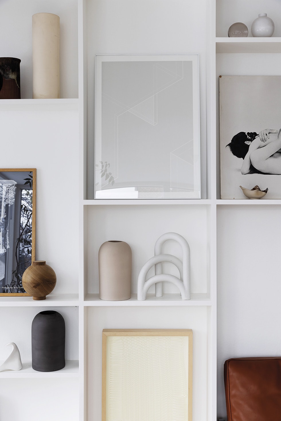
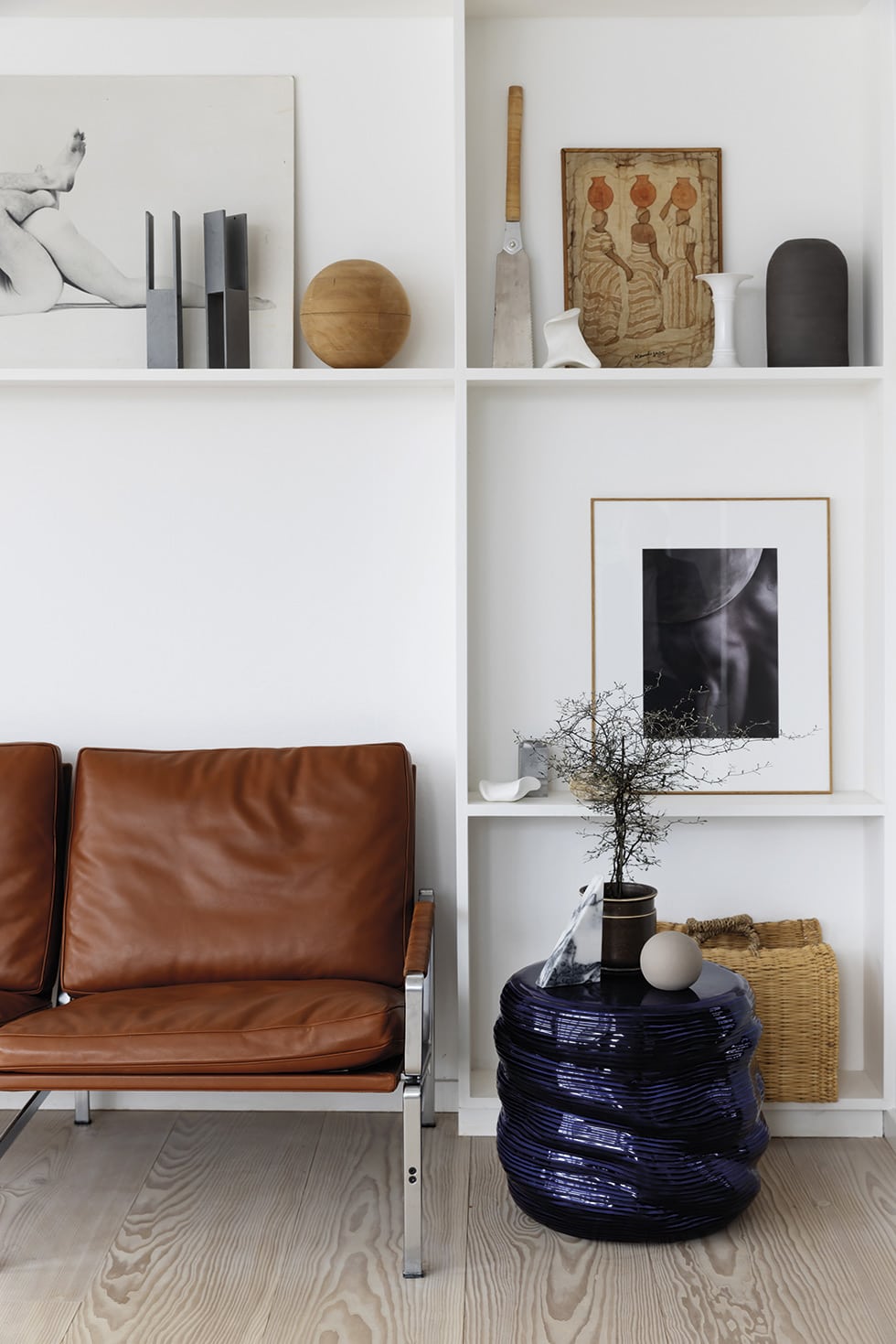
“When I travel or visit markets in Denmark, I’m always aware of objects, and I can’t hold back if there are some delicious ceramics, a beautiful glaze or nice glass items,” she says. “To avoid having ceramics on every surface in the house, many of my collections are grouped in the huge bookcase. It’s like the art, which is curated in clusters with colours that are well connected.”
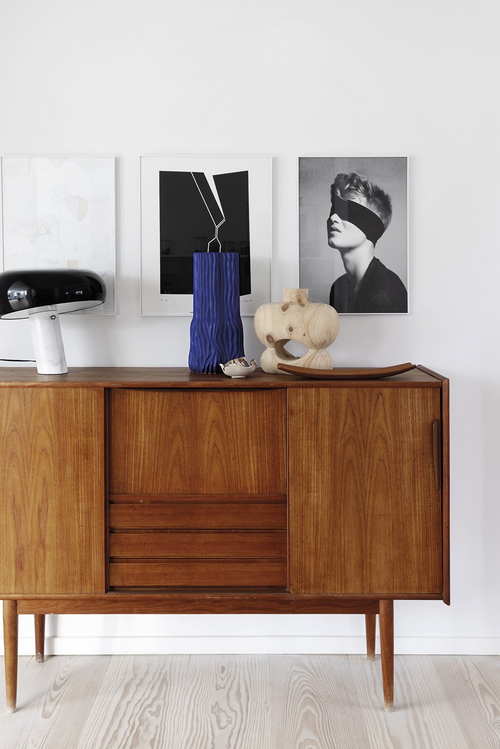
“For me, having pure white surfaces in my home gives a sense of spaciousness and peace,” she continues. Serenity is reflected in the items produced by her eponymous studio Kristina Dam (for which she designs furniture and objects in the zone between interiors and art) and as brand and design director for interiors and lifestyle company Broste Copenhagen. At home, she wants to be able to relax without too much visual noise, so she uses this house to test out her designs before they’re put into production, to be absolutely sure they work in real life.
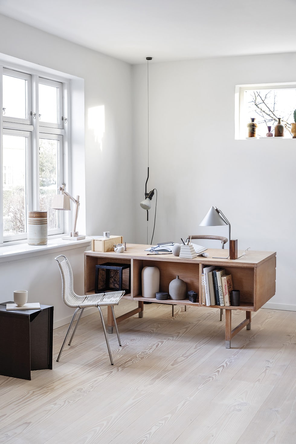
Kristina finds inspiration for her designs in all sorts of places, but never more so than when she travels. She stores impressions and gathers ideas from everything from buildings and exhibitions to fit-outs in restaurants and shops. Even something as simple as a walk on the beach might see her pick up a stone that leads her thoughts to a new product.
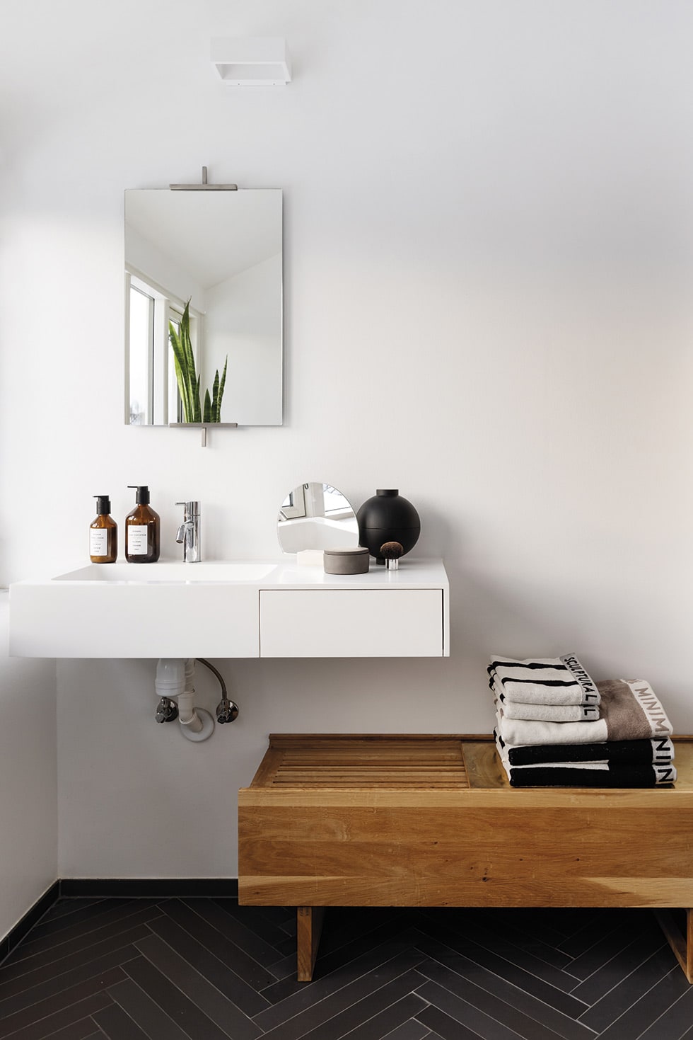
Here, she blends her own creations with design classics by some of her favorite architects and furniture designers. Her list of role models is long, with Danish architect/furniture designer Bodil Kjær, Danish designer Poul Kjærholm, German artist Josef Albers, French architect/designer/artist Le Corbusier, Finnish architect/designer Alvar Alto and American artist Donald Judd among the prominent names on it.
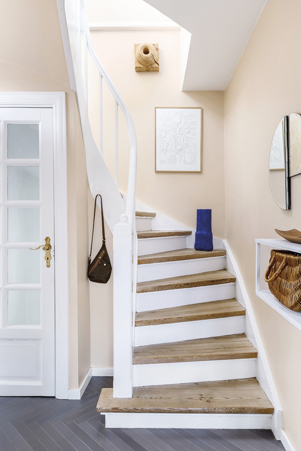
Kristina would rather save up for sublime design and excellent craftsmanship than throw money at short-lived purchases, so once an investment piece is moved in, it’s intended to be reside here forever. “We’ve had many of our objects and furniture for years,” she says. “I love to stage them in new ways to give new life to our home with the things we already have — and every now and then add a few fresh finds I’ve been drawn to.”
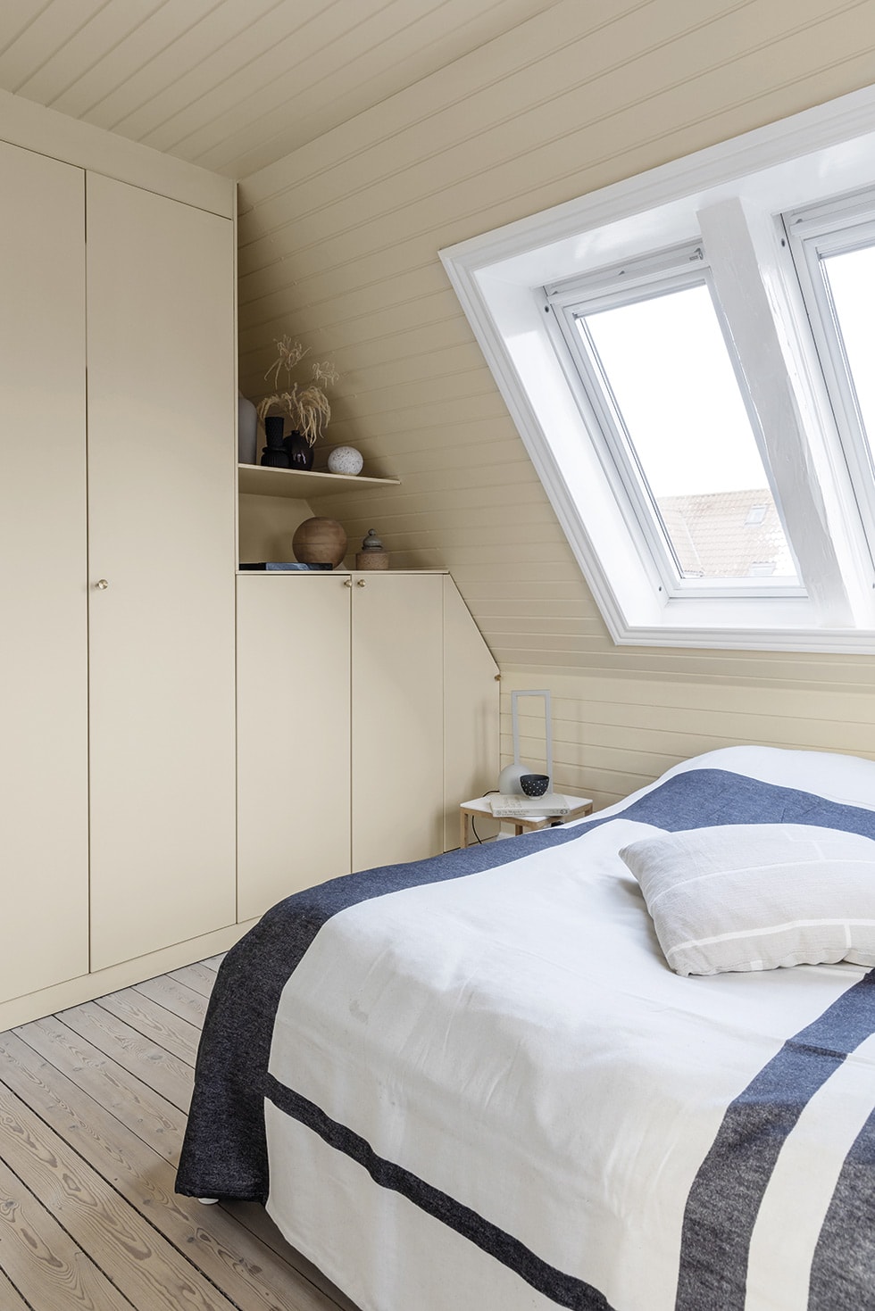
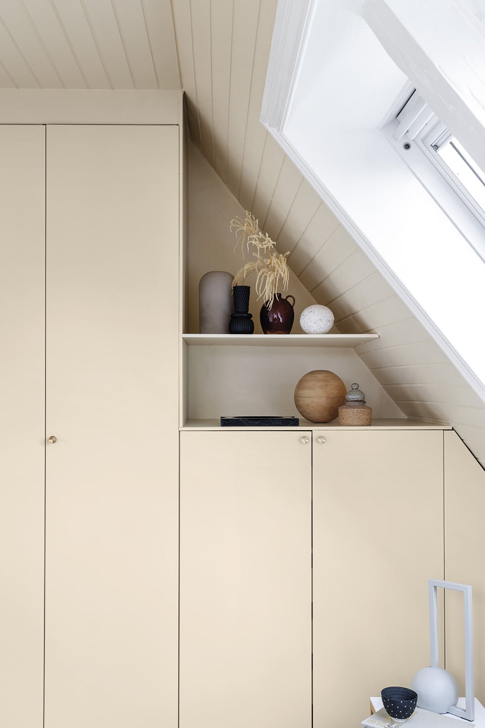
With the help of an architect, Kristina designed an extension to the back of the house that’s given the family an extra 30m2 that now houses the kitchen, dining and living spaces. Clad in black timber and with large sections of glass, it reaches into the backyard via steps and protruding sections of deck. Studded with potted miniature conifers, these outdoor areas are used extensively in the summer and an enchanting sight to behold come winter, when they’re gently dusted with snow.
Words Rikke Graff Juel
Photography Christina Kayser O

